Empowering Individuality
Brand Ecosystem, Strategy & Packaging for Natural Deodorant & Aftershave
Studio Anka was tasked to create an empowering and visually striking brand identity for SWHAT, a deodorant and aftershave brand celebrating self-expression, diversity, and body positivity.
In this comprehensive project, we brought SWHAT’s values to life with a bold, confidence-driven approach. Our work united cohesive visuals, strategic messaging, and impactful packaging design. From a memorable logo to dynamic packaging and engaging social media assets, we created a seamless, authentic brand presence that resonates across platforms, reinforcing SWHAT’s message of self-expression and body positivity at every touchpoint.
SWHAT’s vibrant identity resonates widely, fostering a strong community of self-confidence and individuality, transforming it into more than just a product, it’s a movement.
Direction
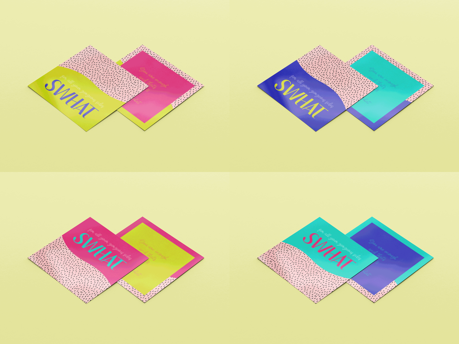
SWHAT’s evoke joy, confidence, and individuality, encouraging customers to embrace their uniqueness. With bold colors, playful typography, and expressive illustrations, each design choice invites self-expression and celebrates diversity.
Impact
SWHAT’s bold, empowering visuals set it apart in a competitive market, building a passionate, body-positive community. Eco-friendly, reusable packaging reinforces its commitment to sustainability, resonating with eco-conscious customers and fostering loyalty. Through impactful design and a clear mission, SWHAT seamlessly connects its values to an engaging and meaningful customer experience.
Visual identity system
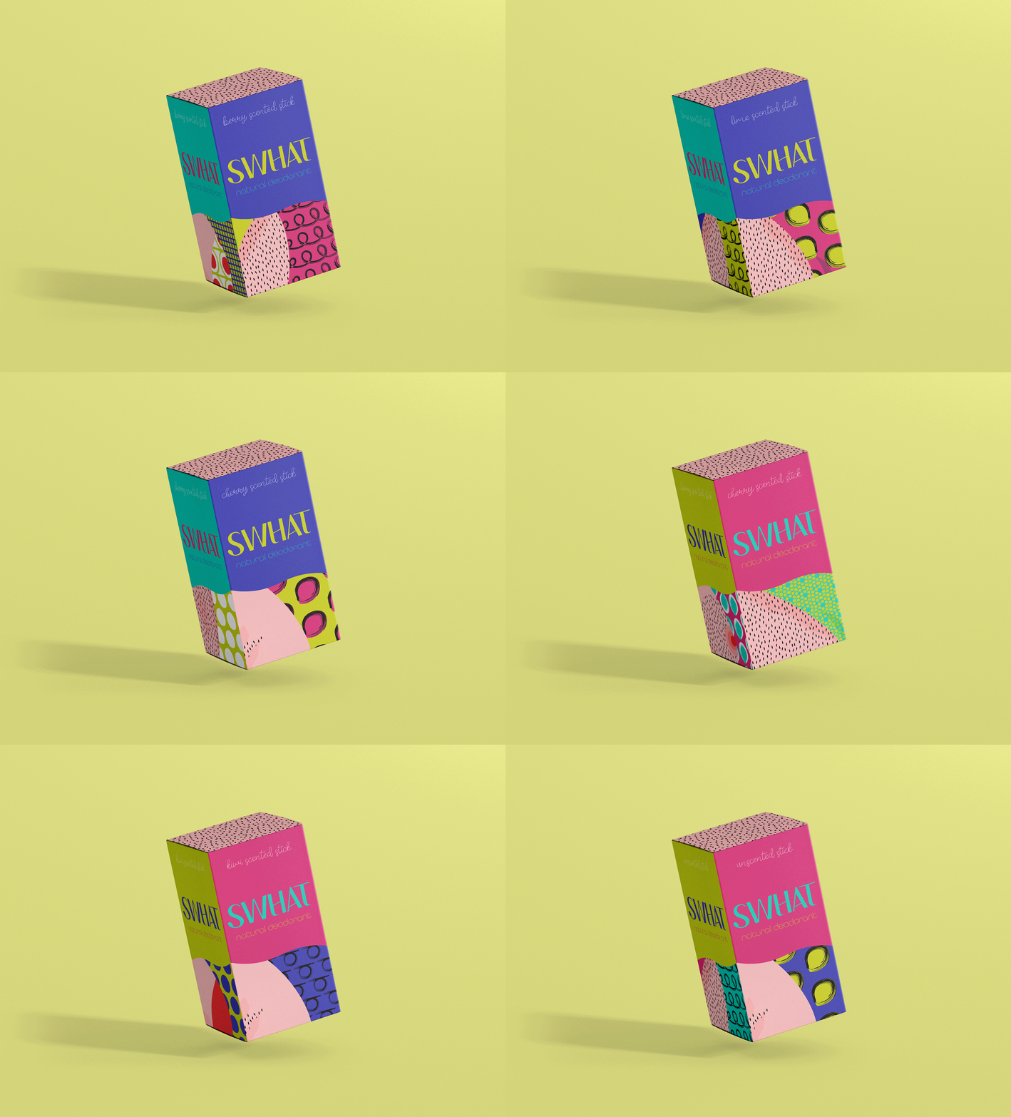
Playful mark, echoing the brand’s vibrant, empowering approach and message of self-love. The bold, modern logo typeface creates a strong, memorable identity that’s both confident and approachable—perfectly aligned with SWHAT’s empowering ethos. Its versatility enhances brand consistency, strengthening customer recall and emotional connection by reinforcing SWHAT’s commitment to individuality and inclusivity at every touchpoint.
The heading typeface is rounded, warm, and inclusive, inviting engagement, while a script-style body font adds a playful, personal touch, reinforcing self-expression and individuality.
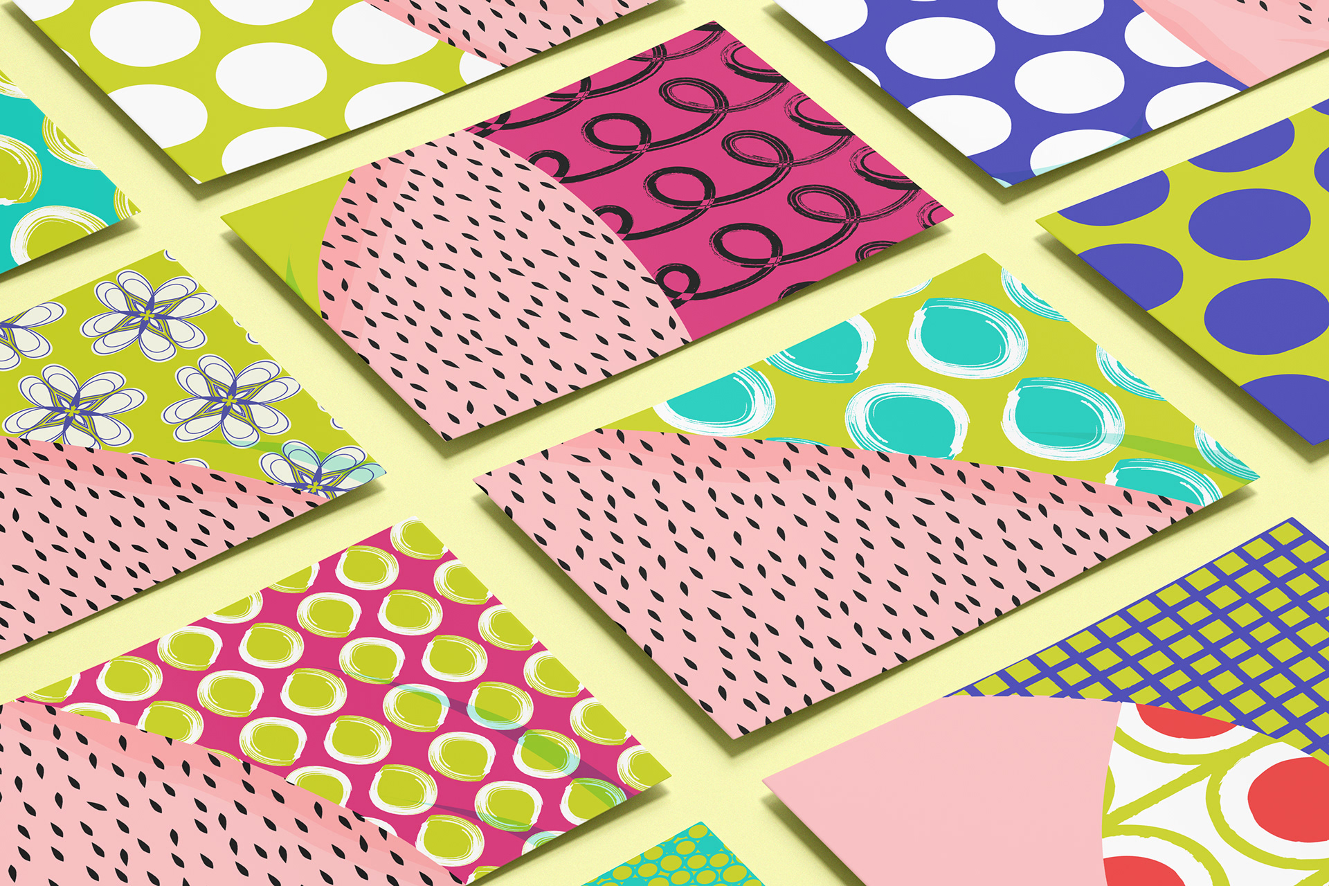
Bright, contrasting hues capture attention and evoke joy, making the brand lively and instantly recognizable, while celebrating individuality and diversity and enhancing shelf presence.
Packaging
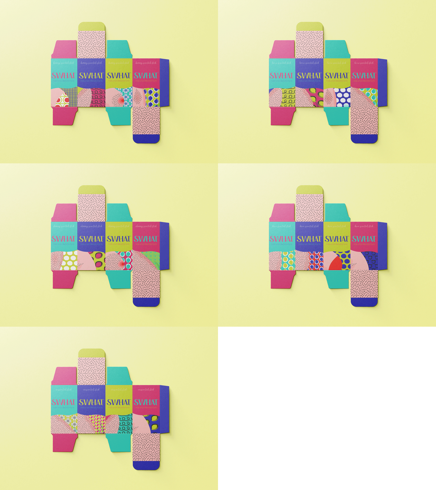
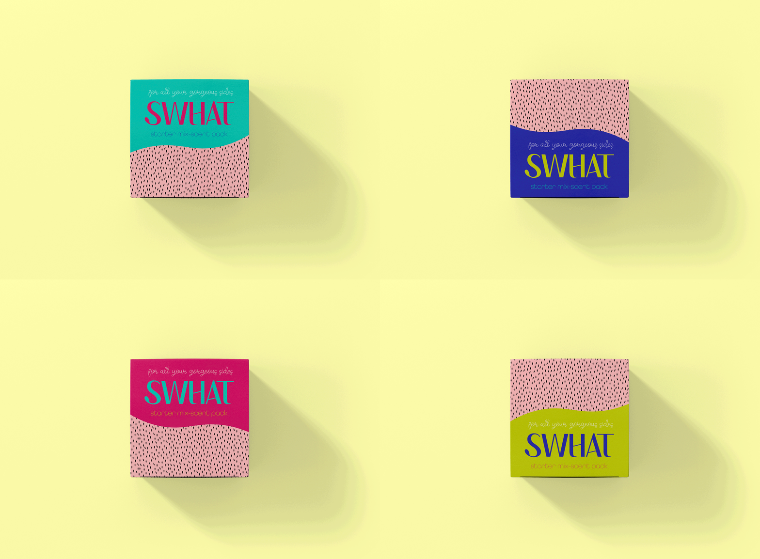
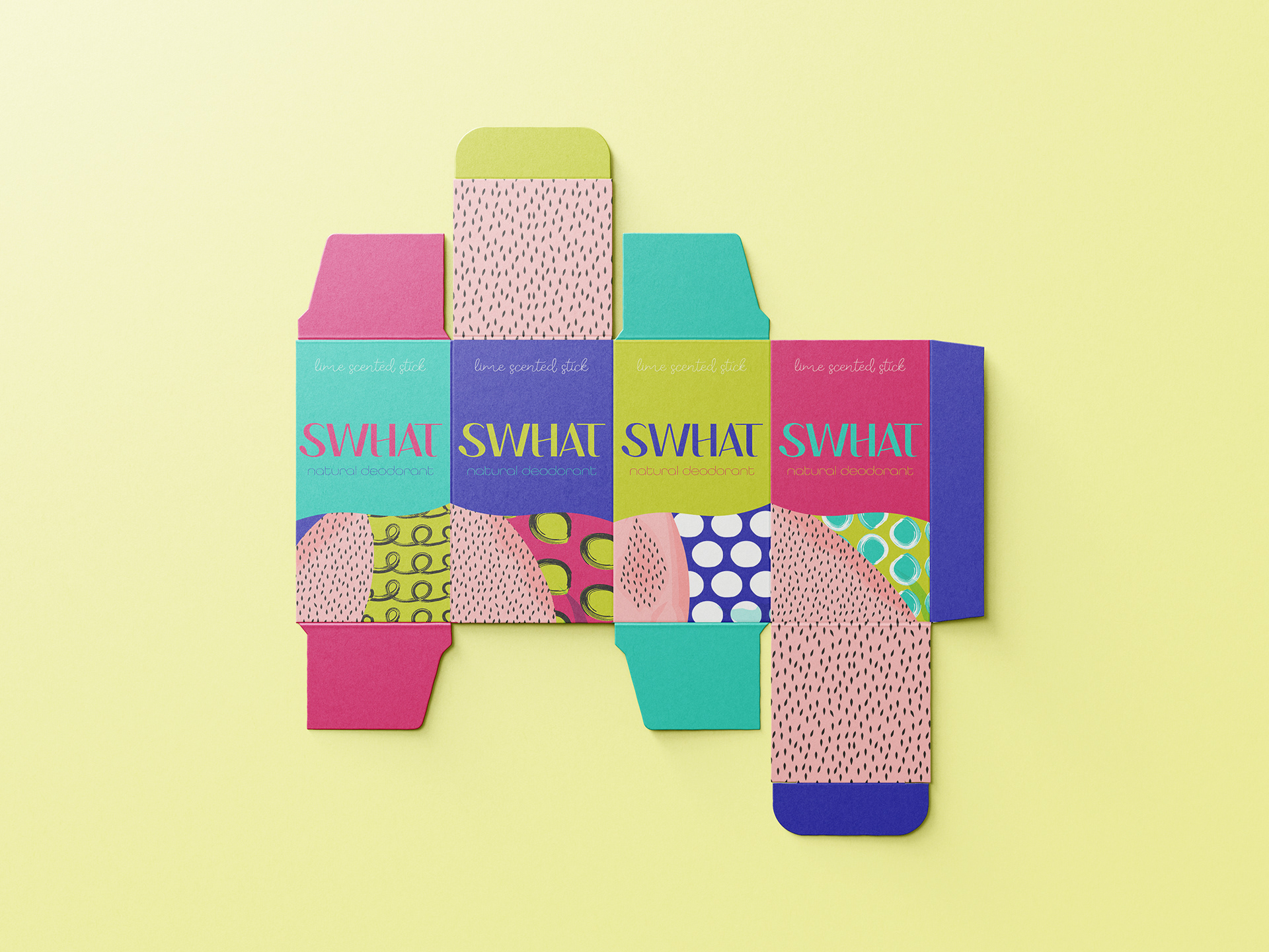
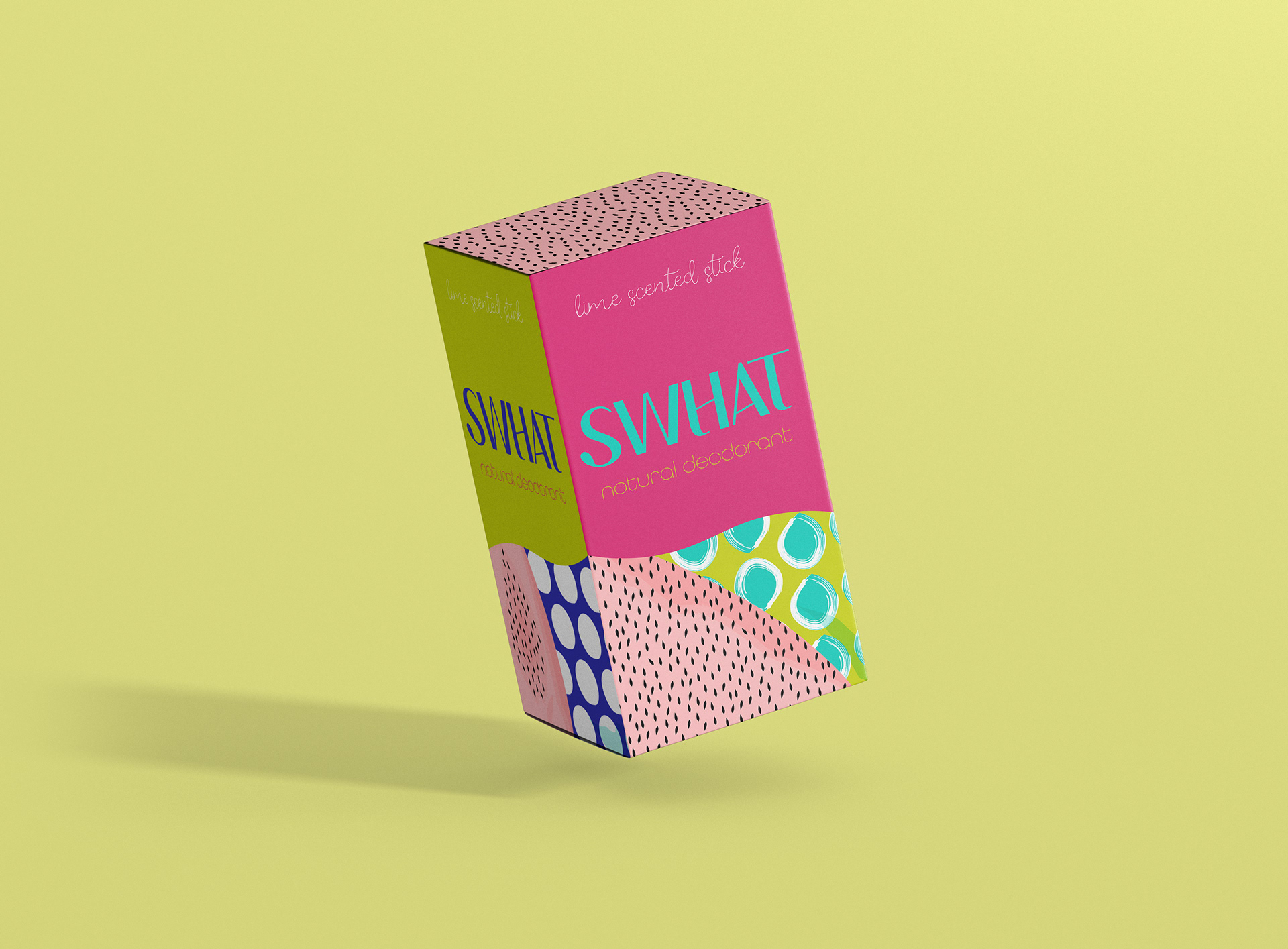
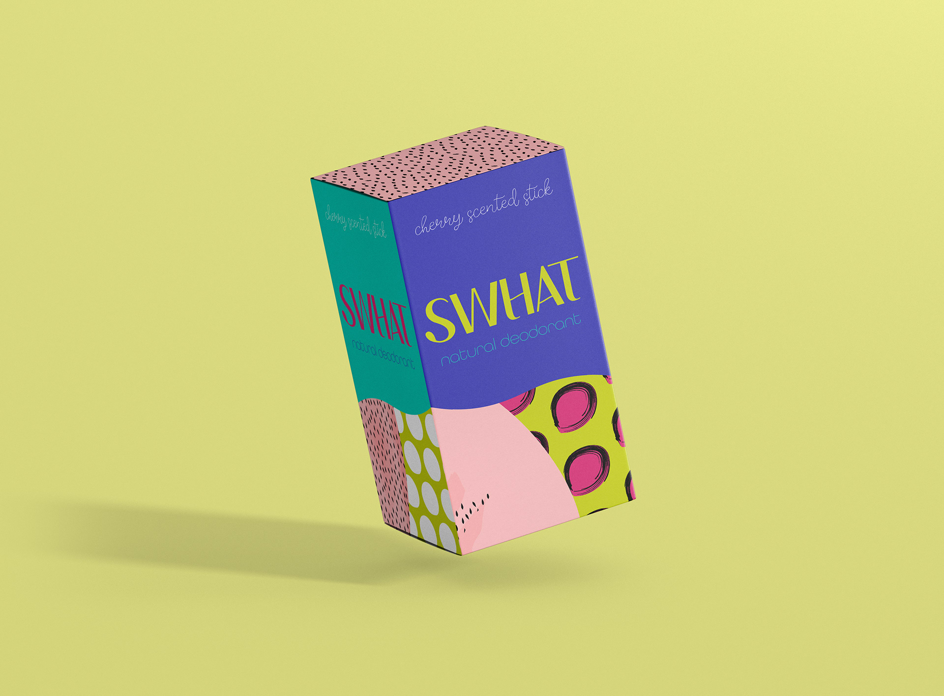
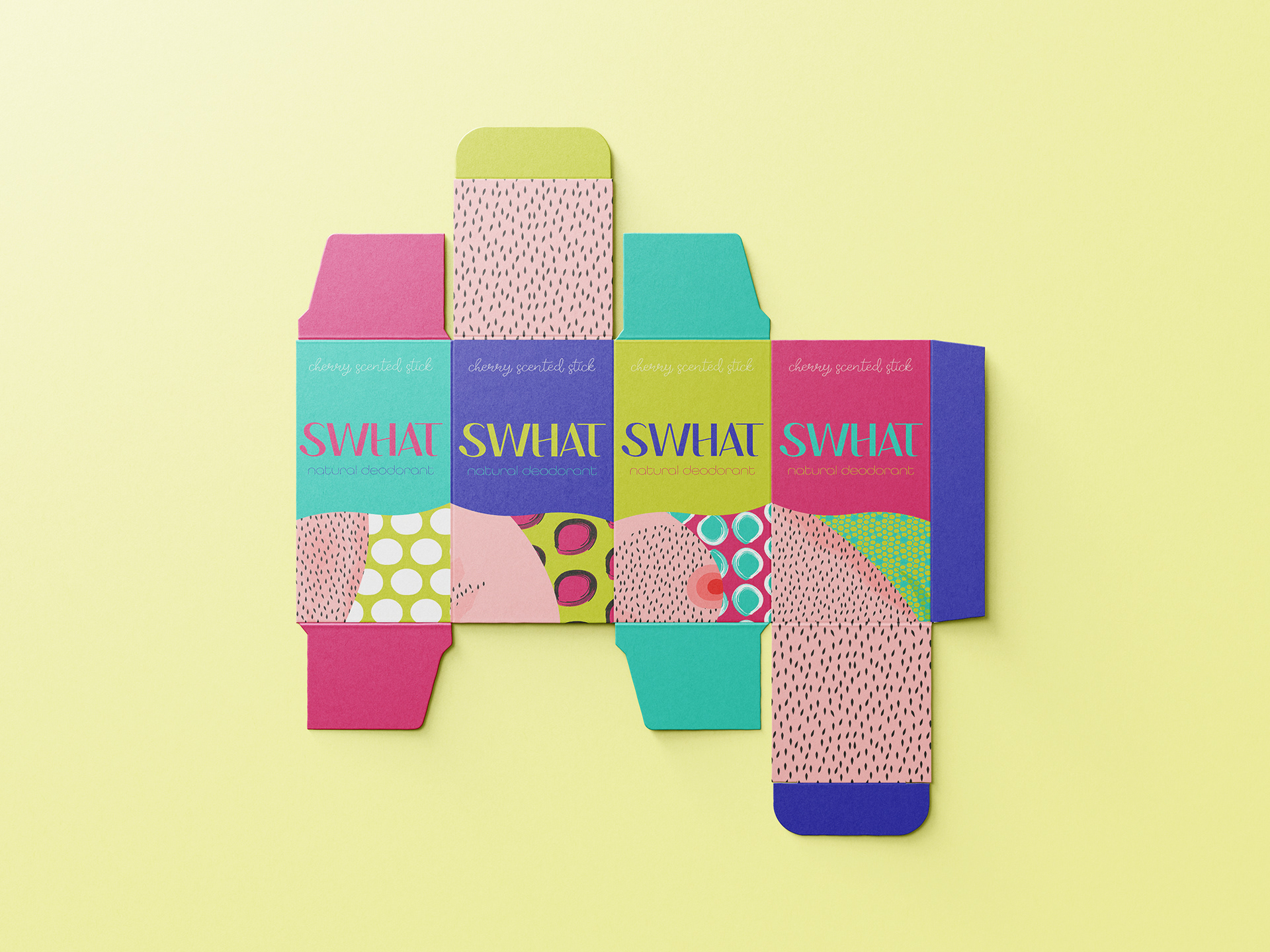
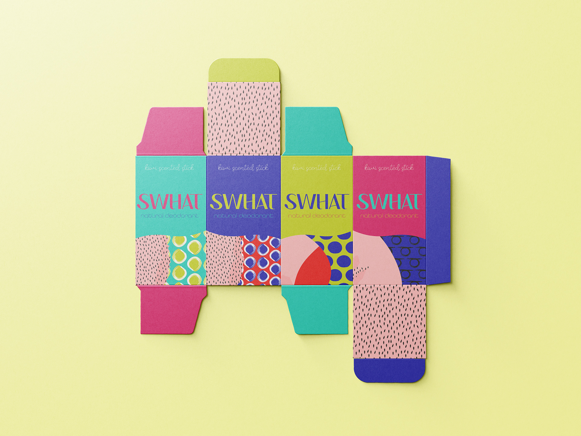
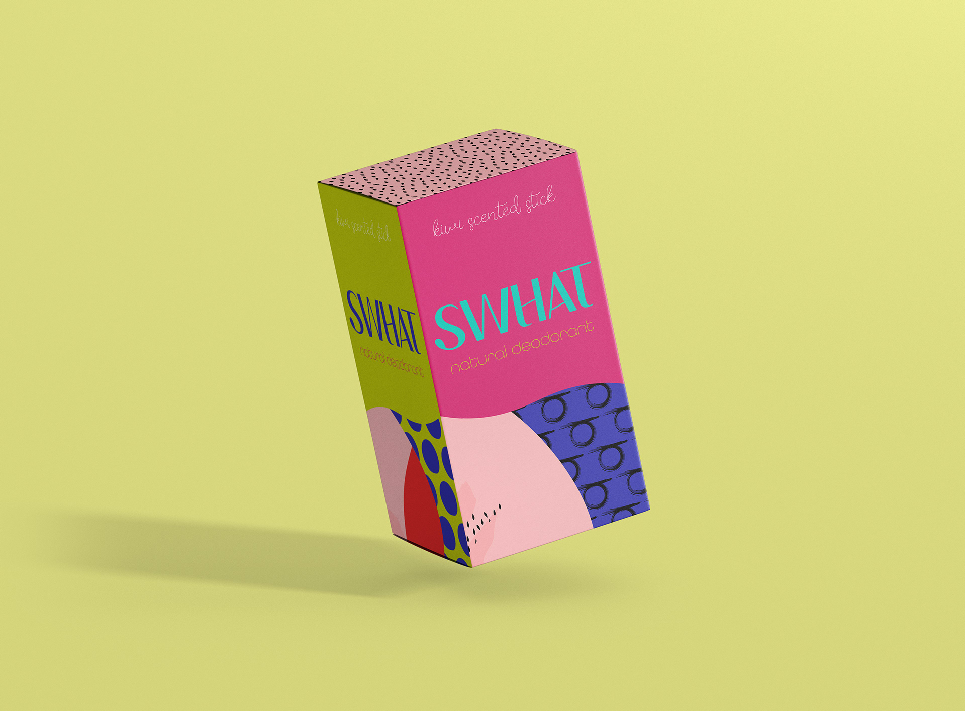
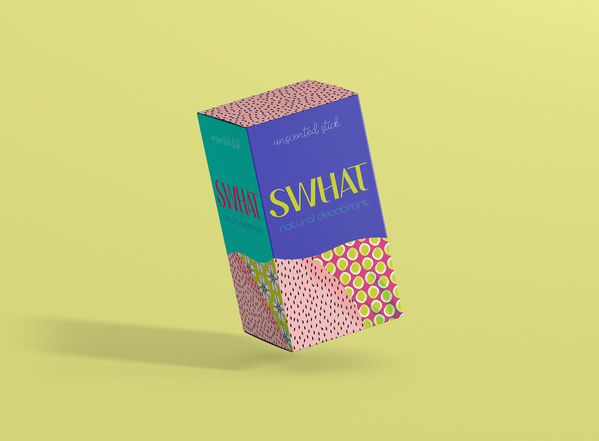
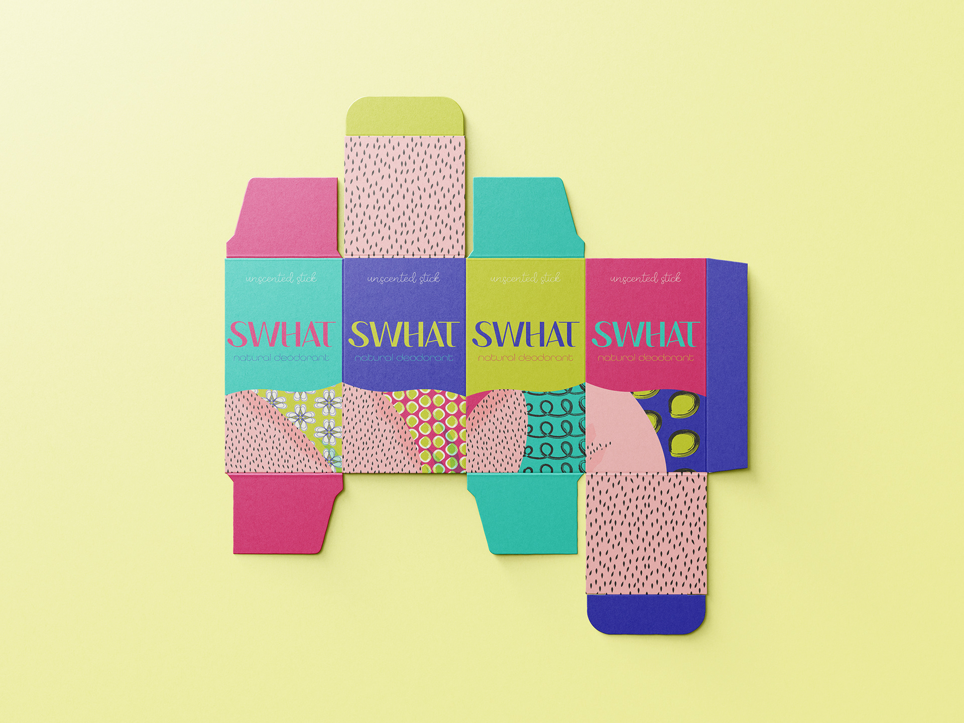
SWHAT’s packaging design meant to radiates joy, individuality, and confidence, encouraging self-expression through bold colors, playful typography, and lively illustrations.

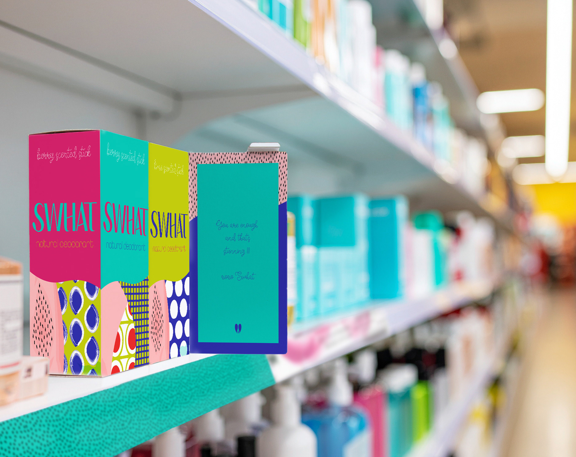
On-shelf presence
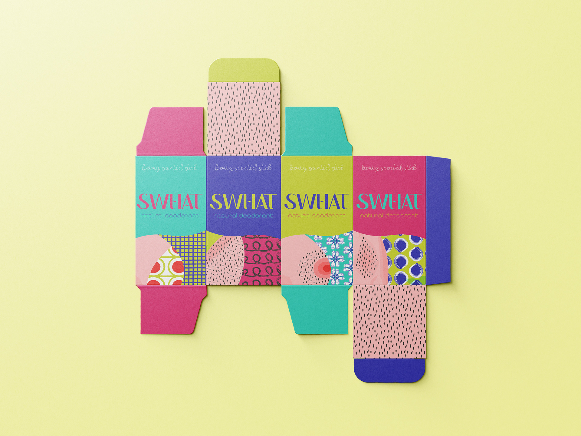
SWHAT’s packaging system creates a bold retail presence and makes the brand instantly recognisable on shelf. Colour-coded variants and contrasting patterns distinguish each product while keeping the range cohesive and easy to spot.
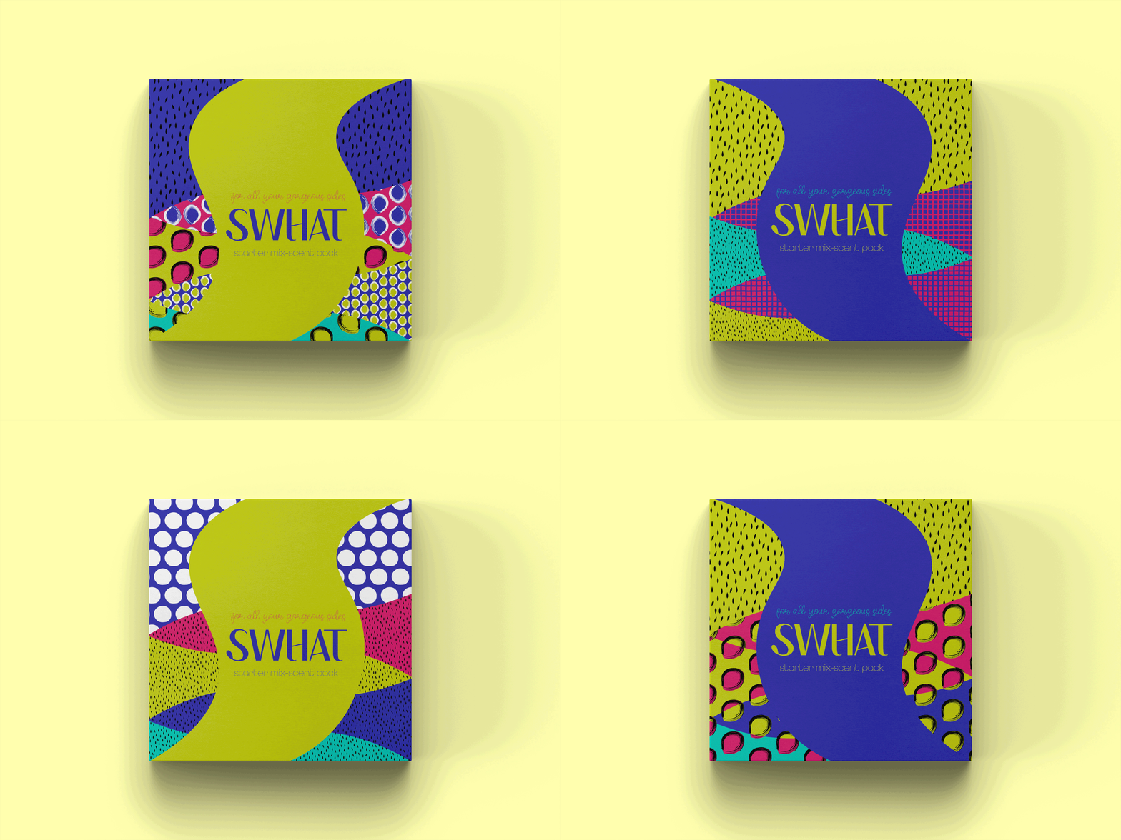
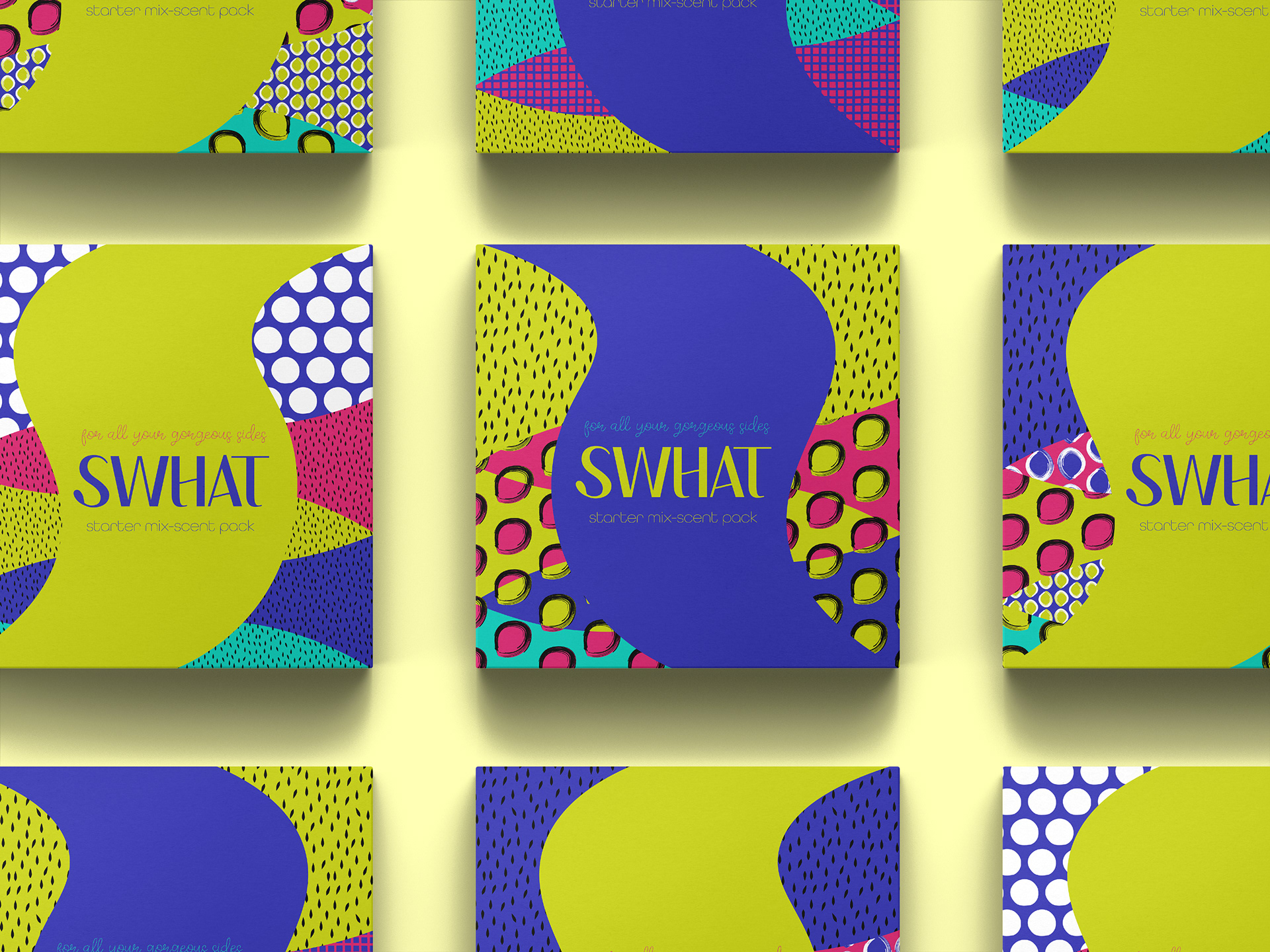
Vibrant, eye-catching designs embrace body positivity, celebrating all shapes and sizes with a relatable, cartoony style.
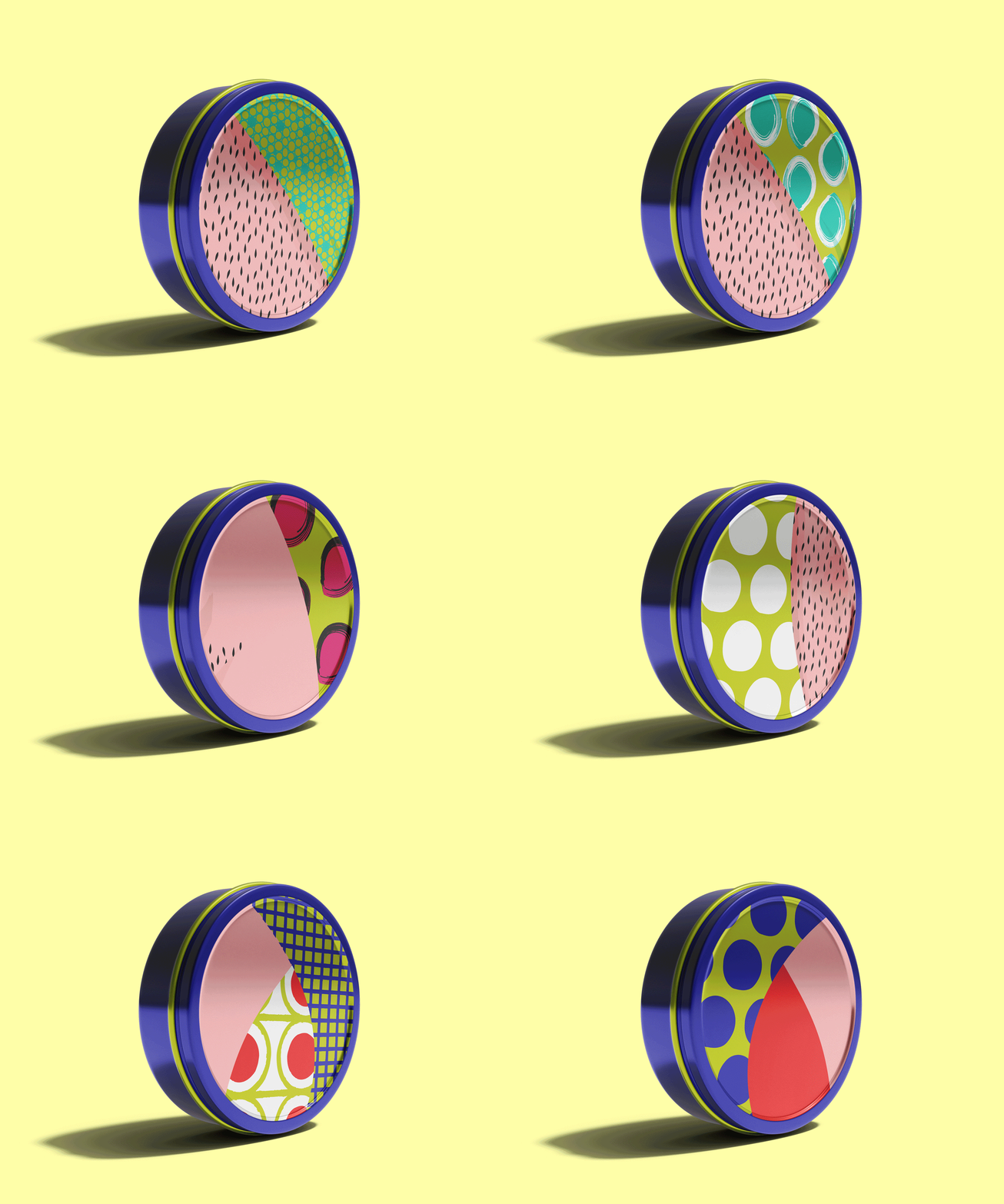
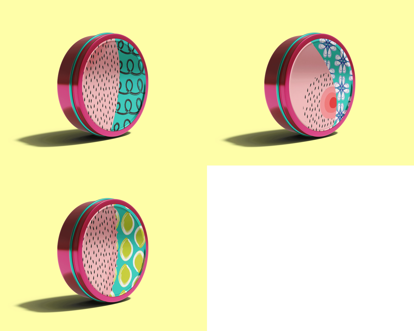
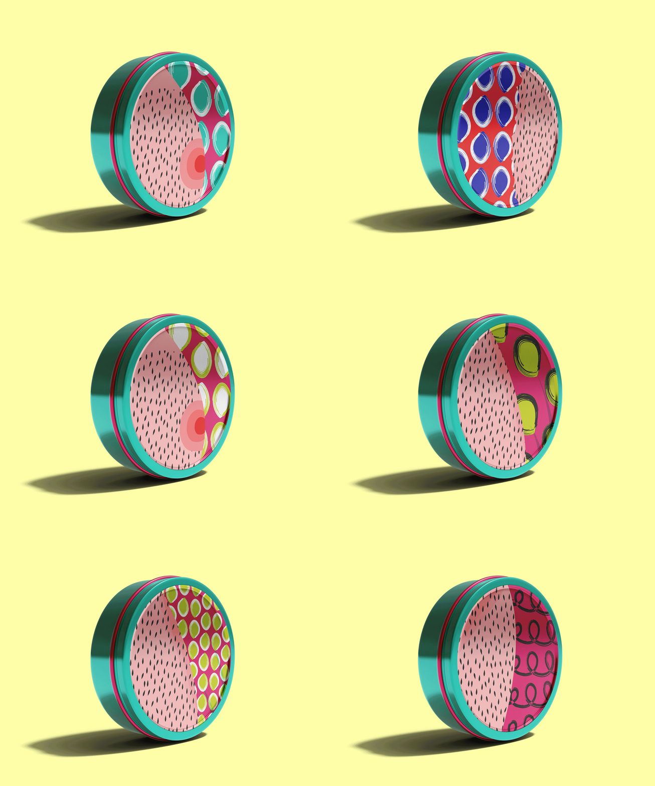
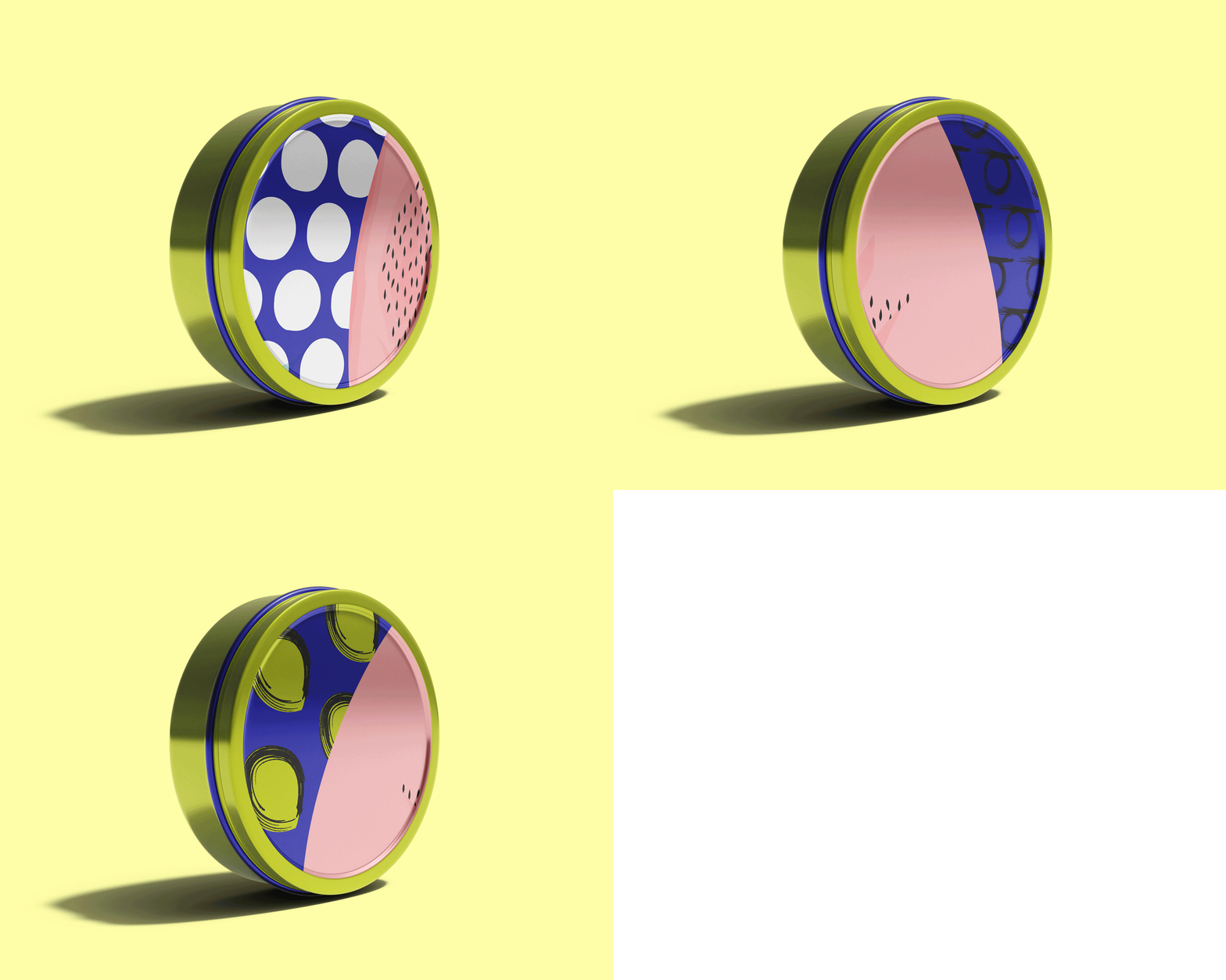
Eco-conscious, reusable packaging reflects SWHAT’s commitment to sustainability, resonating with customers who value environmental responsibility.
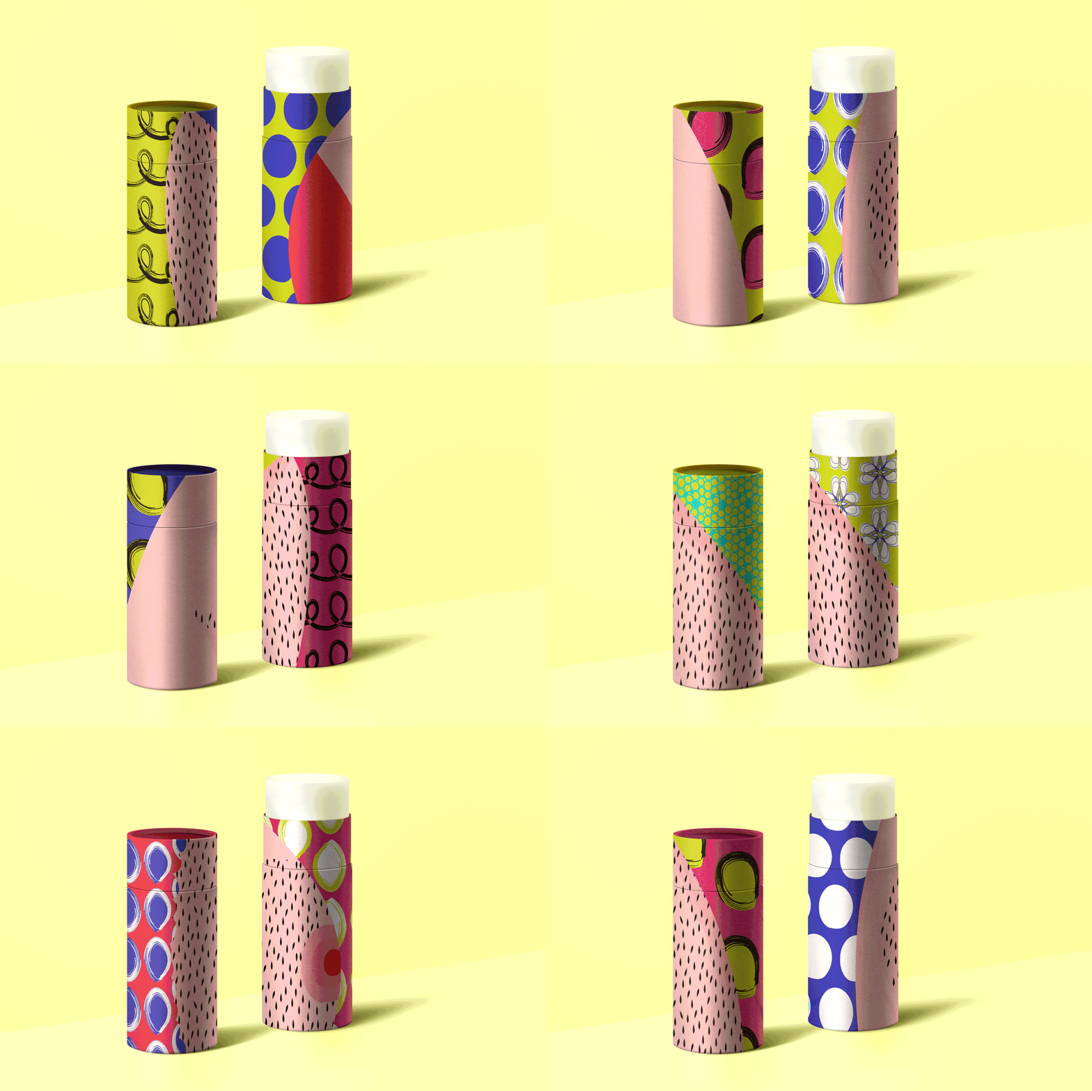
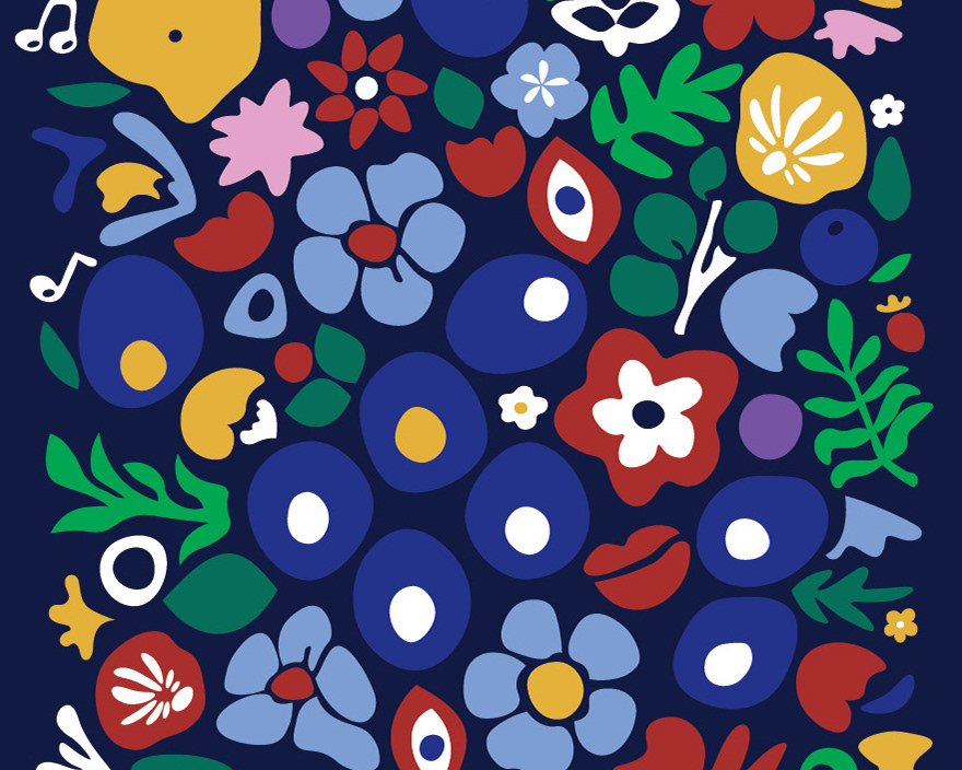
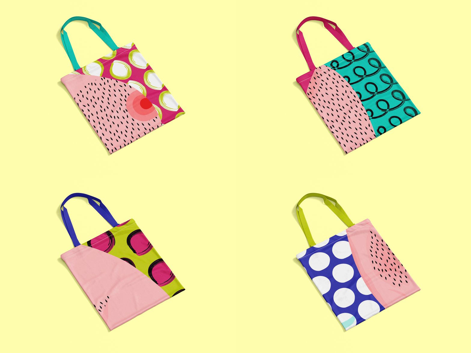
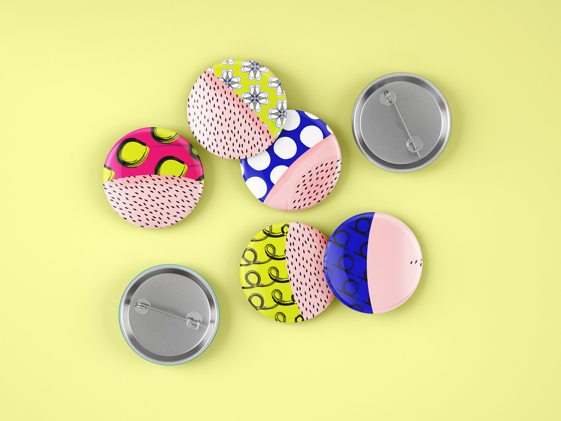
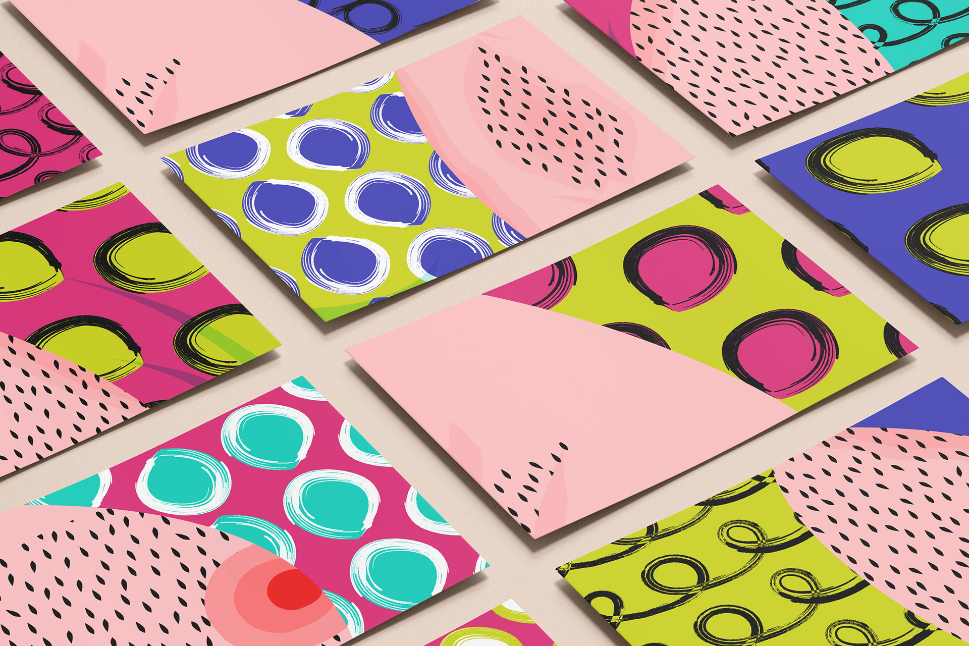
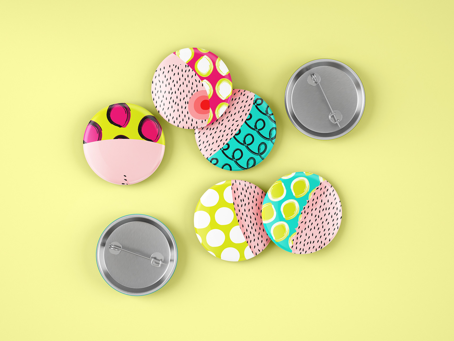
Creativity Embraced in Merchandise; Illustrations extends onto brand's merchandise to celebrate diversity and empowerment, breaking free from conventional norms and embracing boundless creativity and self-expression.
Social media assets
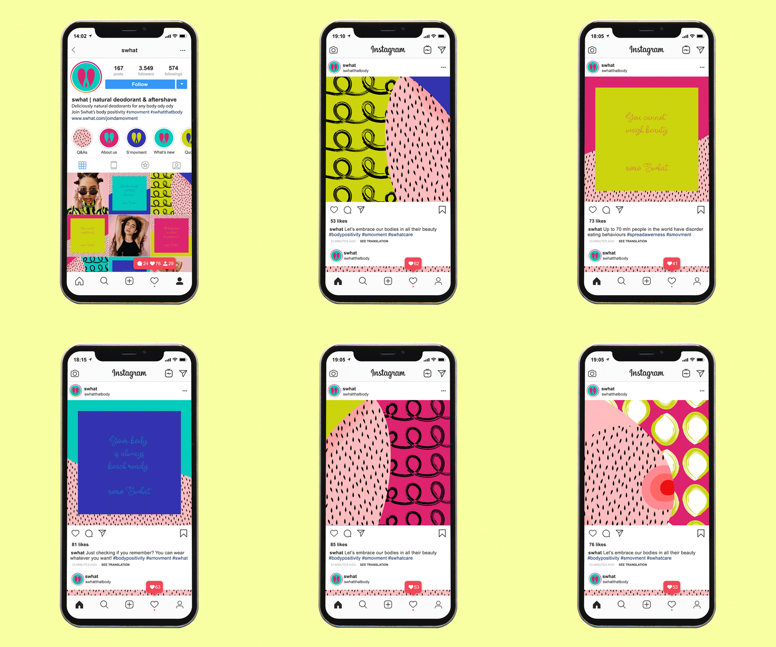
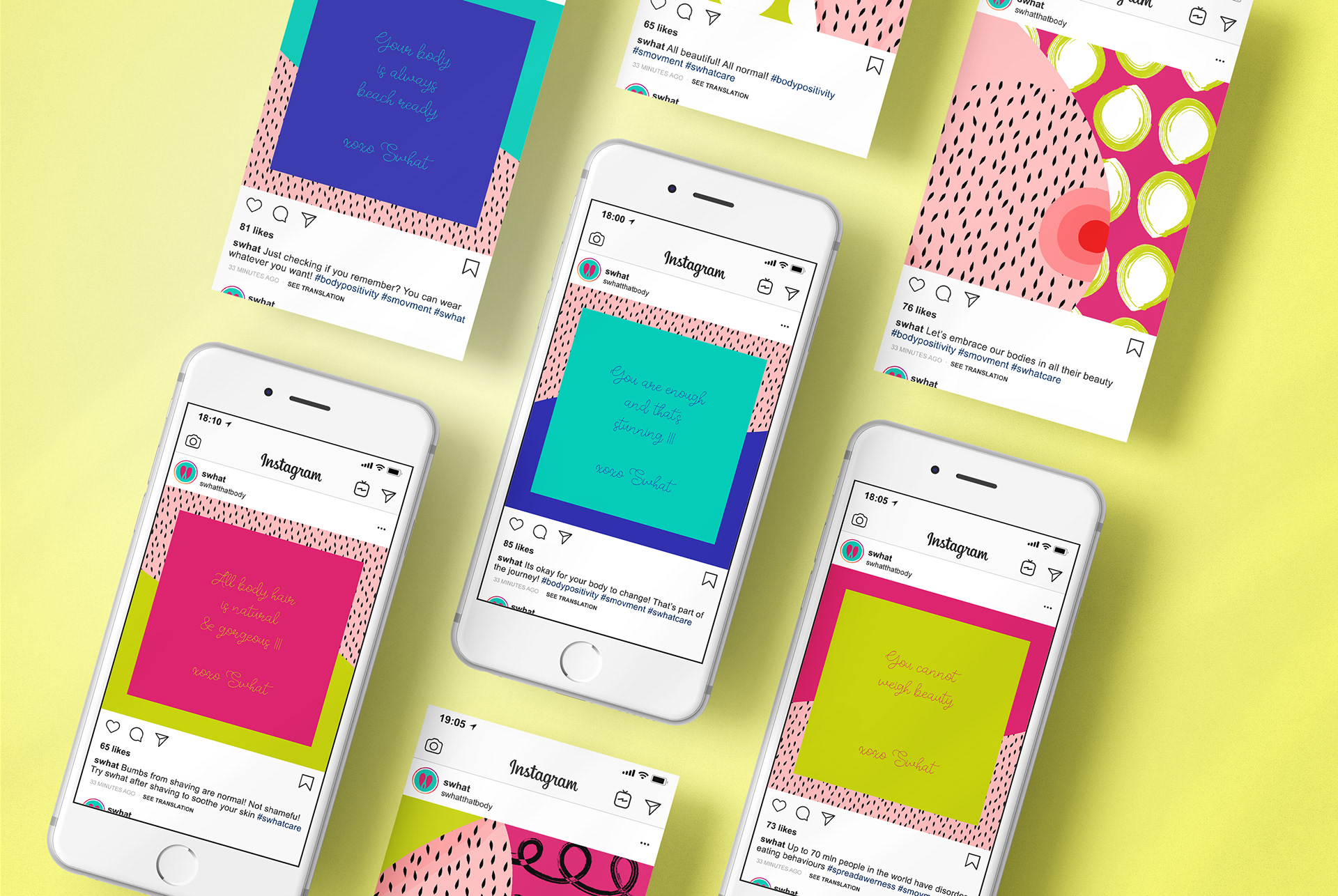
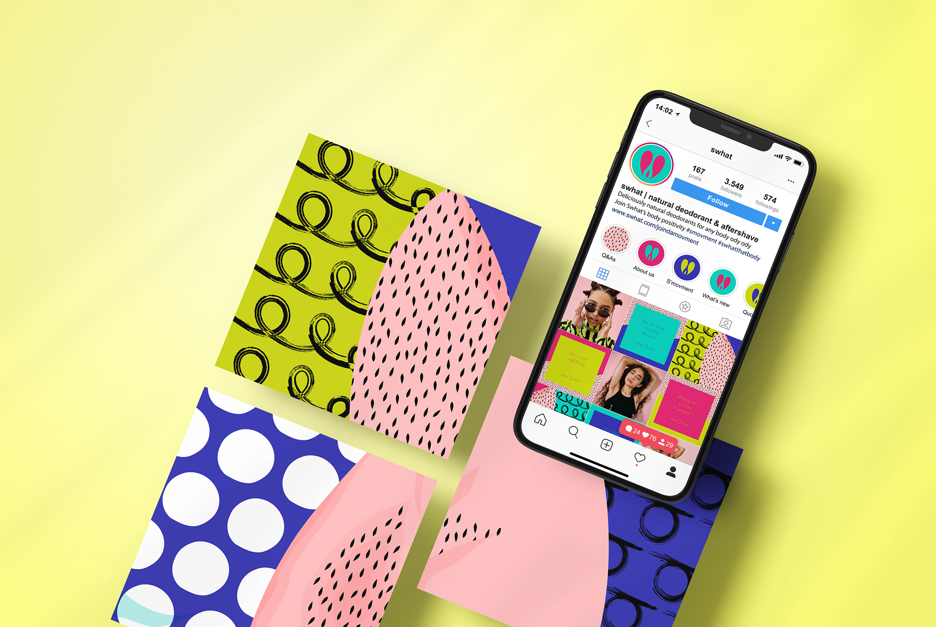
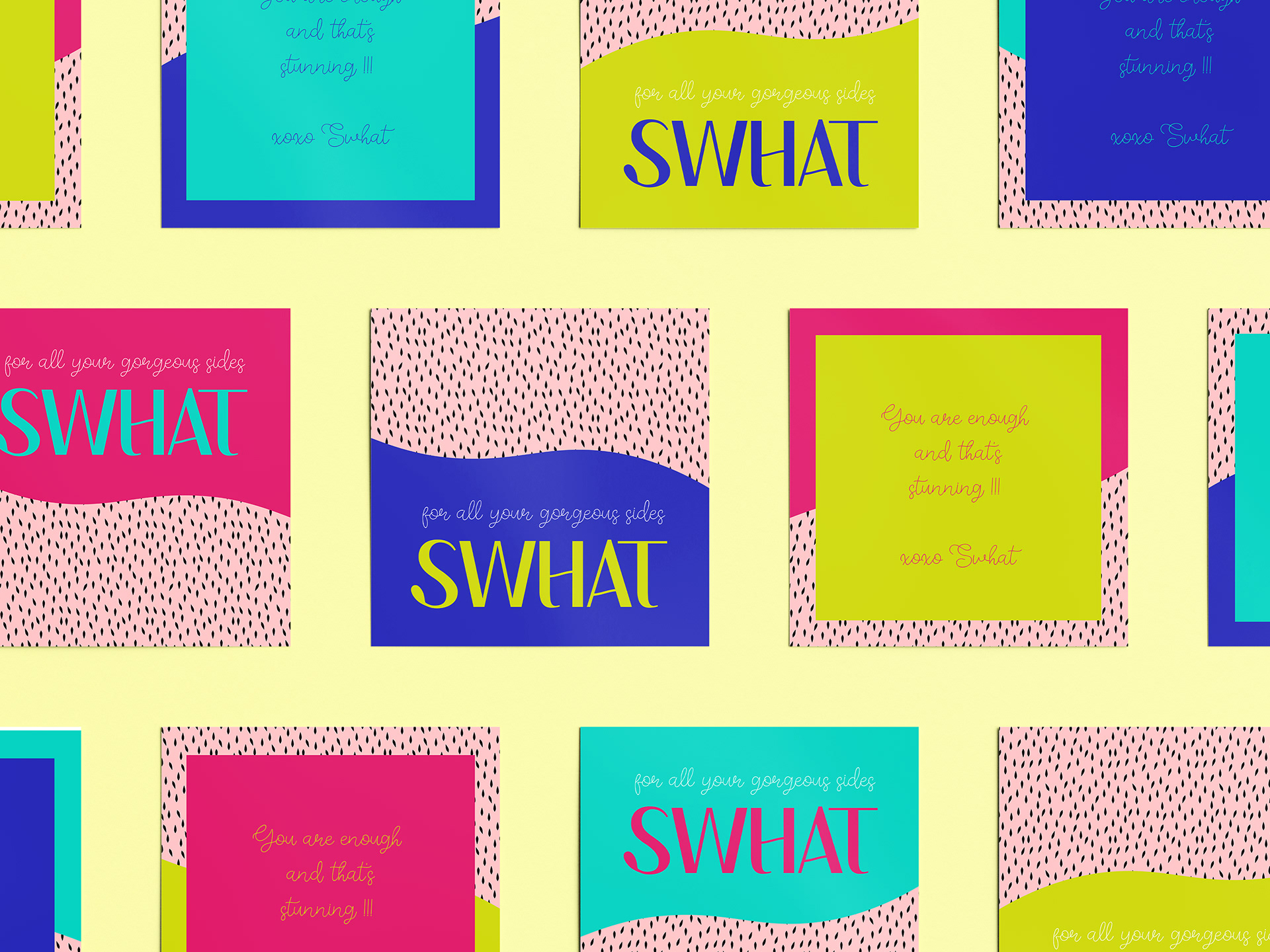
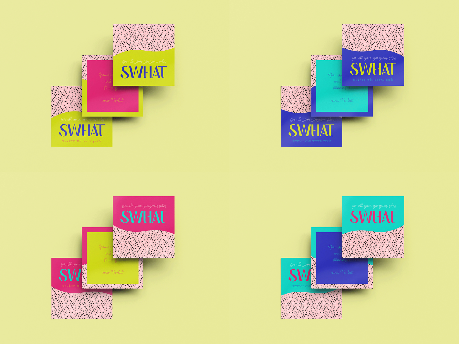
Social media assets extend SWHAT’s bold, playful identity into a flexible content system. Product-led imagery, direct copy and distinctive colours keep communication consistent while helping each product and message stand out.