Where Design Meets Chilli Oil
Creative Direction & Visual Roll-Out for Laidback Eatery Lenudle
Le’nudle is a bold restobar created for sophisticated noodle lovers, serving favourite noods from across Asia. It brings together iconic flavours from cities like Tokyo, Bangkok, Seoul, and Saigon. Eating at Le’nudle feels like a flavour-packed journey through Asia, where culinary tradition meets playful, new-age cooking in a setting full of colour, rhythm, and character.

Cultural celebration
Le'nudle draws inspiration from some of the world’s most iconic food cultures, a celebration of the cities that gave us street food, night markets, bold flavours, and unforgettable energy. From Tokyo to Saigon, Seoul to Bangkok, Taipei to Beijing the visual identity echoes the vibrant pulse of these places. Rather than mimic, it pays tribute: blending colours, textures, and rhythms to create a brand world that feels joyful, modern, and full of flavour.


Creative direction
Every touchpoint at Le’nudle was crafted to feel intentional and immersive, from cheeky sticker copy to the rhythm of a take-out menu. The creative direction blends high-energy moments with quiet precision: playful layouts meet functional hierarchy, neon meets earthy textures. We treated the brand like an experience, not just a logo, building a system that can grow, flex, and stay relevant across packaging, space, digital, and beyond. The visual voice is confident, expressive, and made to stand out in a crowded market.
Identity system
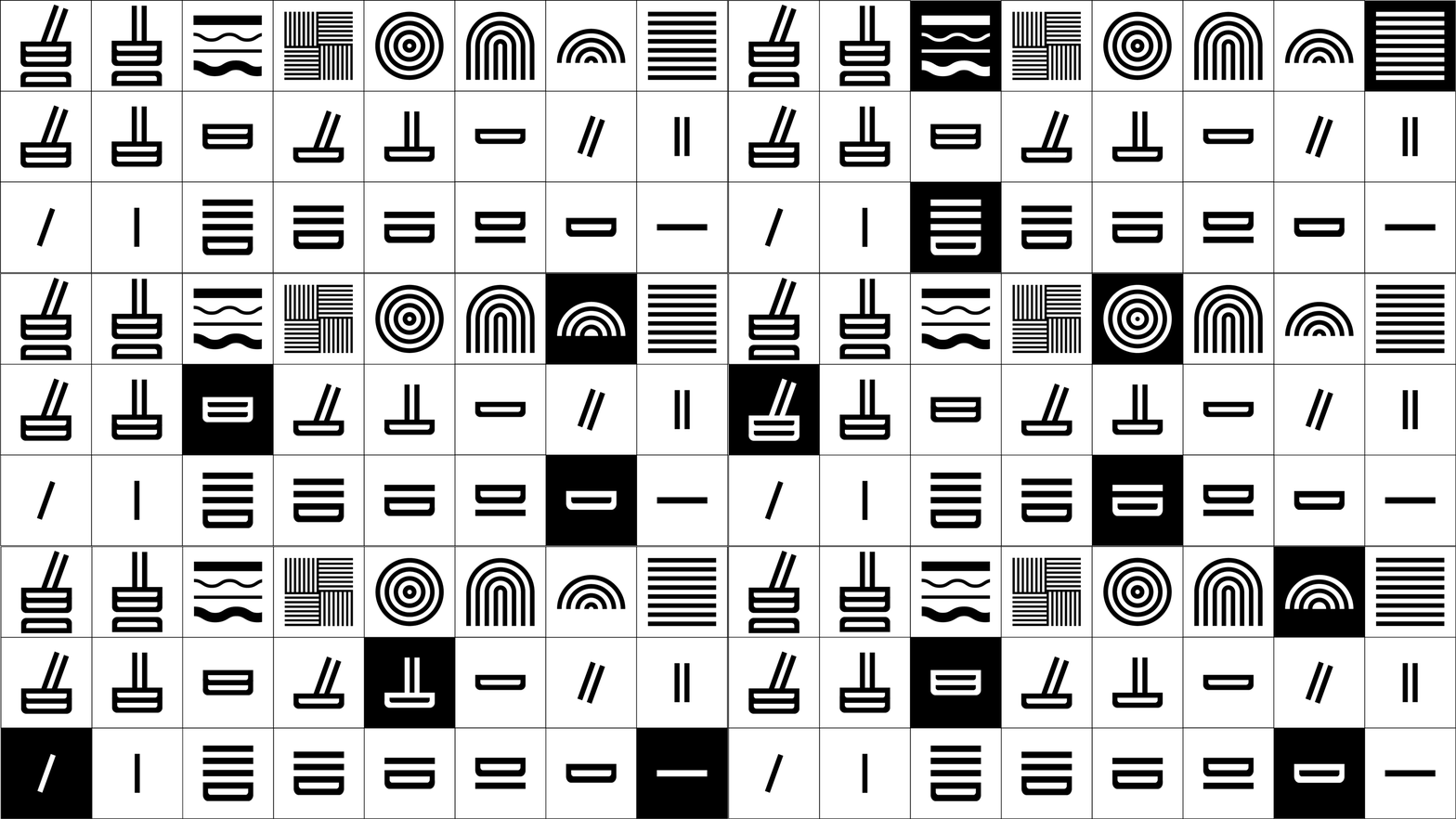
Lenudle’s visual identity was built as an adaptable system, bold in expression, precise in execution. The palette mixes electric hues with more grounding ones, allowing materials to feel dynamic yet coherent. A mix of geometric shapes and flowing lines reflect both the structure of urban landscapes and the softness of noodles themselves.
Typography is playful but considered, with visual contrast used to guide attention and create energy.
The visual system was designed to be scalable across formats and seasons, making it easy to roll out new products, menus, or campaigns without losing clarity or impact.
Every element, from bold key visual to cheeky pattern works together to reinforce the brand’s expressive tone.

Logo design
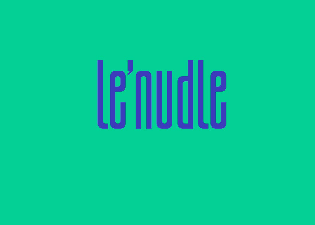
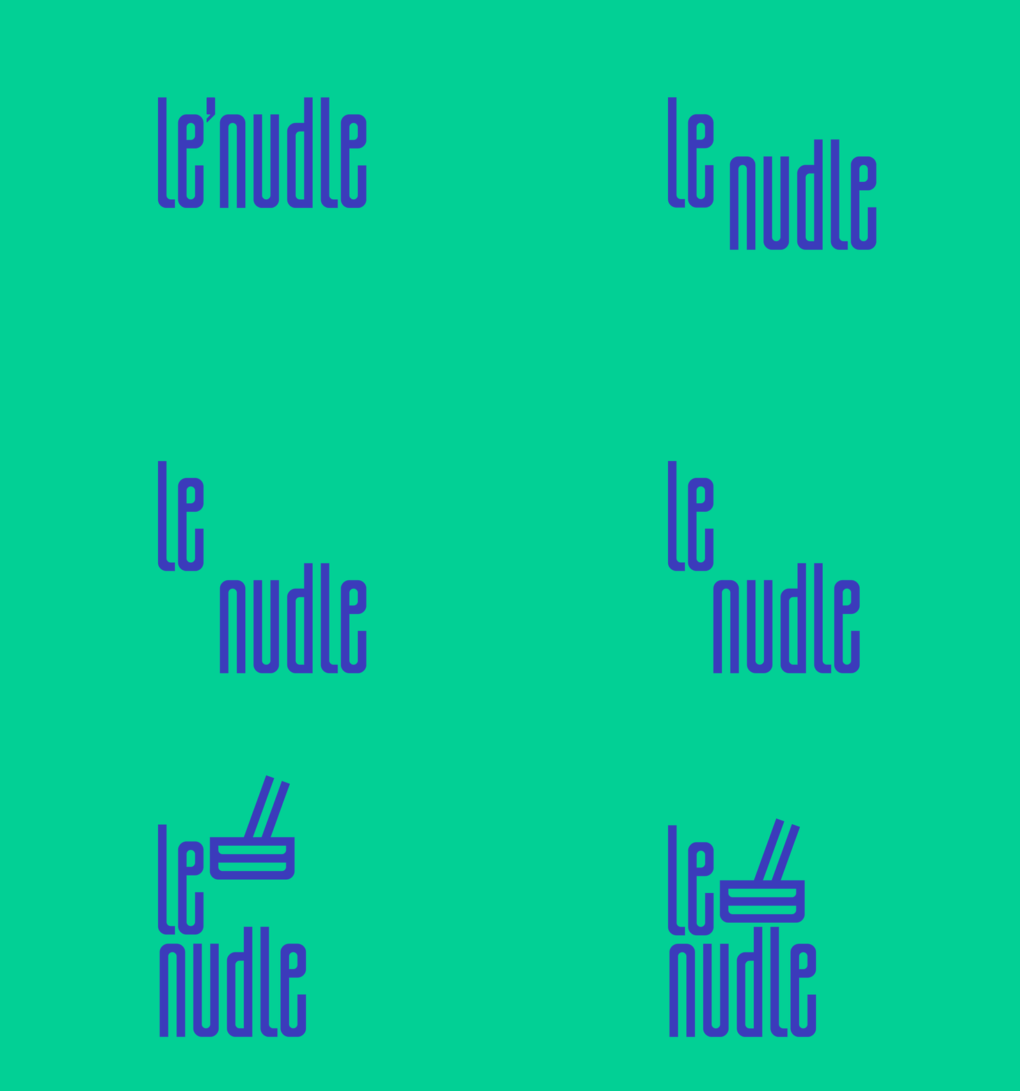
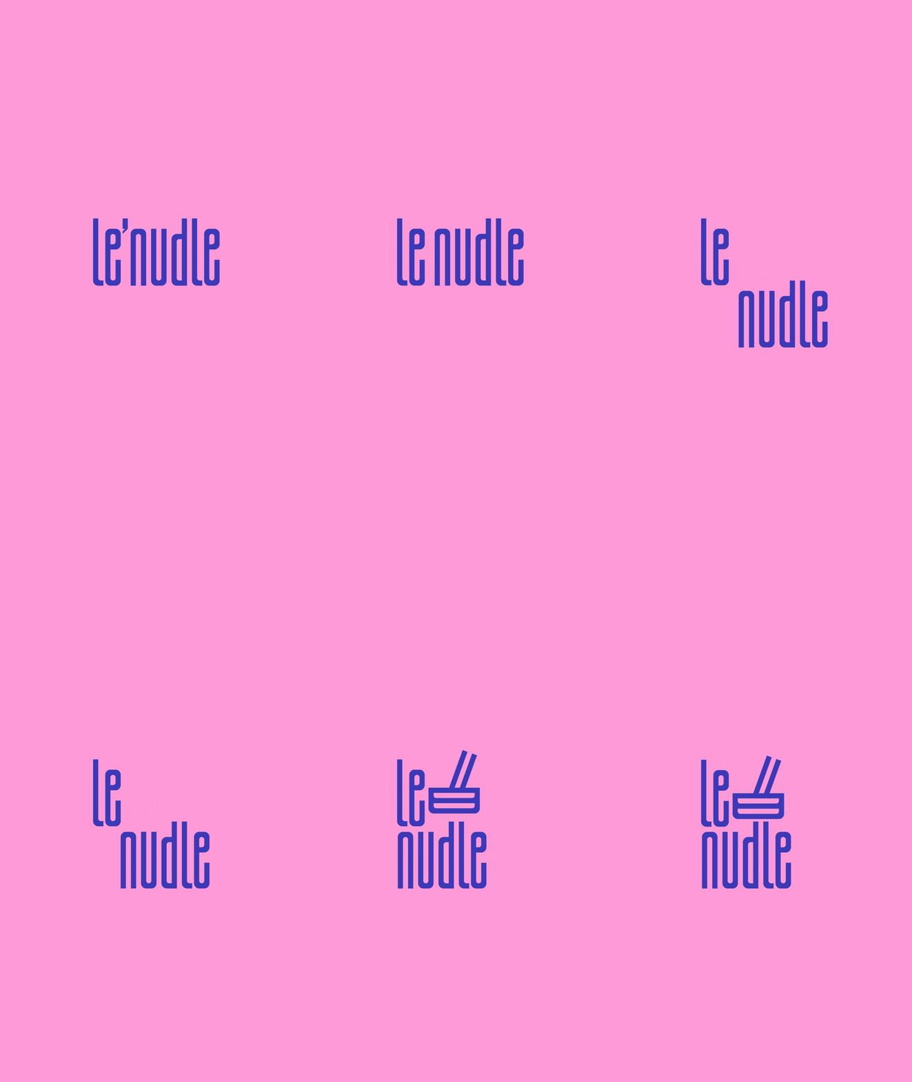
The Le'nudle logo long, slender typography nods to the shape of chopsticks and noodles, accompanied by a cheeky mark resembling a steaming bowl of noodles.
Adaptable system
The logo suite was designed with flexibility in mind. Built to adapt seamlessly across both physical and digital environments. From print menus and takeout packaging to environmental signage and sculptural displays, each variation ensures clarity, consistency, and visual impact at any scale.
Primary
Stacked
Submark
Icon

Logo in motion
The identity comes alive through subtle animations custom-built for social posts, menu screens, and in-store projections. Each loop reveals the noodle-like flow of the letterforms, adding playfulness and reinforcing recognition. Lightweight and scalable, the motion suite adapts from a tiny avatar to a full-width hero banner.


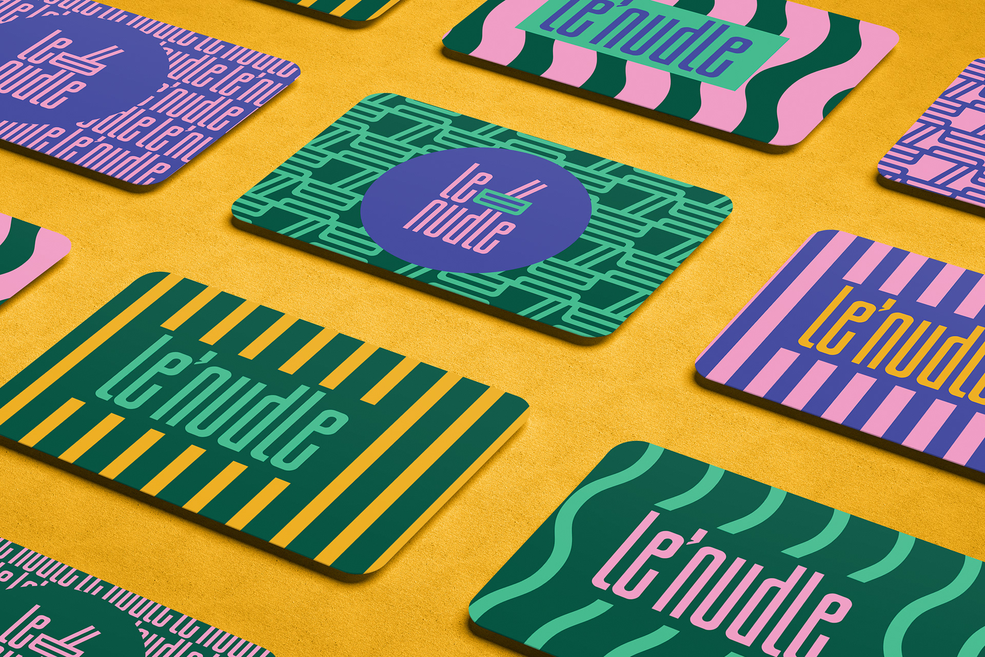
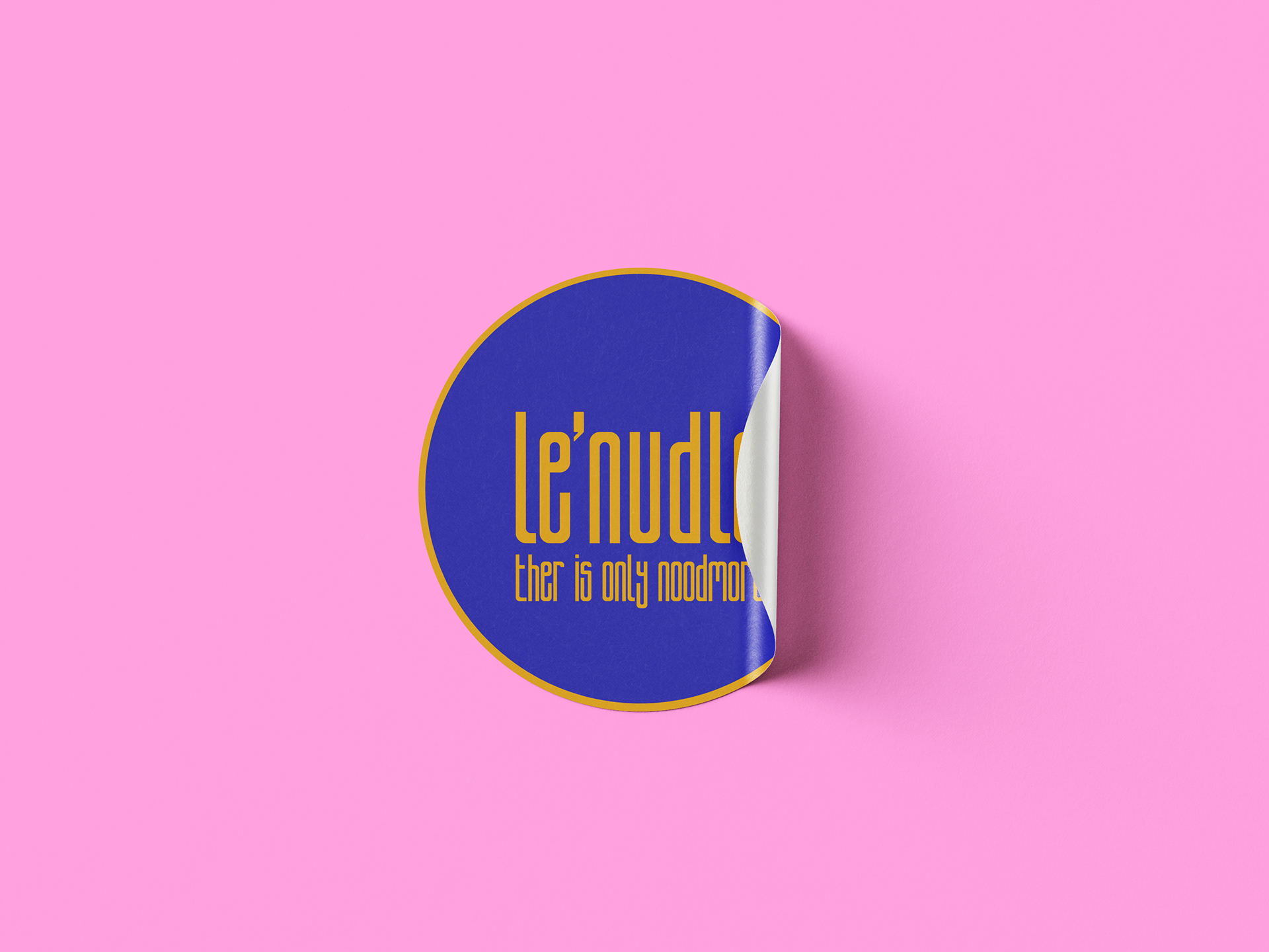
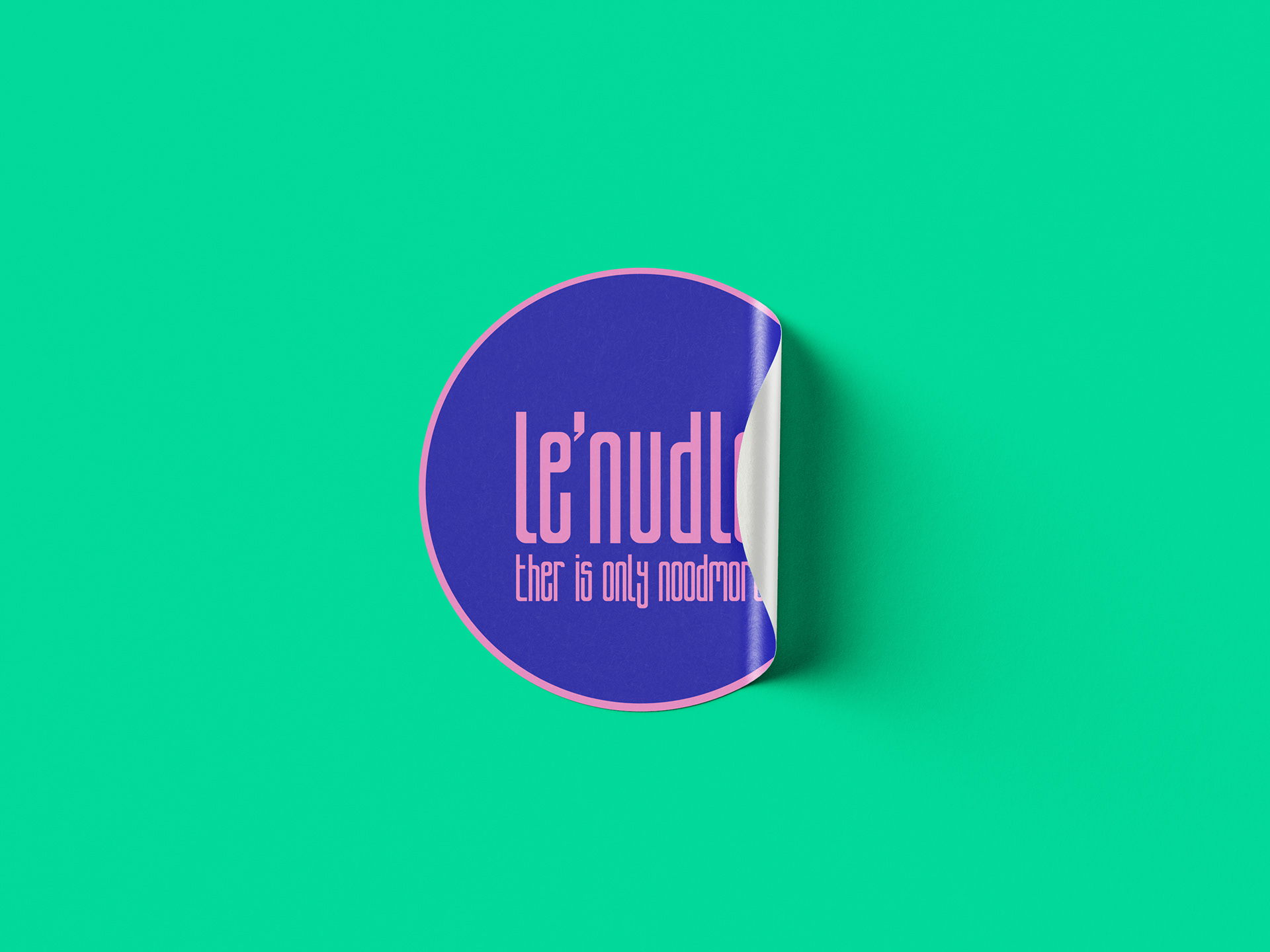
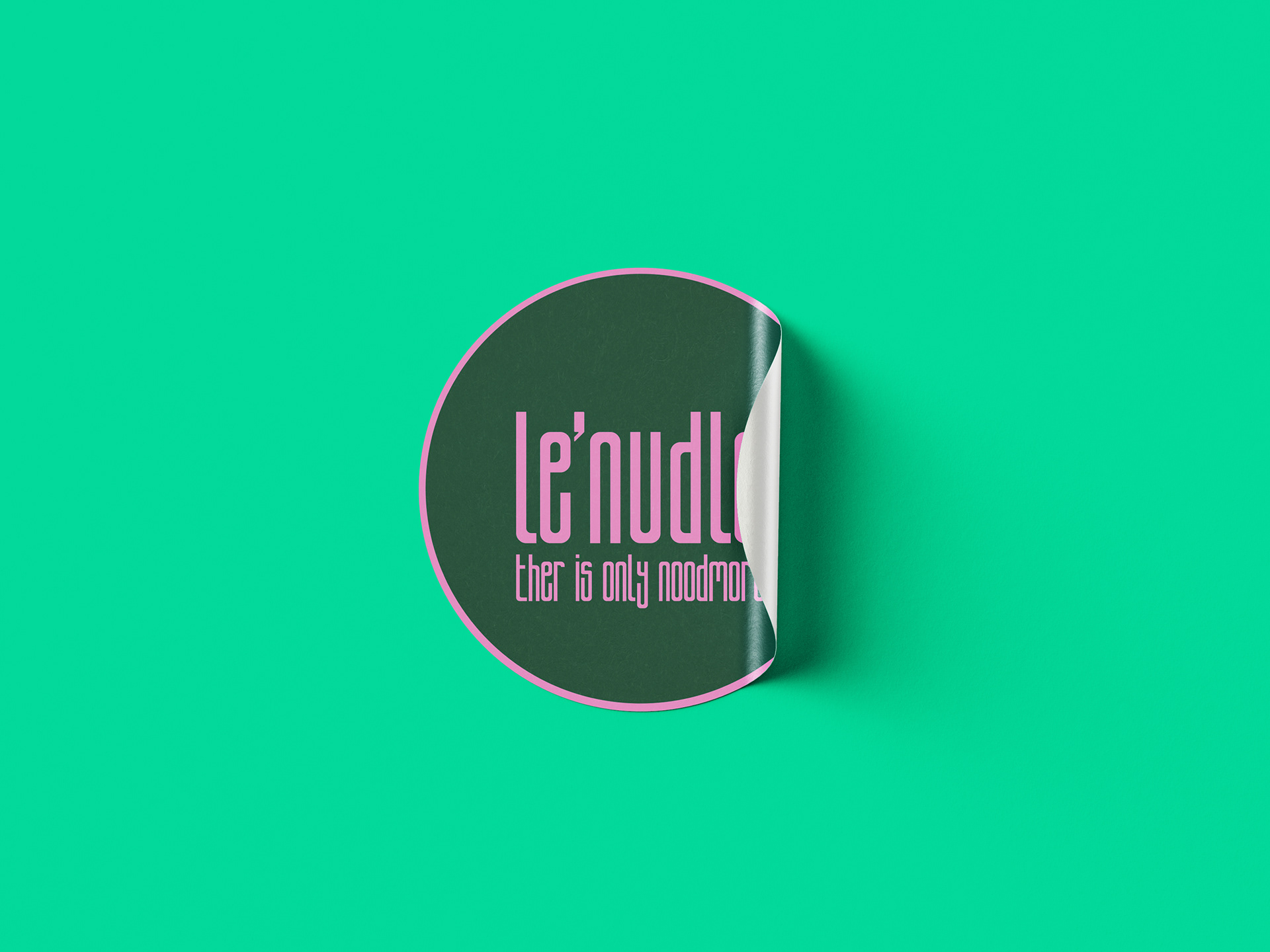
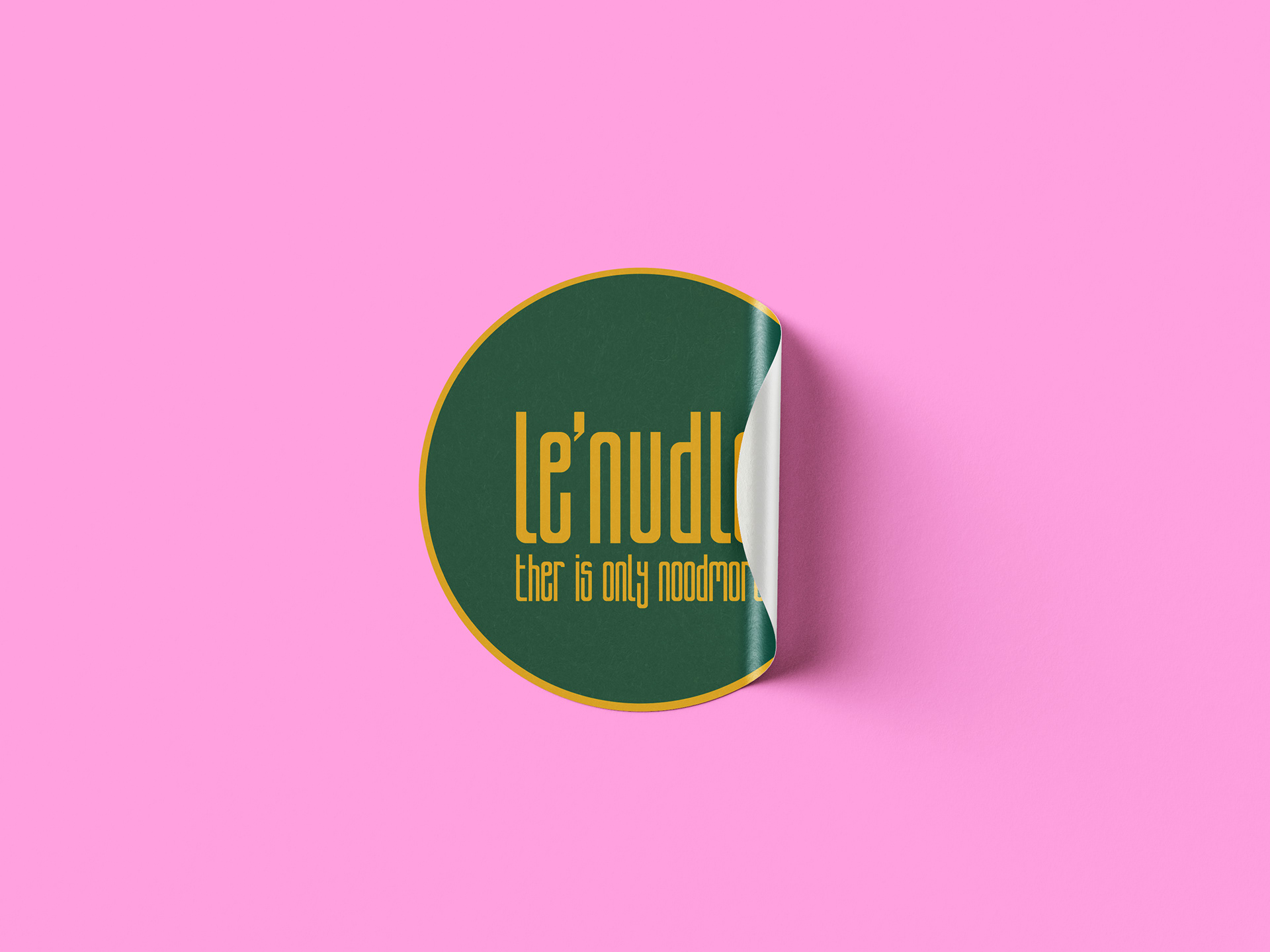
Whether screen-printed on stickers, subtly integrated into coaster patterns, or glowing above the entrance, each application extends the brand’s presence while maintaining recognisability and character across all touchpoints.
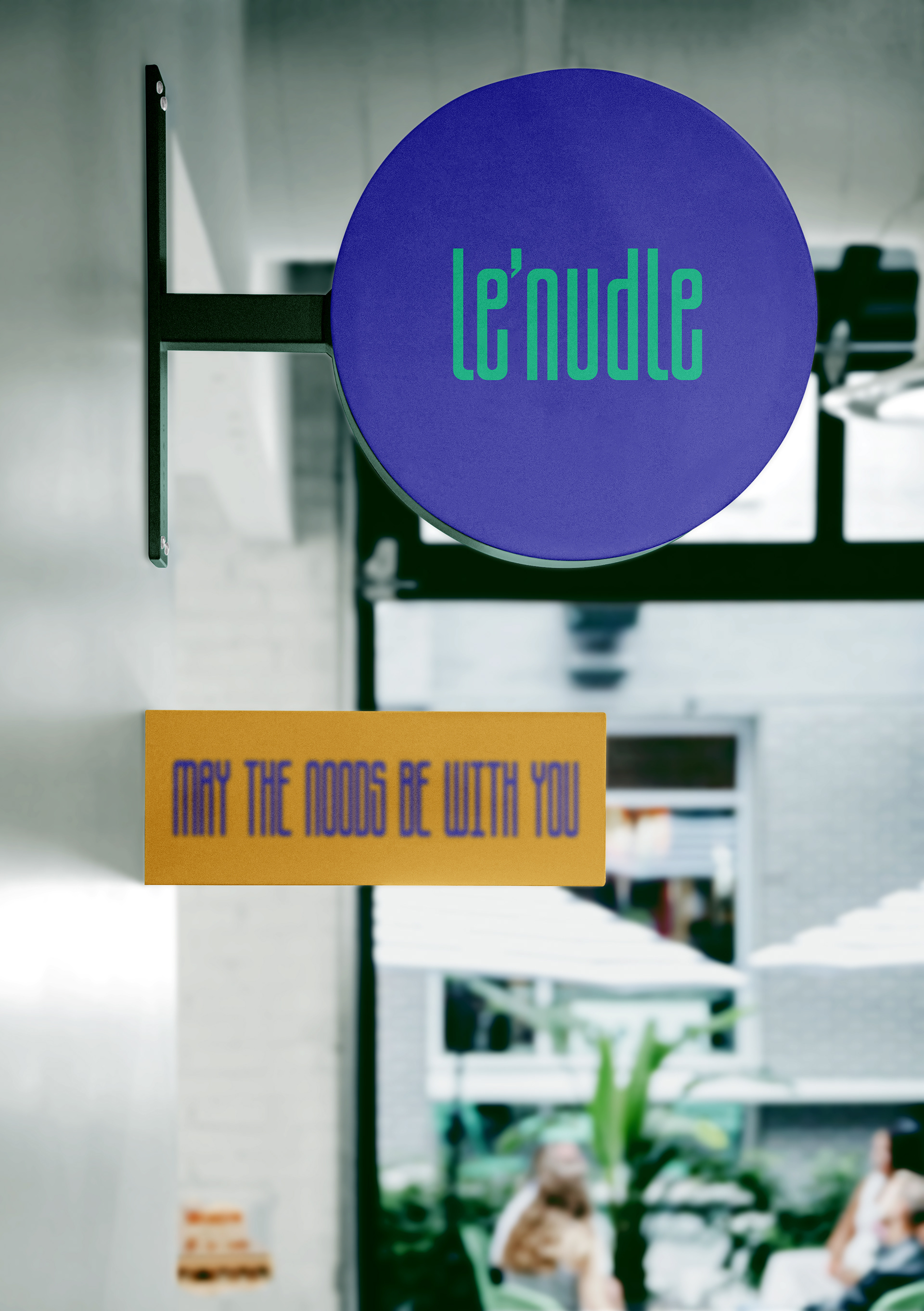
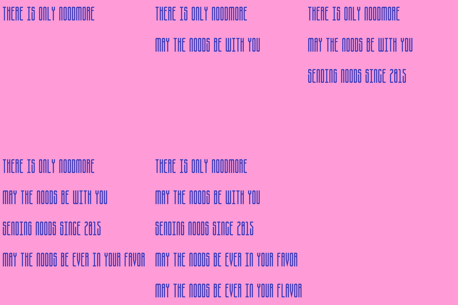
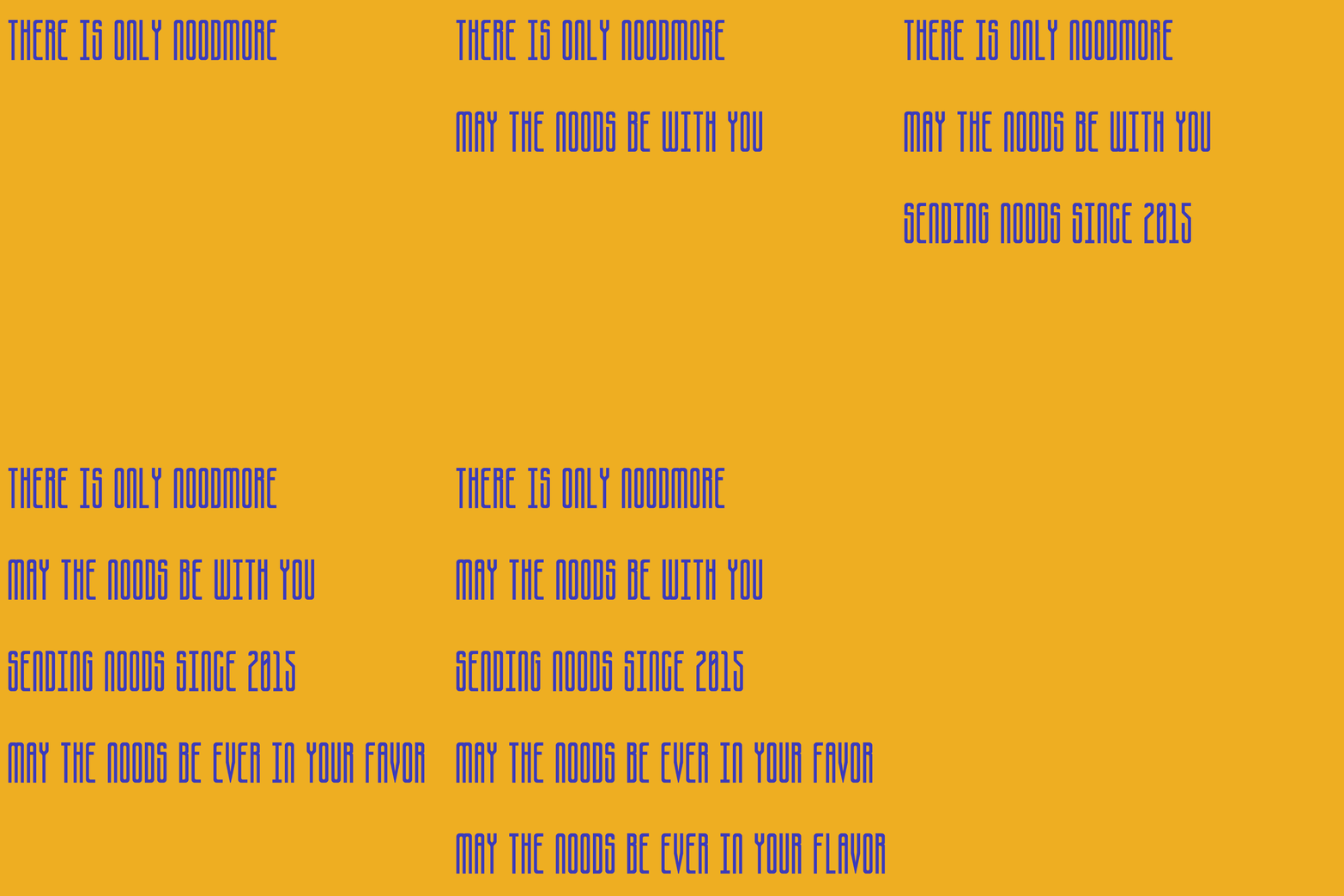
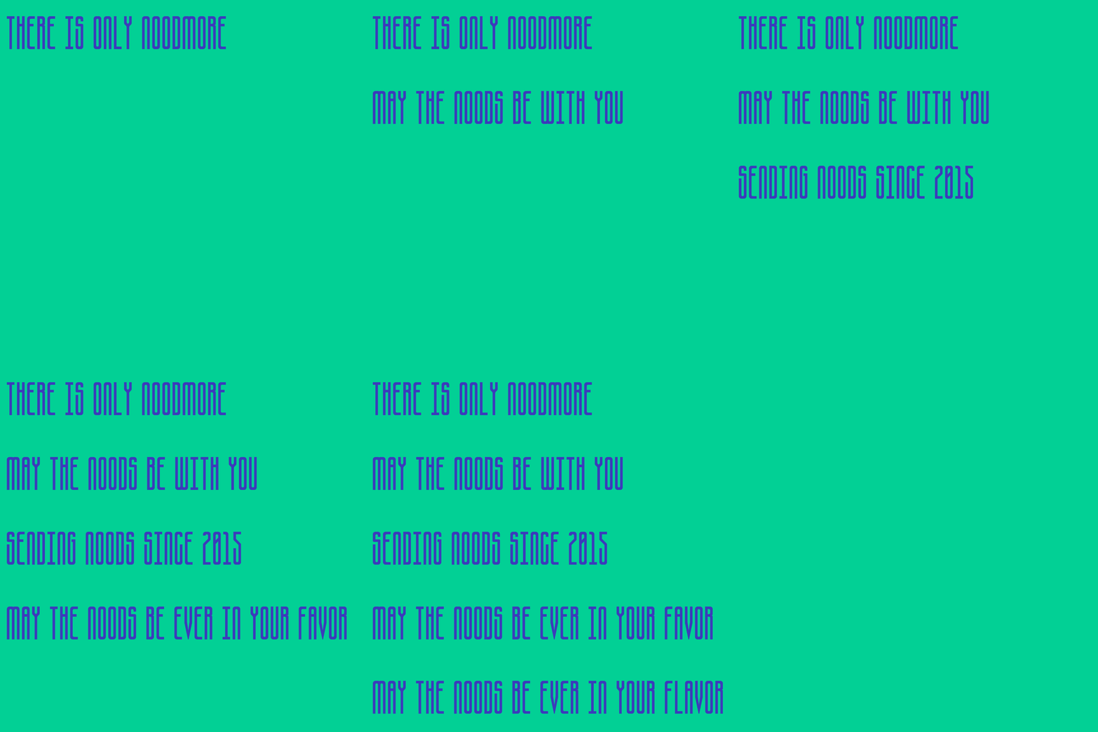
Le’nudle’s ton of voice reflects its bold, playful spirit, confident, witty, and culturally aware. Slogans like May the noods be with ever in your flavour, Sending noods since 2015 became a key part of the identity system, bringing cohesion and recognisability across packaging, signage, and digital channels, helping the brand stand out in a crowded market with charm and attitude.
Menu
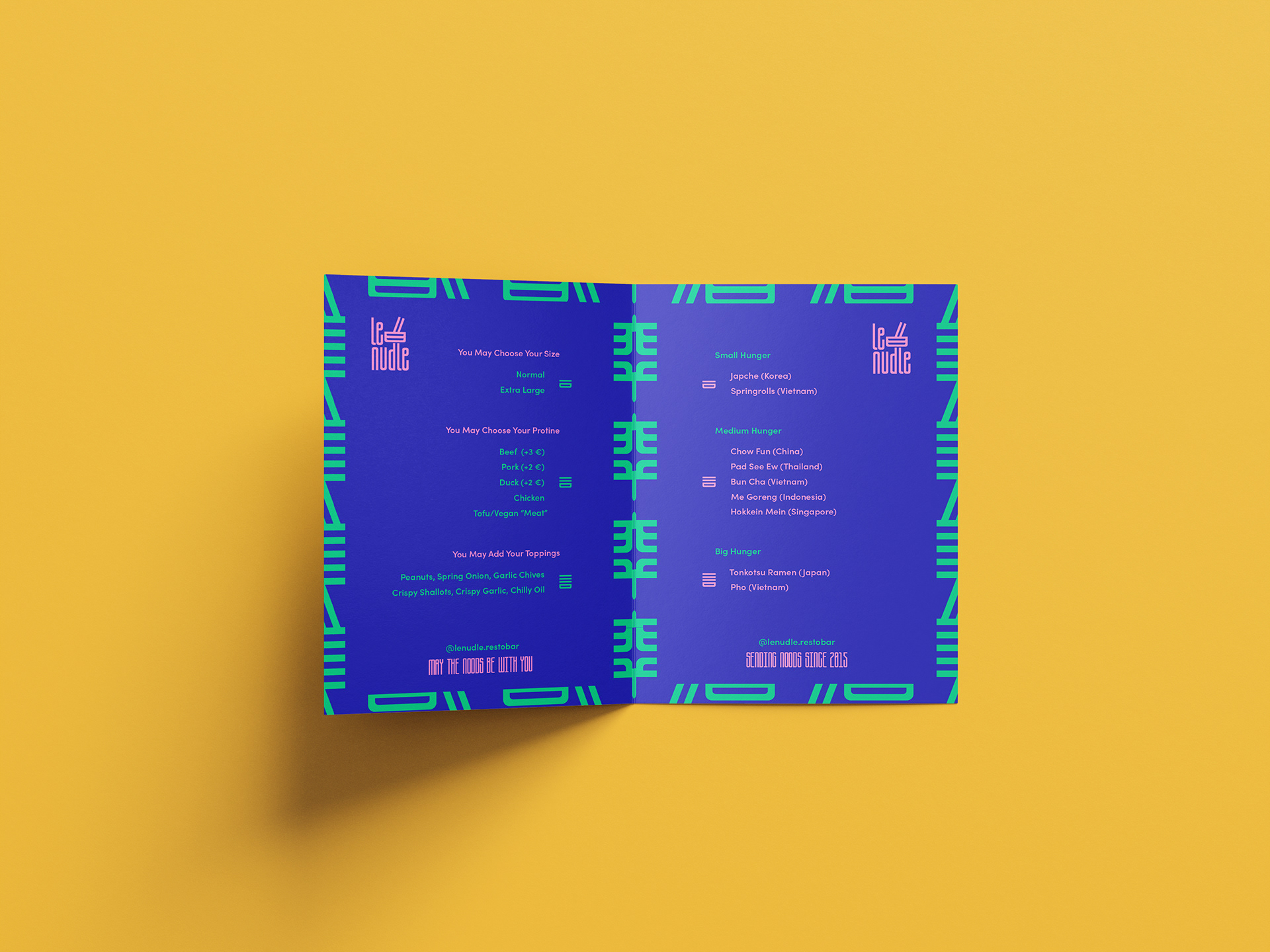
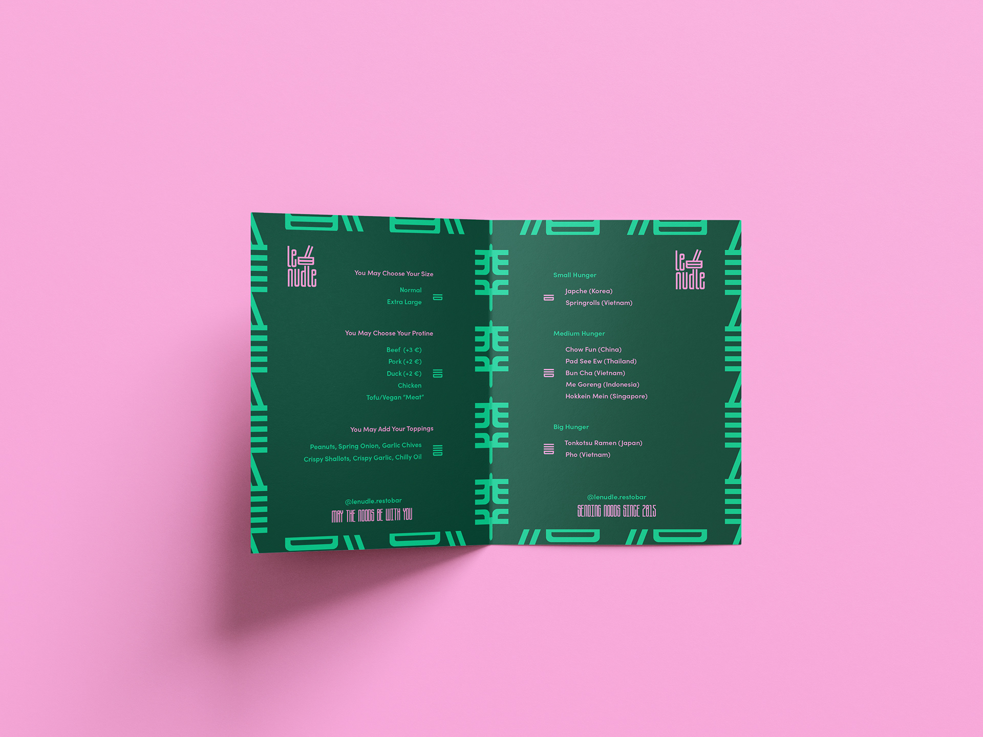
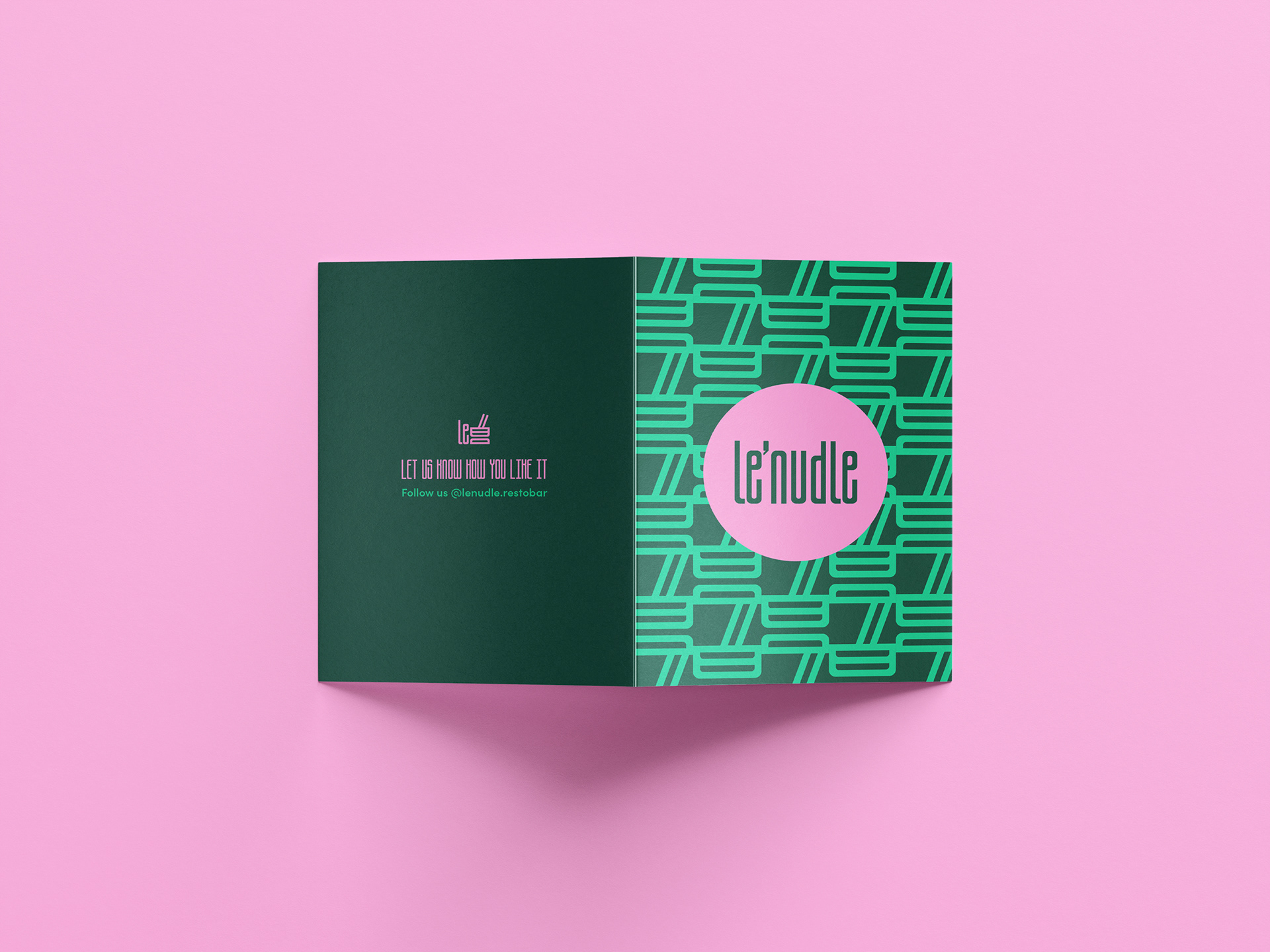
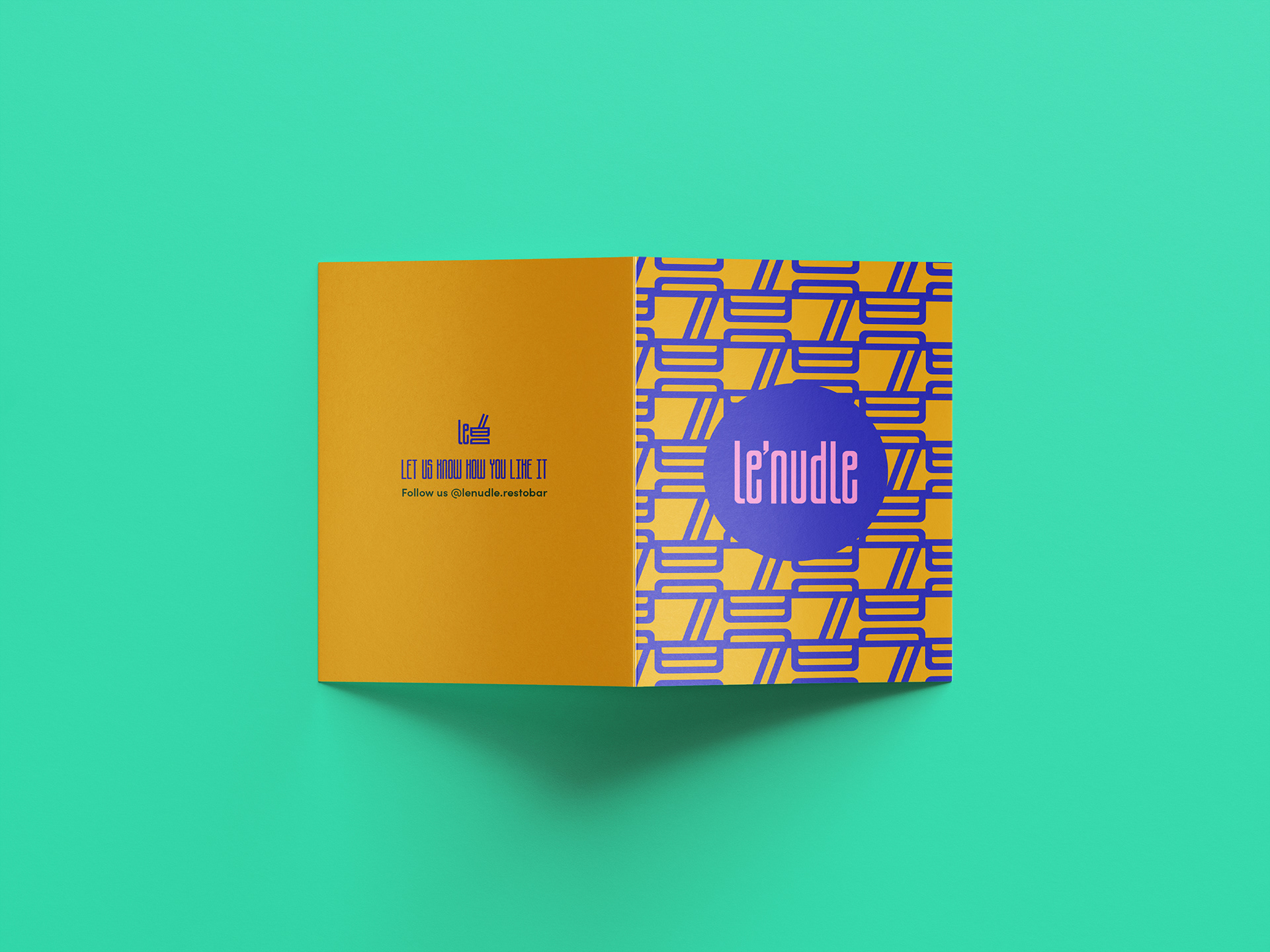
Lenudle’s menu were designed to mirror the brand’s vibrant energy while remaining practical and easy to navigate. Colour-coded sections, expressive typography, and modular layouts guide the eye, helping customers browse with ease, whether dining in or taking out.


Packaging
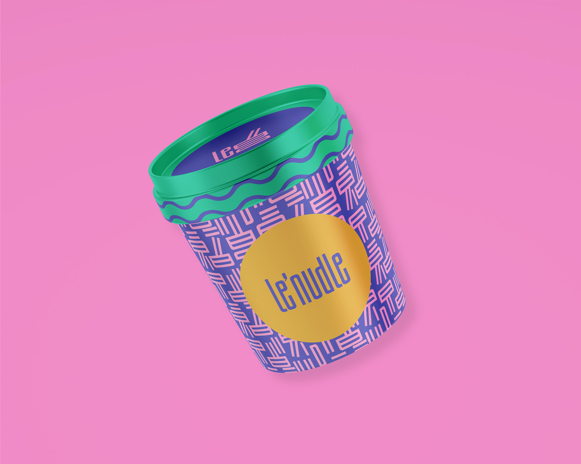
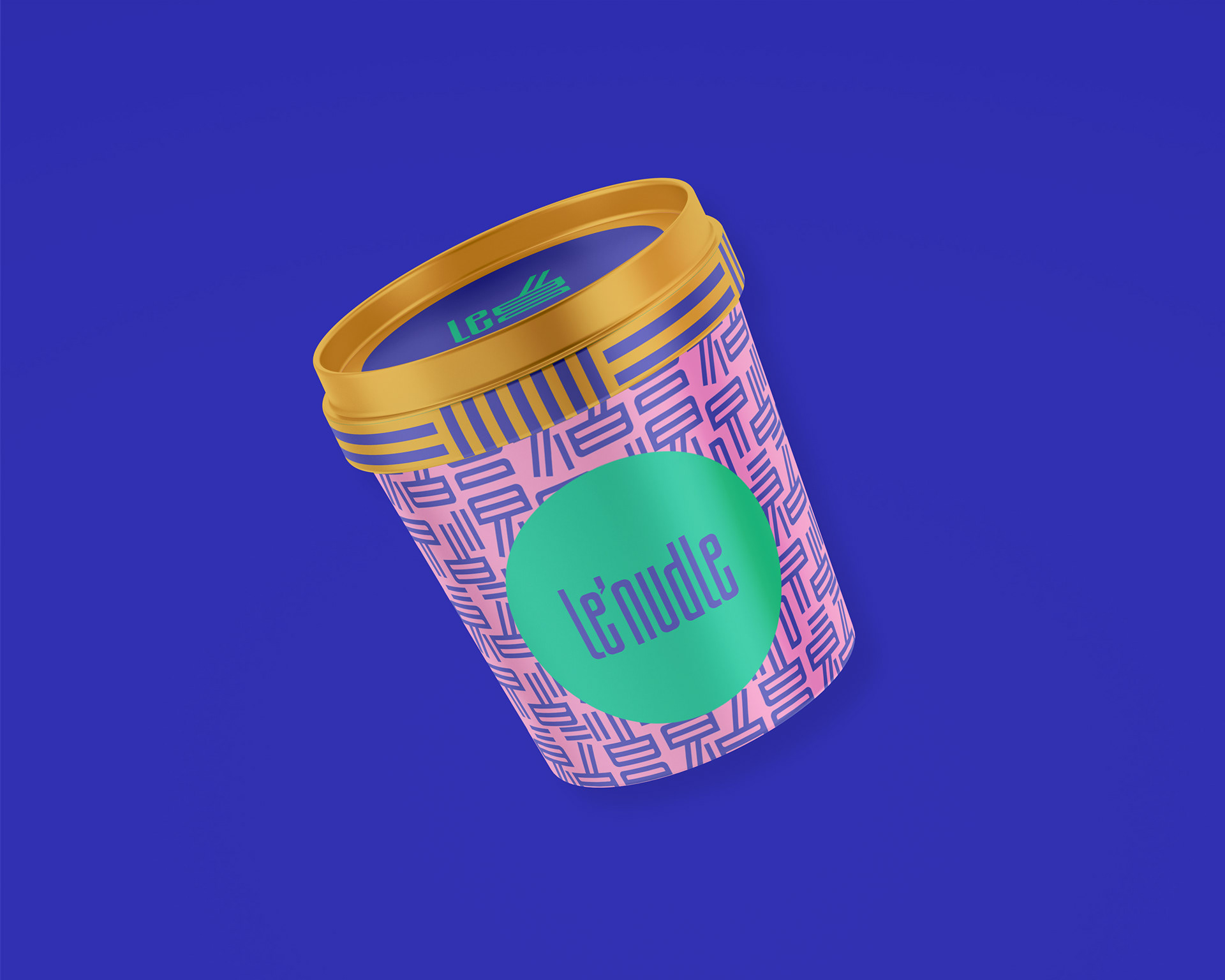
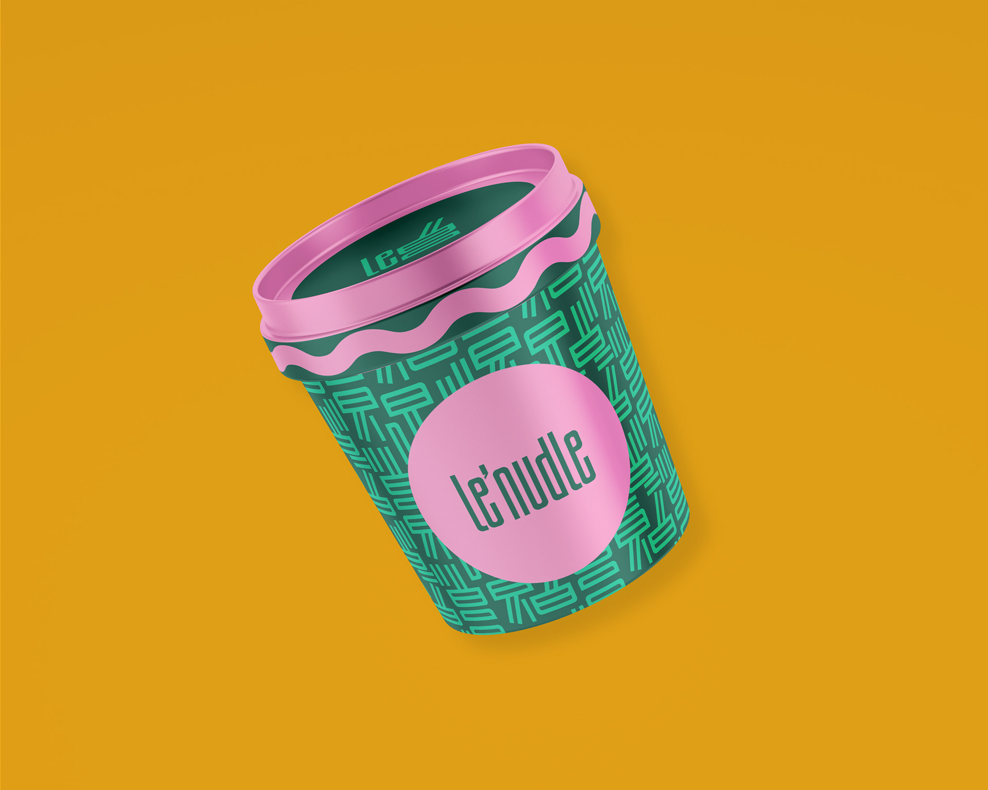
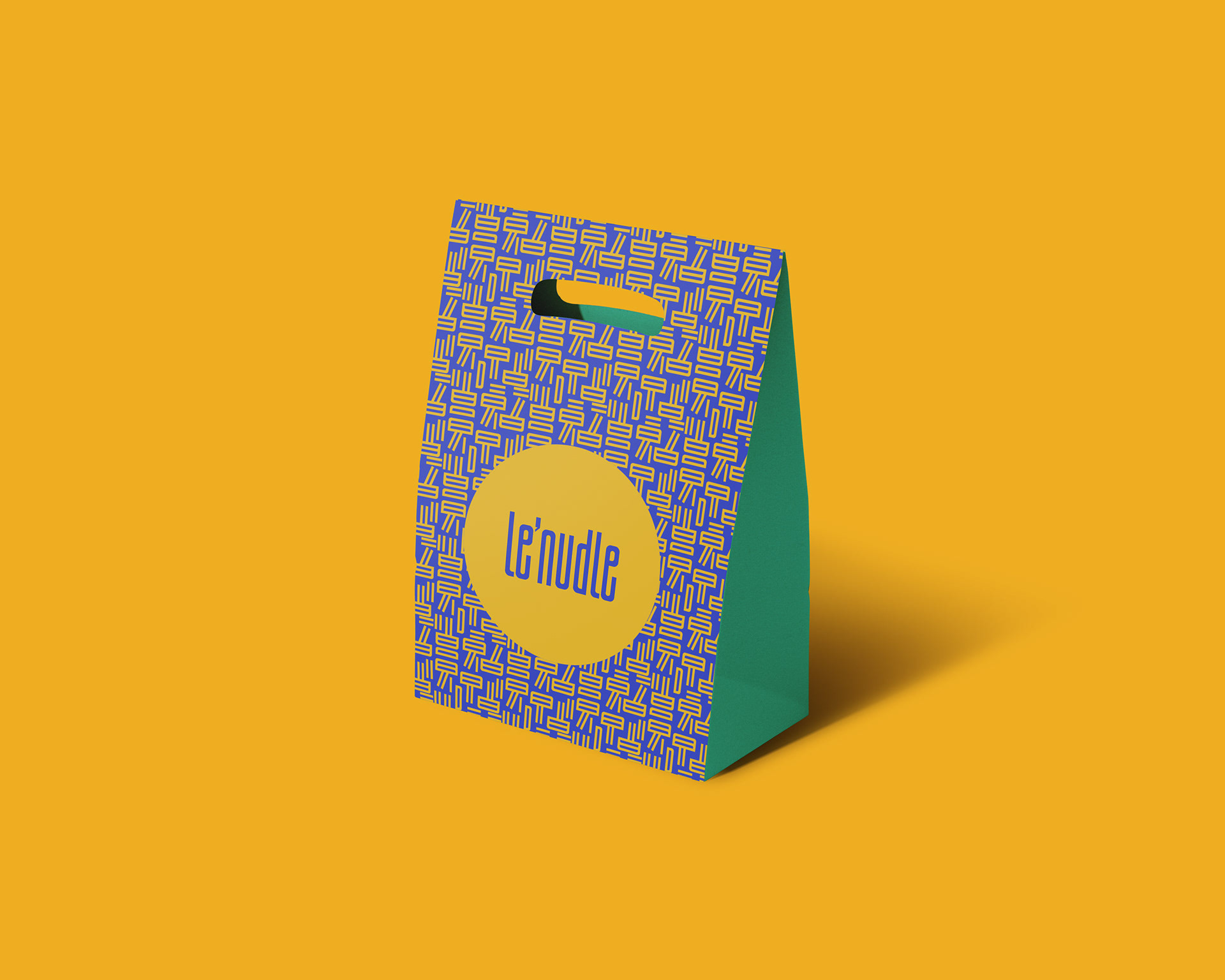
The full-bodied packaging system was built for both everyday service and long-term brand growth. Designed to be more than just containers, it combines modular layouts with consistent branding, making it easy to adapt to new dishes, promotions, or product lines. Scalable and intuitive, the system supports smooth operations for the team and delivers a clear, cohesive experience for customers.


The system balance high-impact key visuals with real-world functionality: stackable, durable, and easy to implement in fast-paced environments. From noodle boxes and soup cups to lids, bags, wraps, and custom stickers, every item is shaping the brand experience yet on another level.
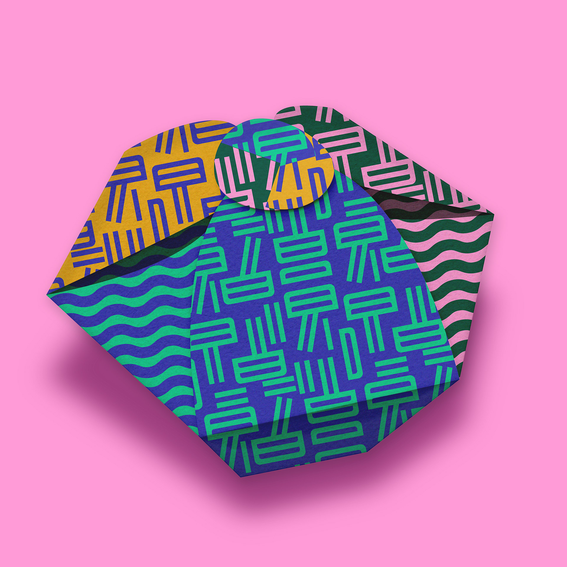
A fully custom structural packaging was developed to elevate special orders and gifting. From dieline to final form, every fold was designed with purpose. Its angular, origami-inspired form not only secures the contents but creates a moment of surprise, combining combining smart functionality with standout visual impact.
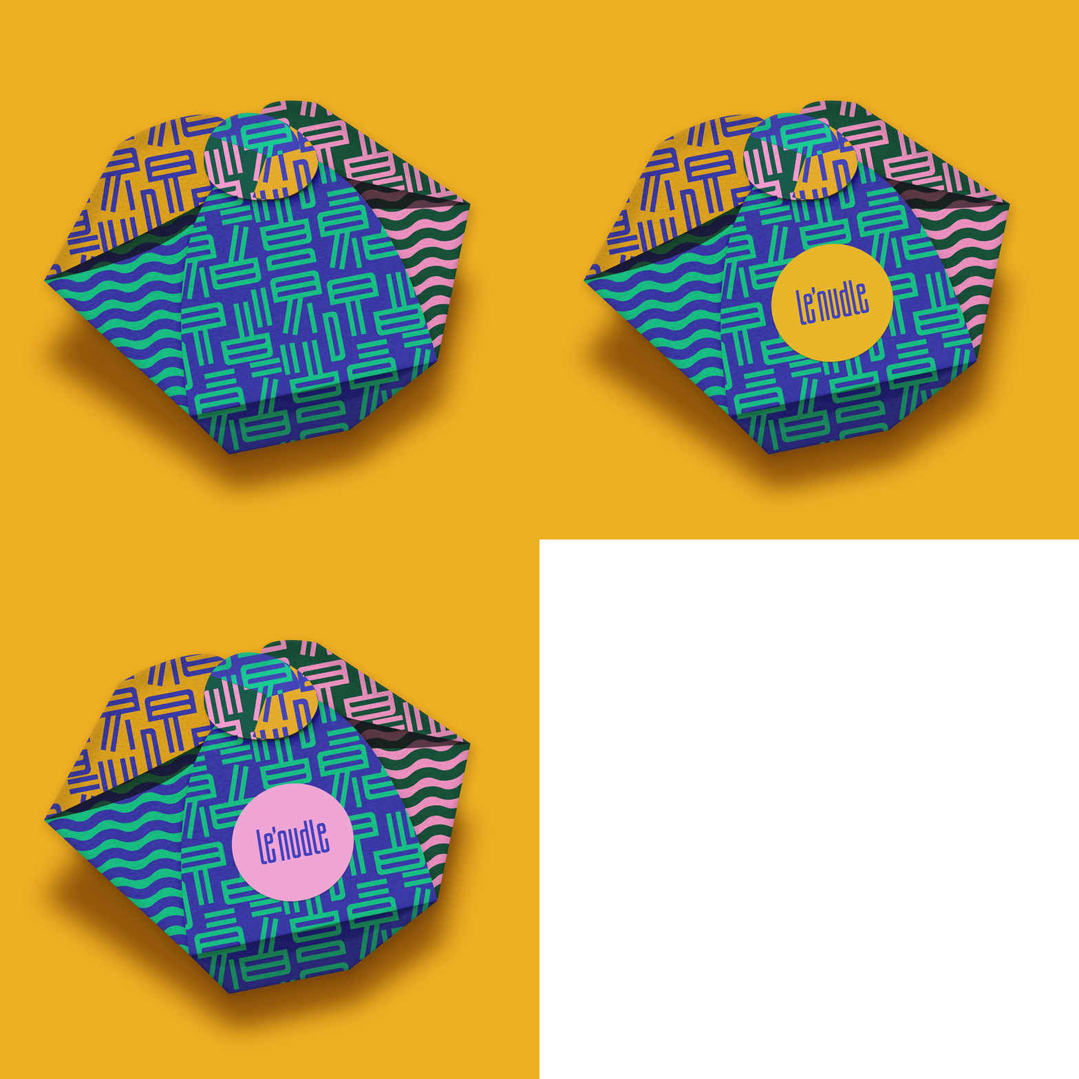


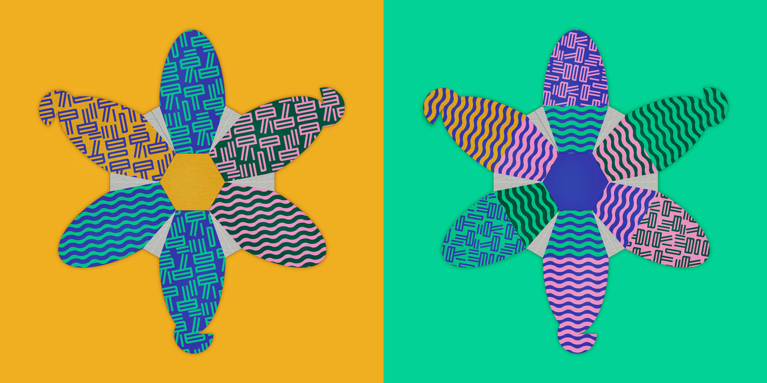
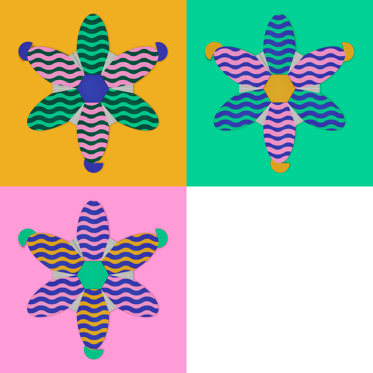
Each material features bold graphics, colour-coded categories, and tongue-in-cheek copy, creating a sense of play and cohesion across all formats.


Digital media
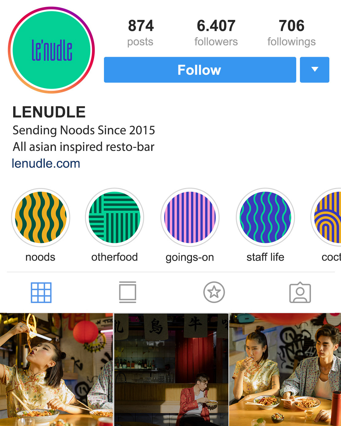
Lenudle’s social media media presence blends modular content with playful motion. From animated noodles to cheeky slogans and colour-blocked layouts, the system keeps the feed fresh and on-brand.
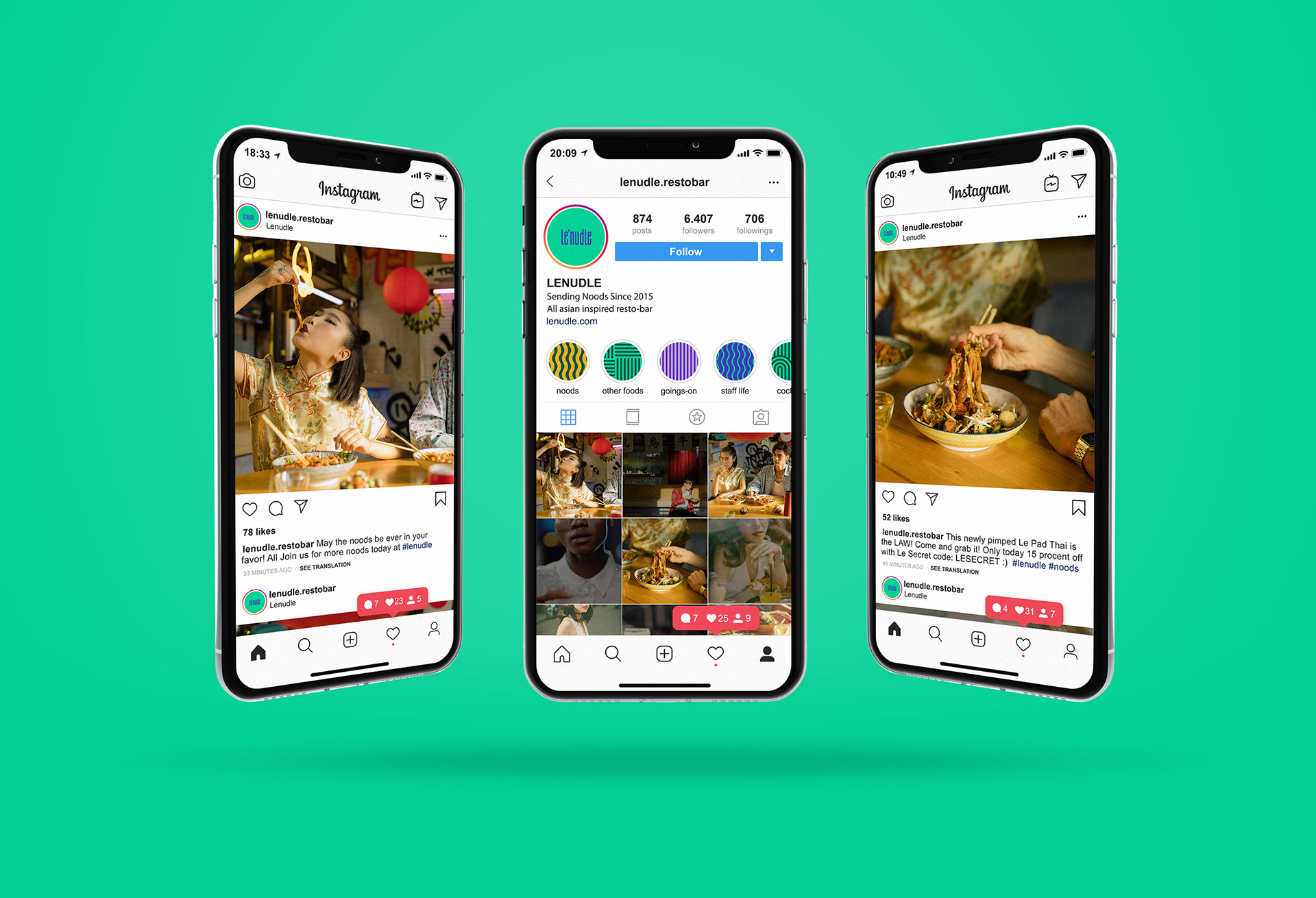
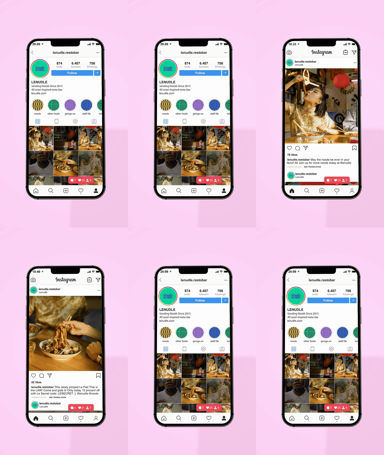
Light weight, looped visual animations bring rhythm and recognition to posts and stories, adding energy without overwhelming the message.

Apparel & merch
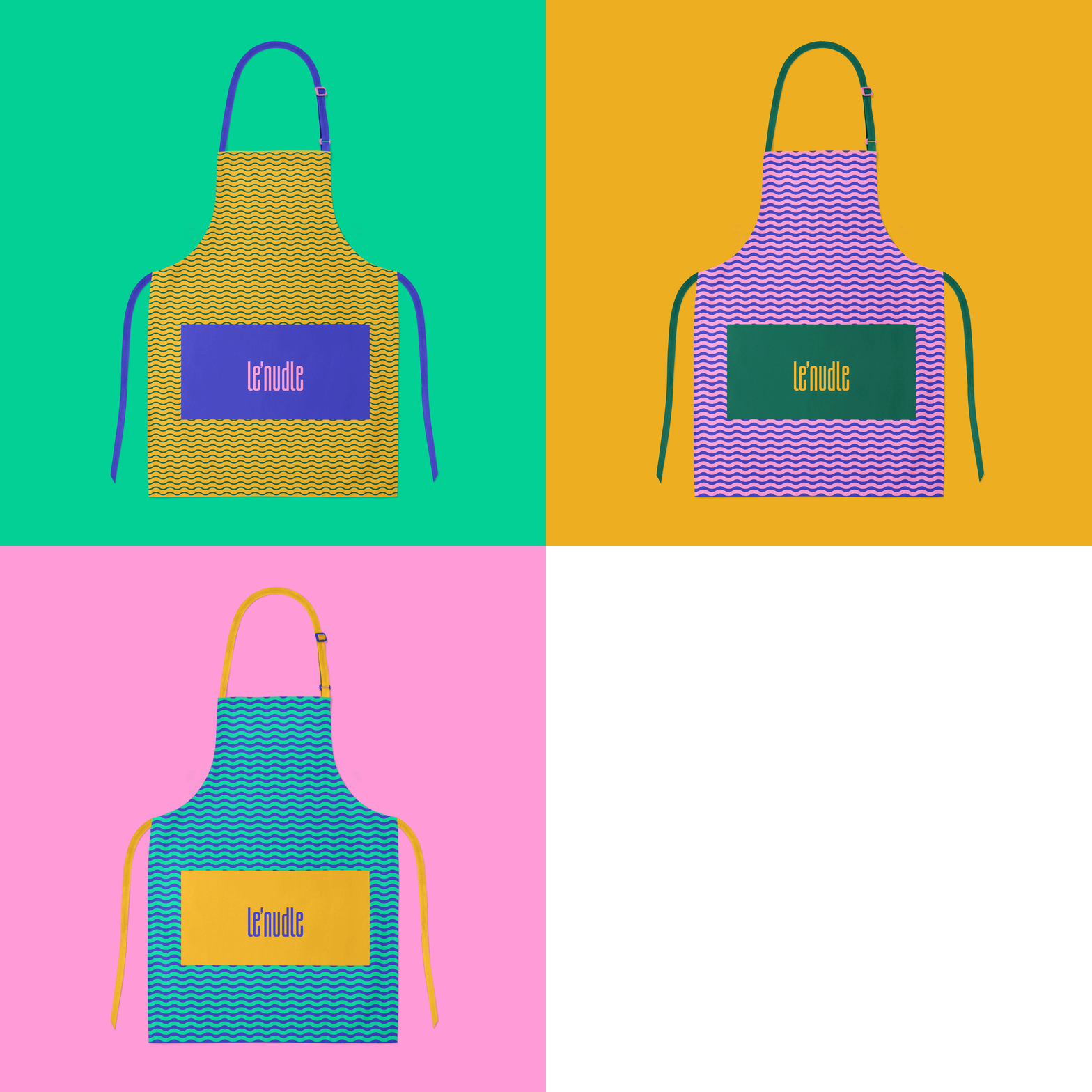
Designed for daily use, loved beyond the kitchen. Durable, comfortable, and subtly branded, the staff apparel balances function and flair, supporting service while doubling as desirable merch that extends the brand beyond the table.
