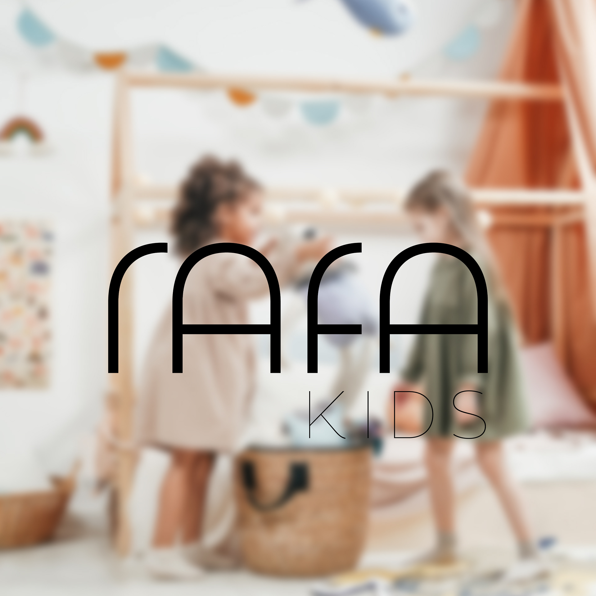
Modern kids furniture, full of spirit
Concept & Visual Direction
Rotterdam-based brand that designs modern, long-lasting furniture for children. Created to grow with kids of different ages, the furniture blends aesthetic simplicity with smart functionality, loved equally by children and their parents.
Inspiration
The concept draws from Rafa's values: modularity, modern aesthetics, and the playful nature of childhood. The goal was to create a visual world that feels clean, confident, and imaginative, just like the brand’s furniture. Natural materials, geometric shapes, and smart design informed a minimal yet characterful approach.
Originally developed during an initial design brief, the concept was further explored as an independent creative study, allowing space to refine the visual language across materials.

Foundation
More than furniture, it builds connections across generations. Rooted in simplicity, every piece is designed to give children freedom while meeting the expectations of design-conscious parents. The brand believes in timeless forms and long-term quality, reducing waste while nurturing play. This is where function meets feeling, minimalist, lasting, and full of life.
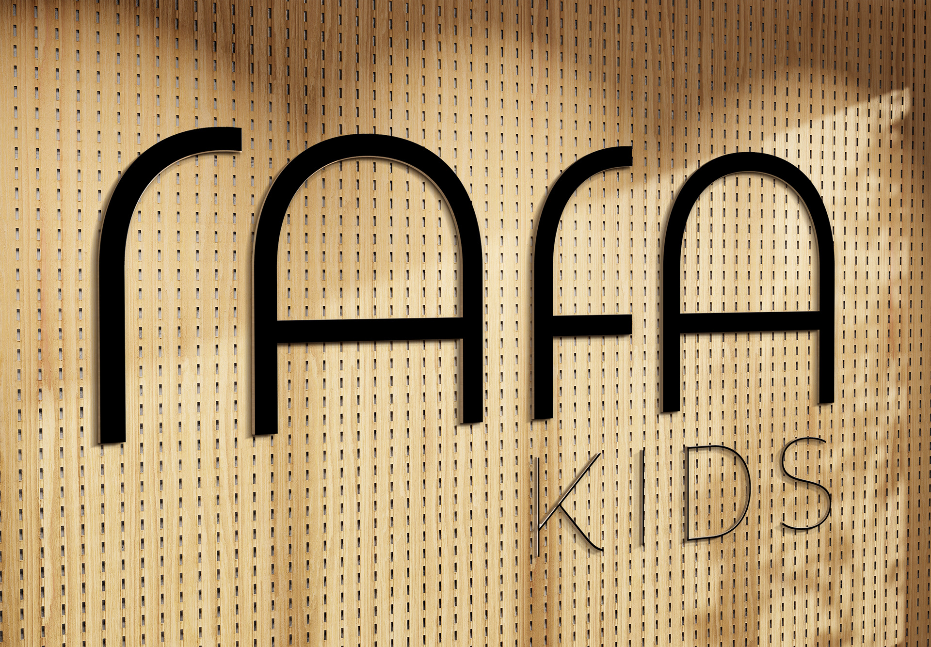
Direction
A flexible identity system system that grows with the brand, balancing playfulness with precision. The logo, typography and layouts were built to adapt seamlessly across physical and digital touchpoints, from product tags to packaging and online content. Calm colours and functional white space leave room for the products to breath.


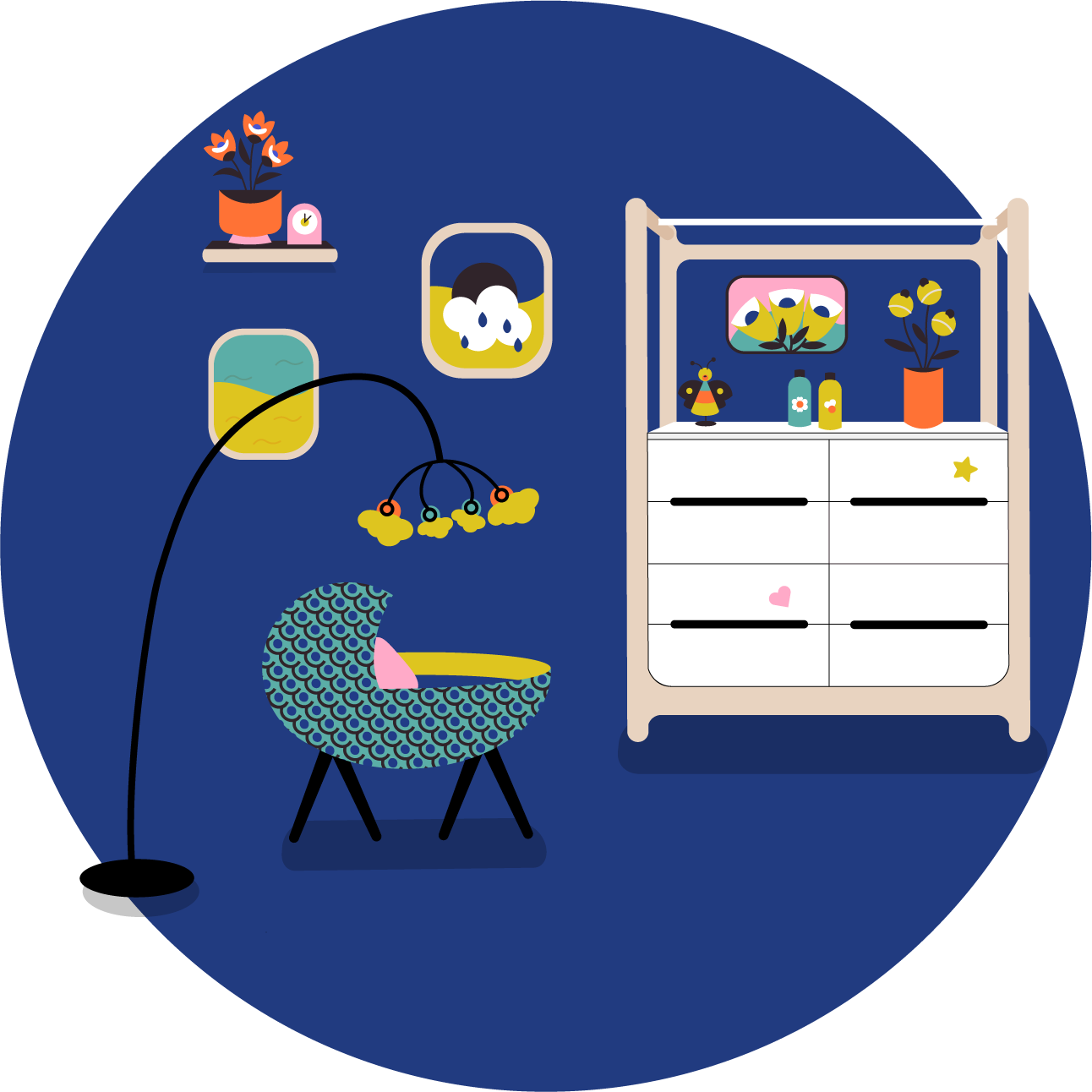
Illustrated with intention
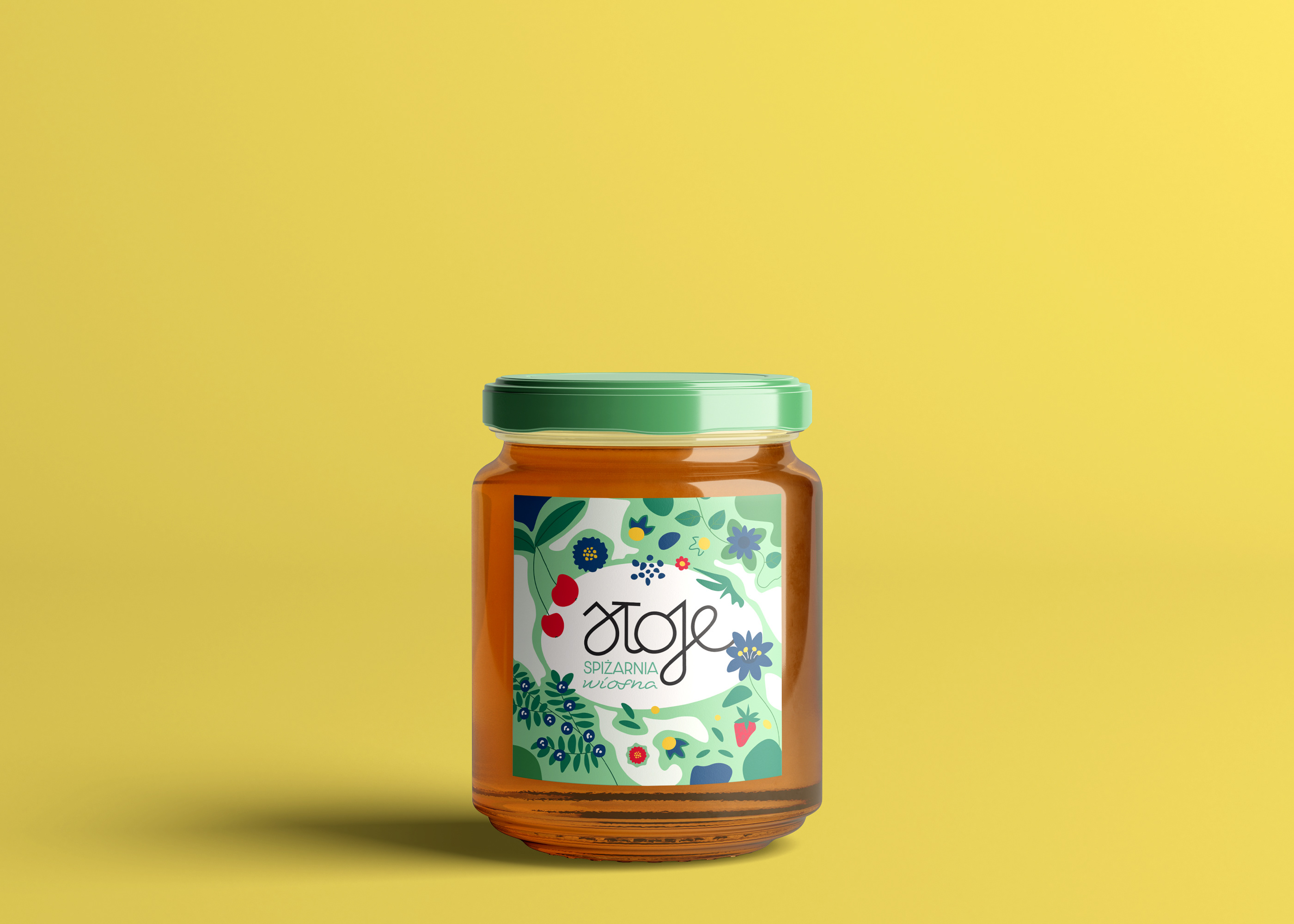
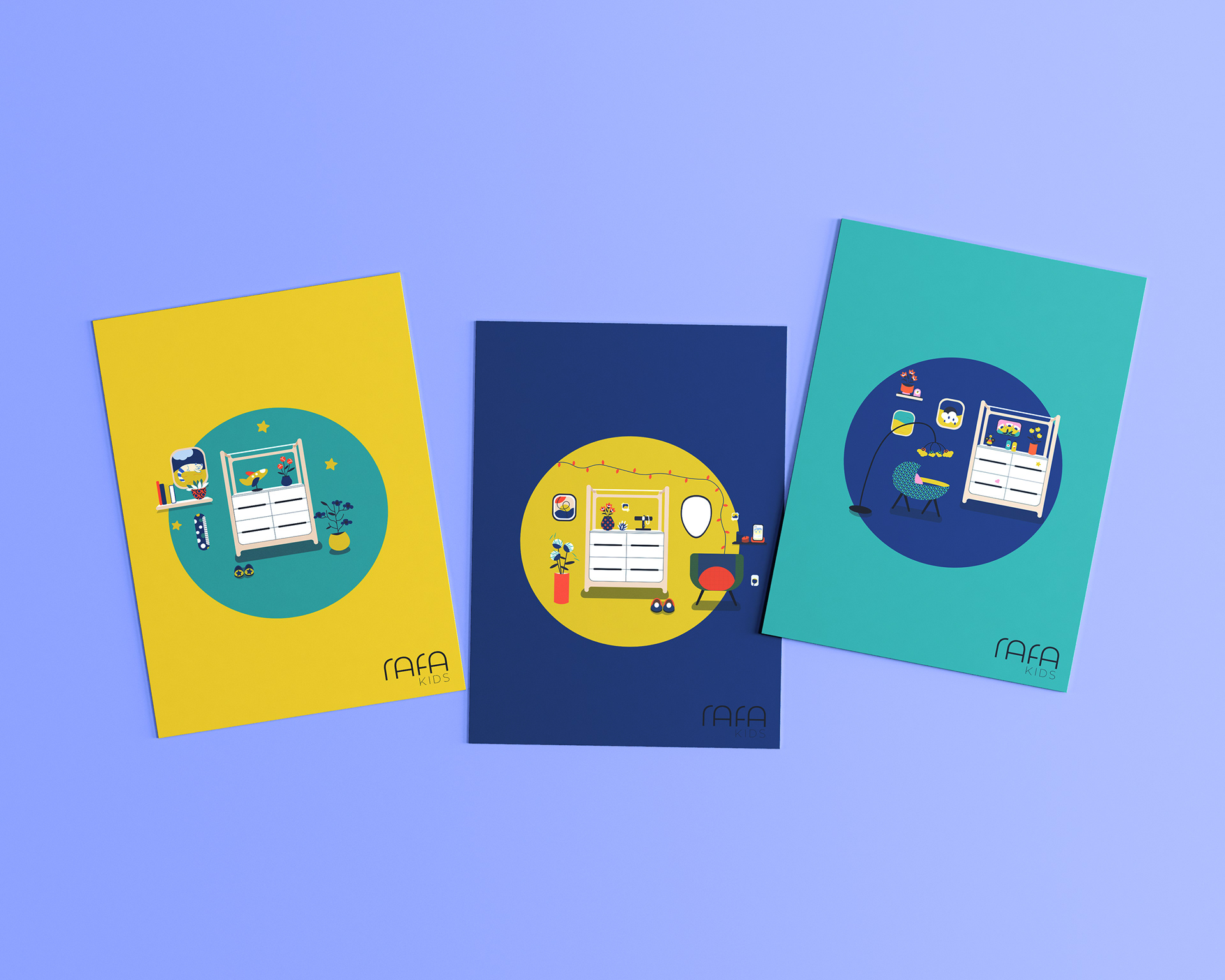
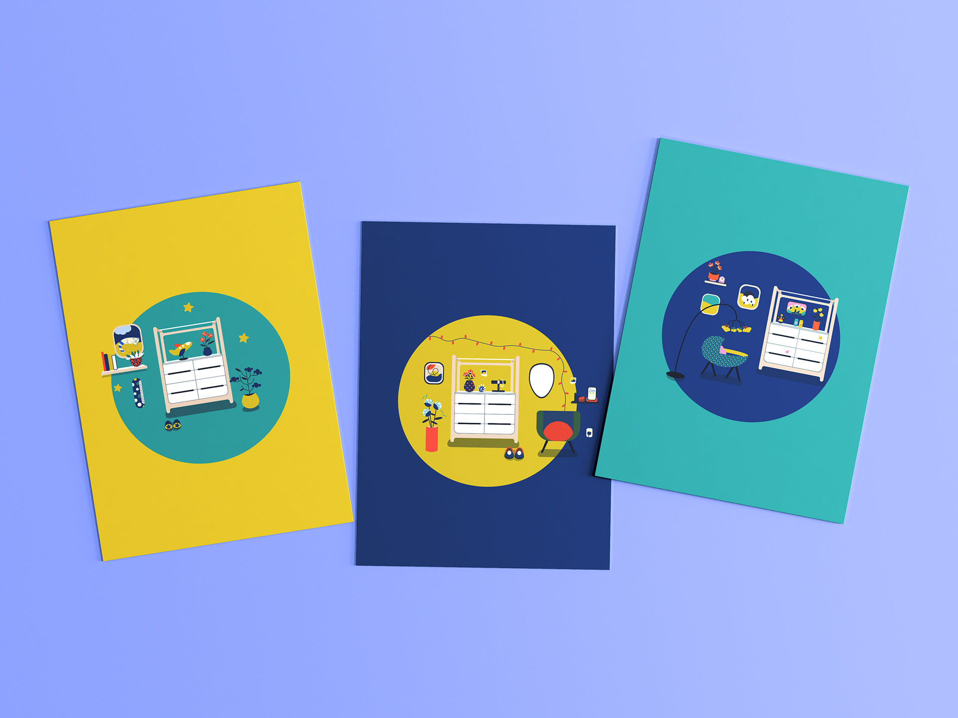
A custom illustration set was created to echo Rafa-kids’ visual language, soft, structured, and playful. Rooted in the geometry of the furniture, the shapes bring rhythm and imagination without overpowering the space. Not overly complicated, yet expressive, the system stays flexible enough to evolve with future collections. These illustrations act as key key visuals, anchoring the brand’s identity across formats with clarity and charm.
Applied with care
The illustrations were adapted across brand materials, from care cards and wraps to packaging and newsletters.
They add a quiet layer of personality and consistency, scaling with ease while keeping the brand warm, clear, and recognisable.
They add a quiet layer of personality and consistency, scaling with ease while keeping the brand warm, clear, and recognisable.


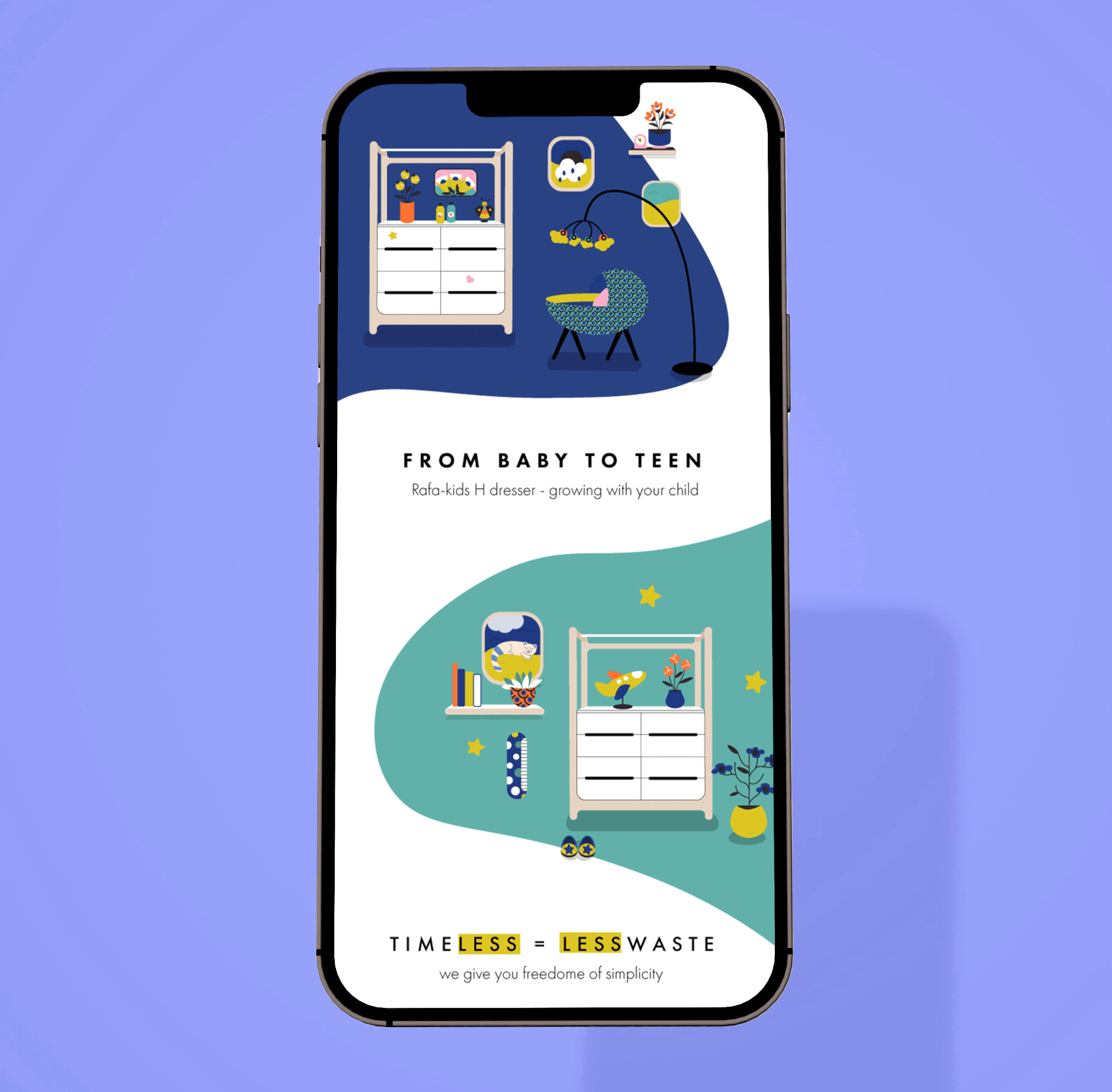
Digital Presence
The digital layout follows a modular structure that balances product functionality with lifestyle storytelling. It’s user-friendly, visually calm, and editorial in feel, encouraging quiet, considered interaction.
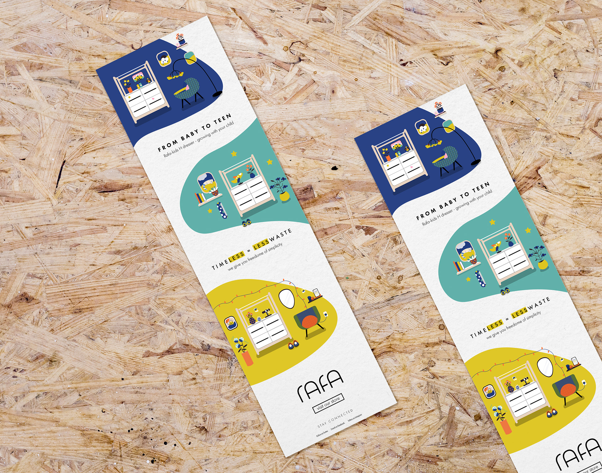
The newsletter extends this experience across email. Built to share updates, seasonal moments, and behind-the-scenes content, it uses a clear hierarchy and warm visual language to stay engaging and easy to follow. Subtle branding keeps it cohesive, while the flexible format adapts to everything from product drops to parenting tips.
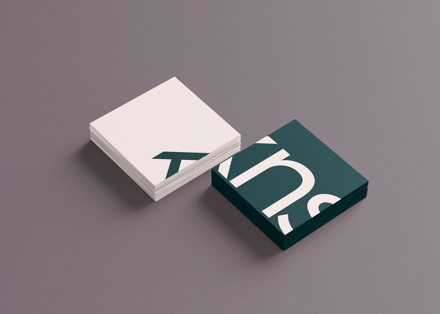
Printed Collateral
Includes custom business cards and a series of promotional promotional folder covers, designed to introduce the product through age-specific storytelling and extend the visual identity across physical touchpoints.


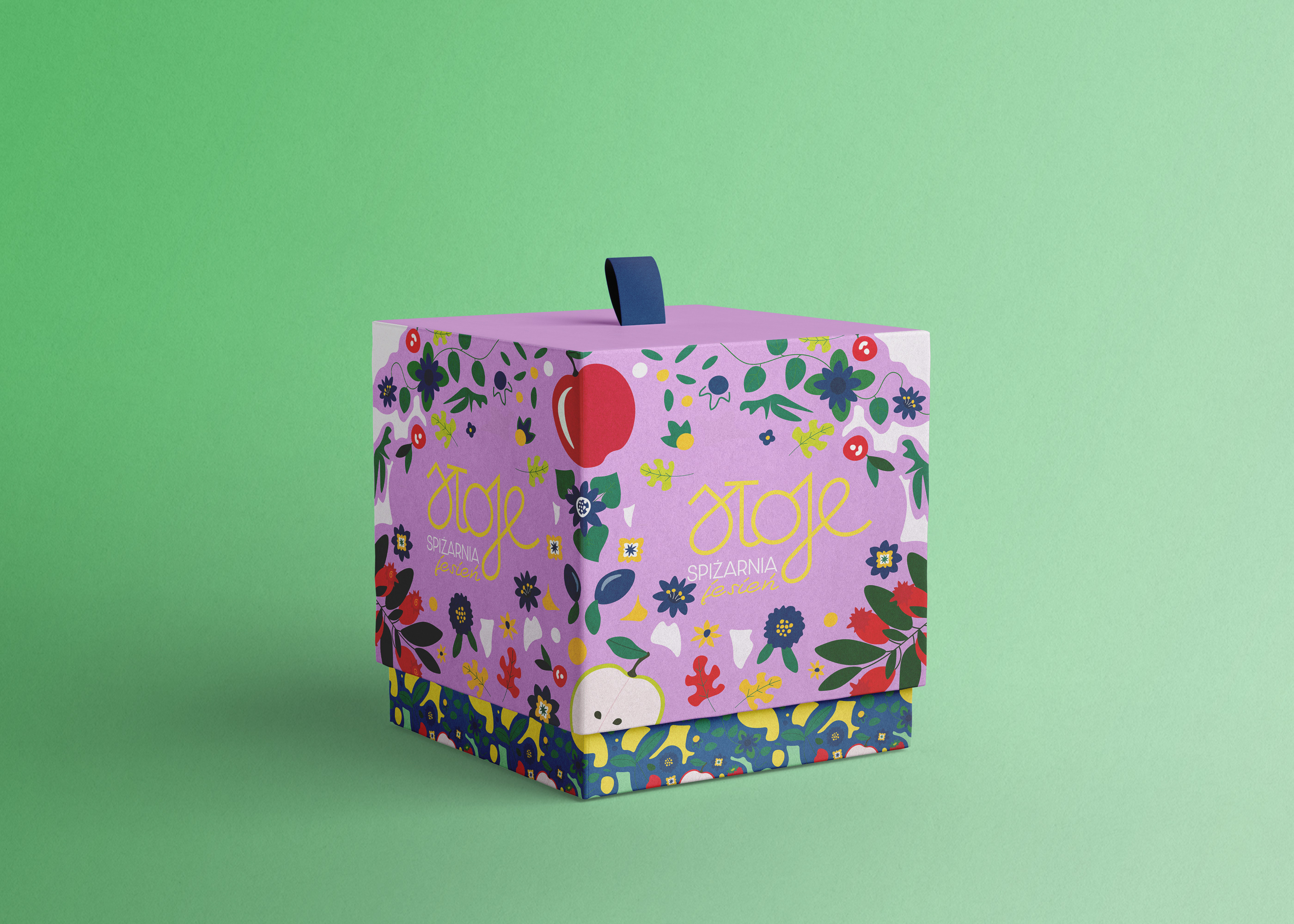
Packaging
Beyond the product, the packaging was designed to extend Rafa-kids’ playful yet refined spirit into the unboxing experience. Custom illustrations bring each box to life, showing the furniture in context and creating a sense of imagination and care, turning simple delivery into a moment worth remembering, and making the unboxing feel personal and joyful.
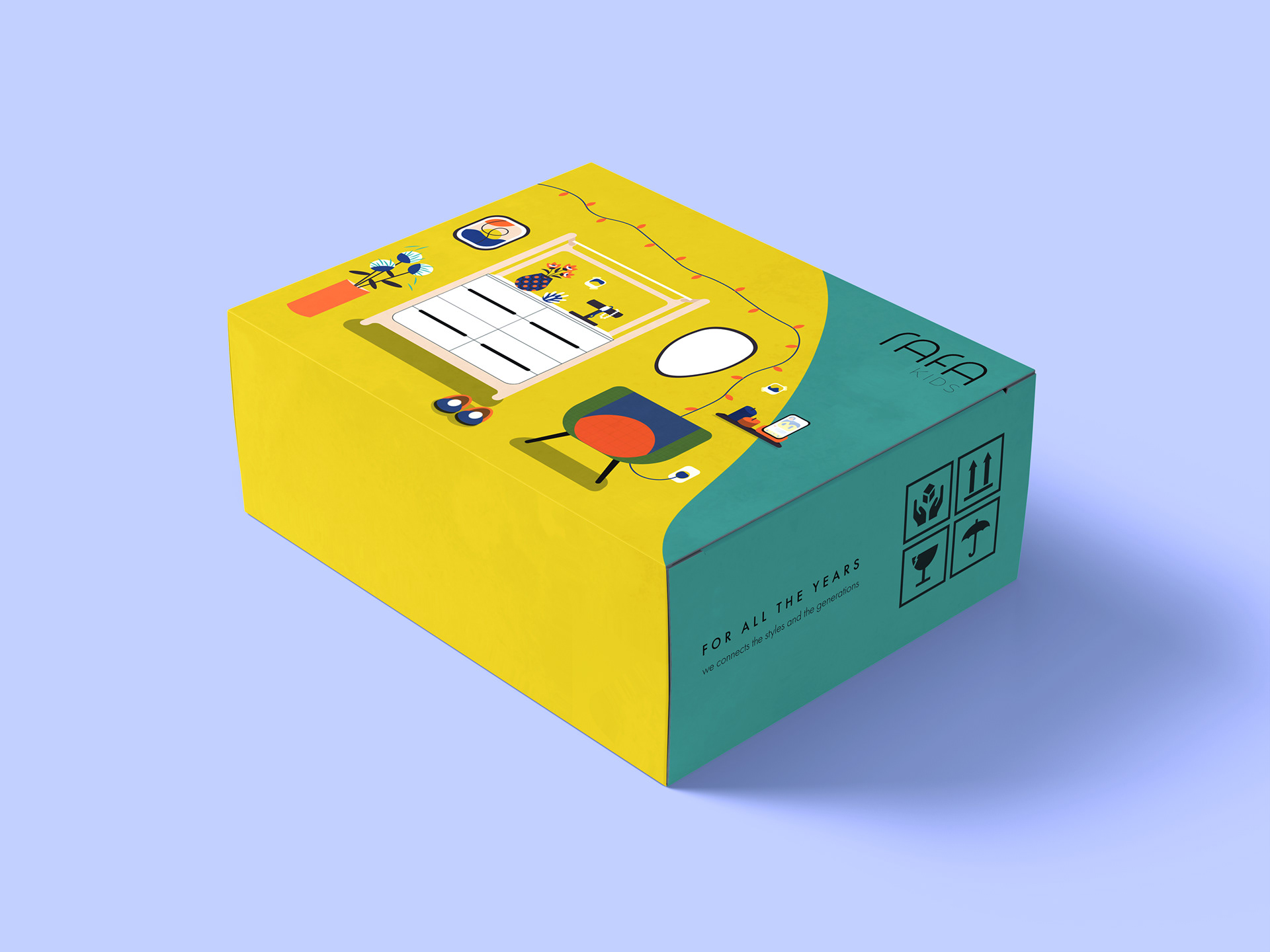
Beyond aesthetics, the packaging system is built for function. Bold colour-blocked layouts support clear product identification, while soft forms and consistent visuals ensure brand cohesion across age groups and formats. Practical yet expressive, the packaging becomes a quiet storytelling tool, connecting with both children and design-minded parents.
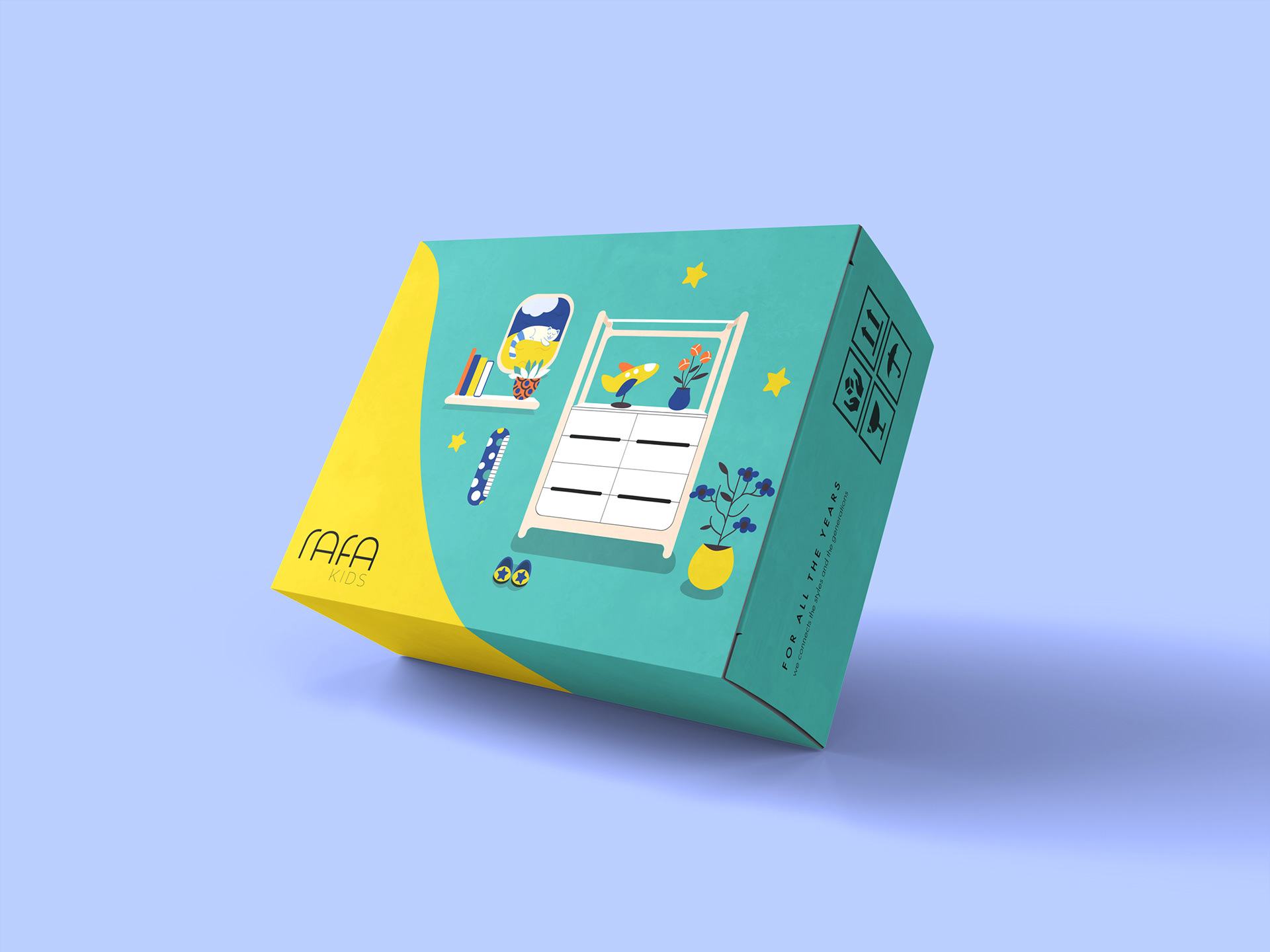

Stickers act as both branding and functional elements, securing packaging while reinforcing the visual identity. Playful and practical, they support recognition and add a thoughtful finishing touch to every order.