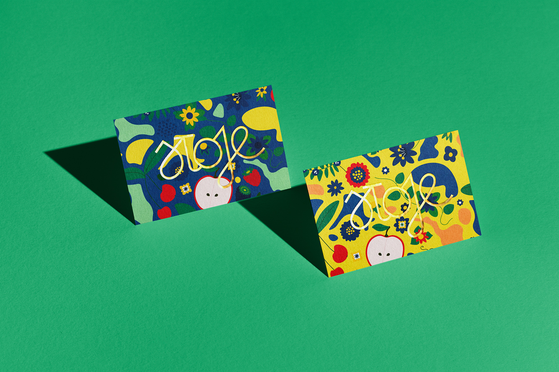
Rooted In Season
Brand Identity for delicatessen & catering based in Poland
A brand rooted in self-grown ingredients and locally sourced seasonal produce, perfect for elevating festive occasions or cozy nights in. Sloje honors the natural rhythm of growth, capturing freshness in jars so your memories and flavours stay vibrant.
Inspiration
The design draws from traditional preserves, pantry shelves, and everyday meals. We used simple shapes, soft textures, and custom lettering to give the brand a welcoming, homemade feel. The result is a warm, coherent identity that’s easy to apply, from catering materials to storefront visuals.
Direction
Ready toolkit that helped the client present their offer clearly and consistently. It built trust with customers right away, giving the new business a professional yet personal look. The branding now supports Sloje’s daily operations and future growth, from local catering to wider retail plans.
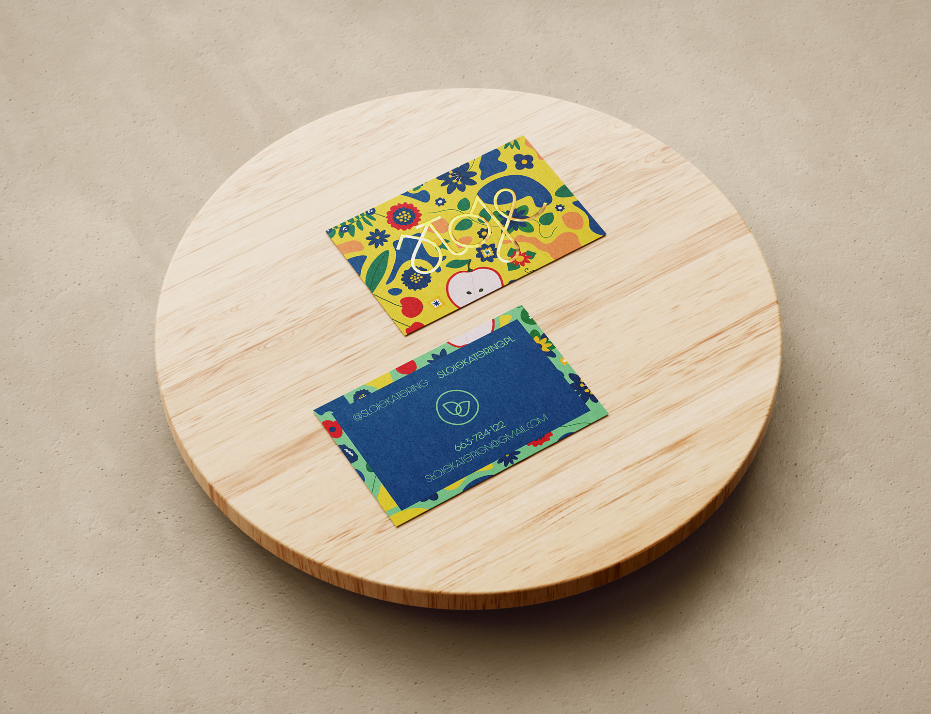
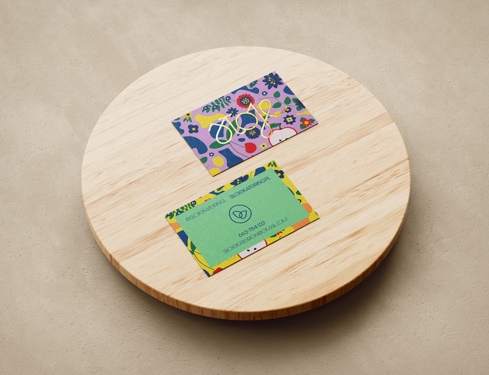
visual identity System
Soft colors, minimal layouts, and subtle textures make it feel both elevated and down to earth,while staying easy to scale, apply, and adapt to seasonal offerings. The visual language is warm and refined, capturing Sloje’s essence: seasonal, honest, and rooted in craft.

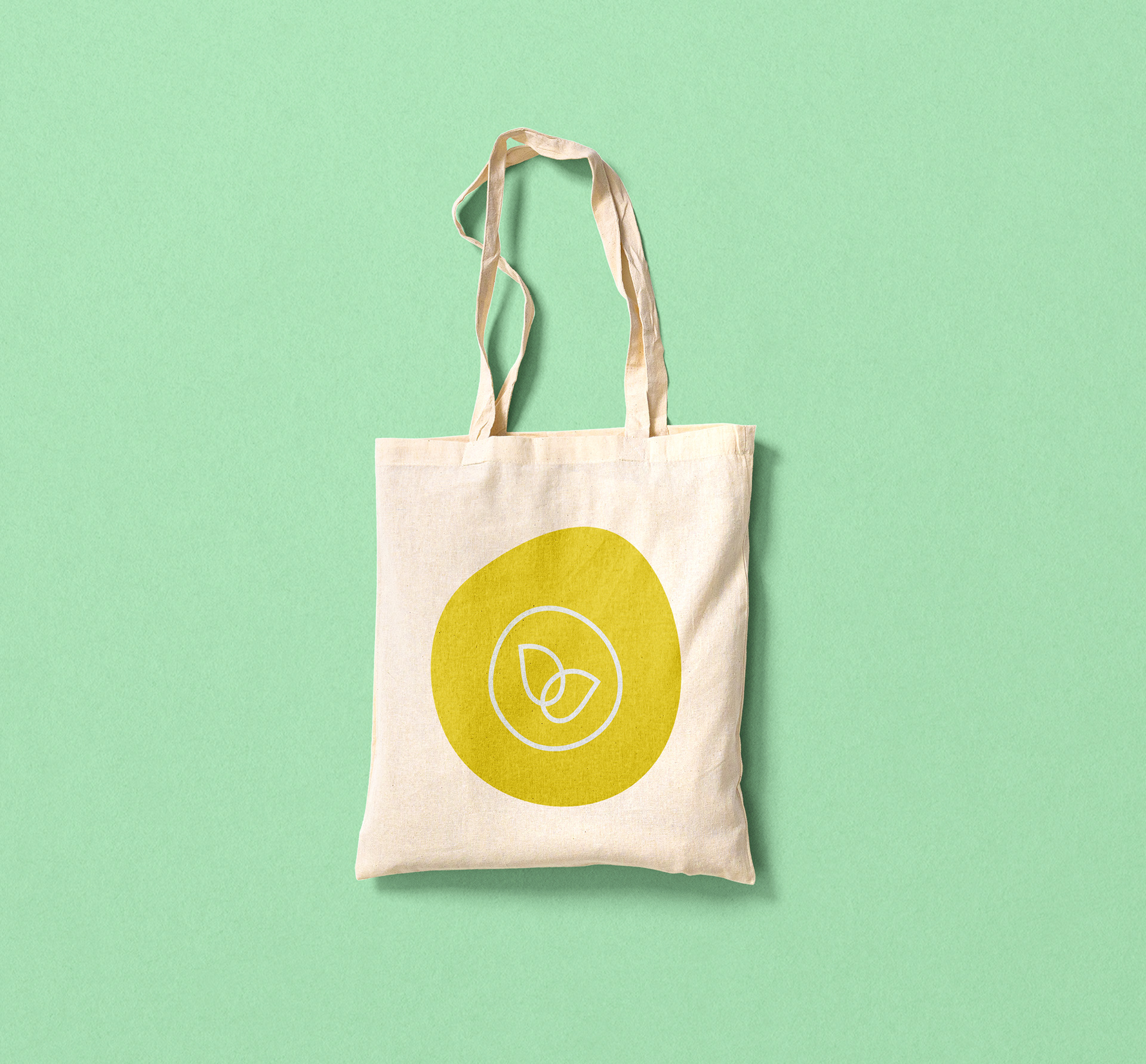

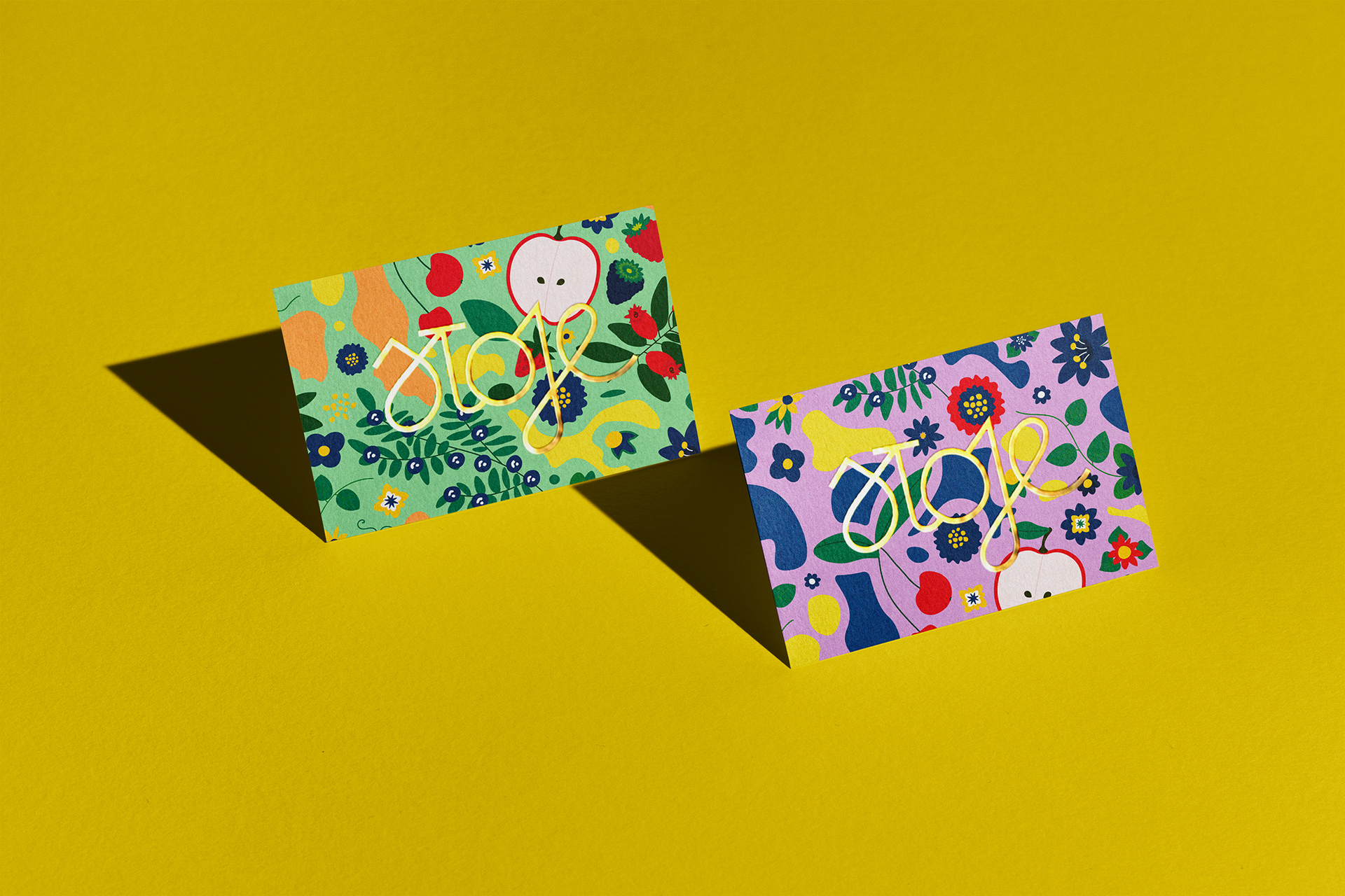
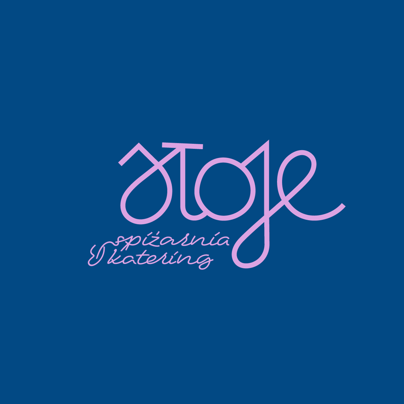
The brand features a hand-drawn logotype with soft curves inspired by handwritten labels. A minimal brand mark complements the system and it’s used as supporting mark. Designed for flexibility, the logo adapts seamlessly, from tiny jar seals to storefront signage.

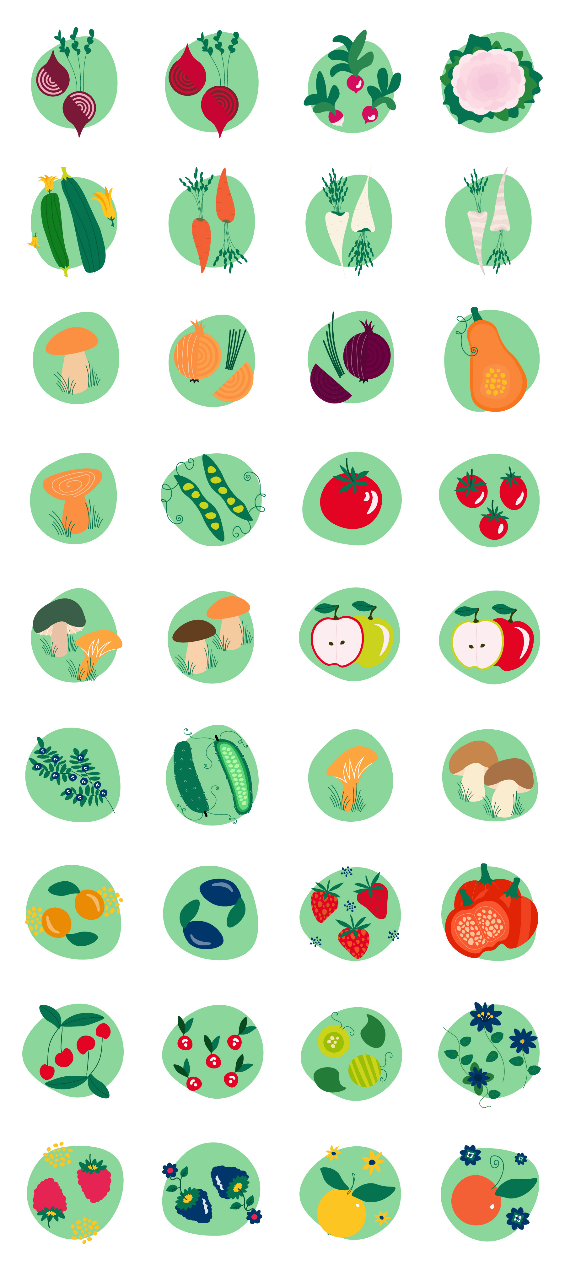
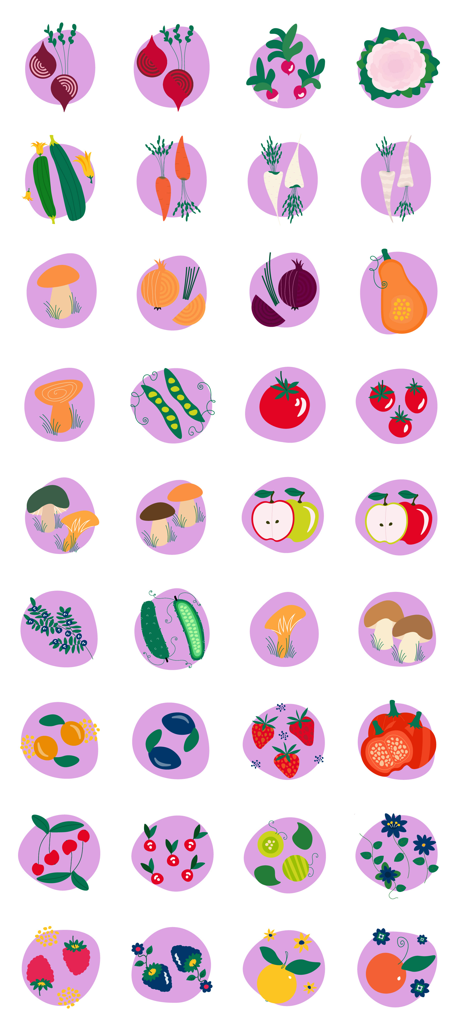
Custom illustrations bring warmth and consistency across every brand piece, tying everything together in one coherent visual story.


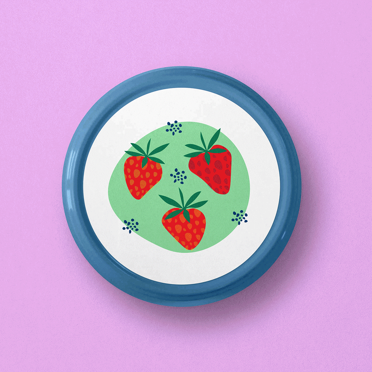
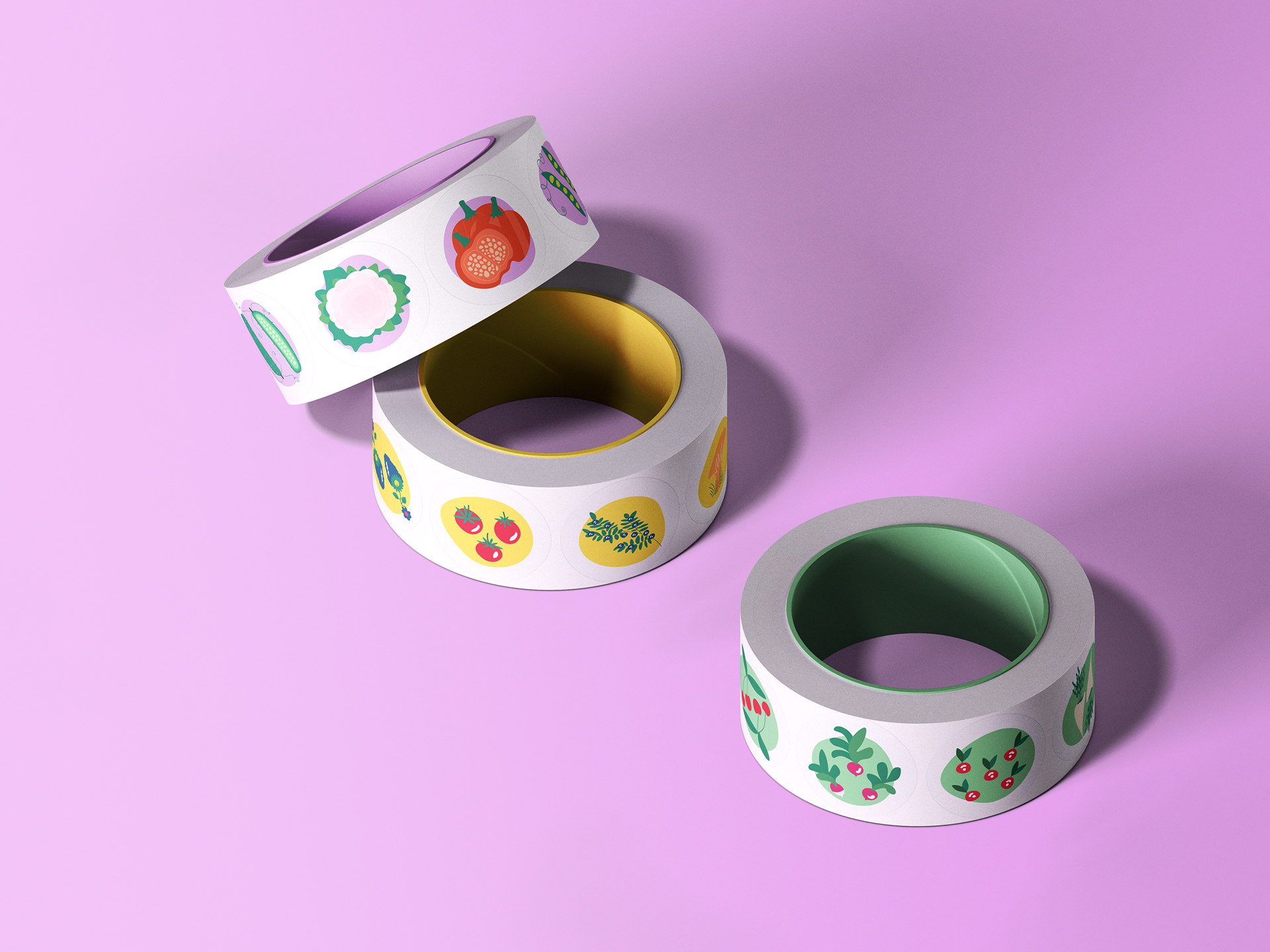
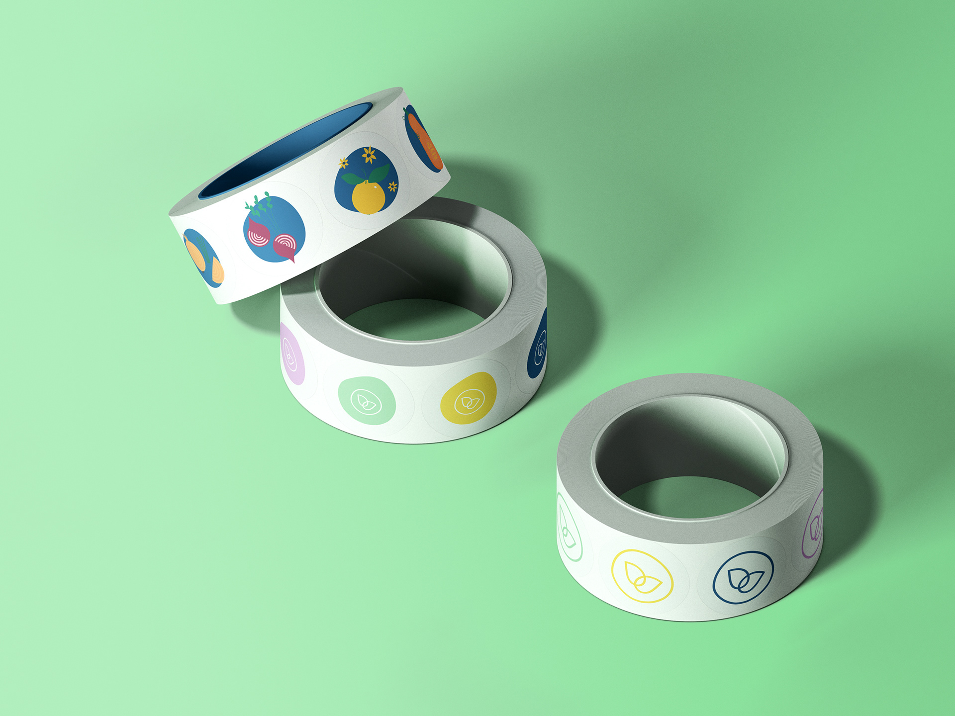
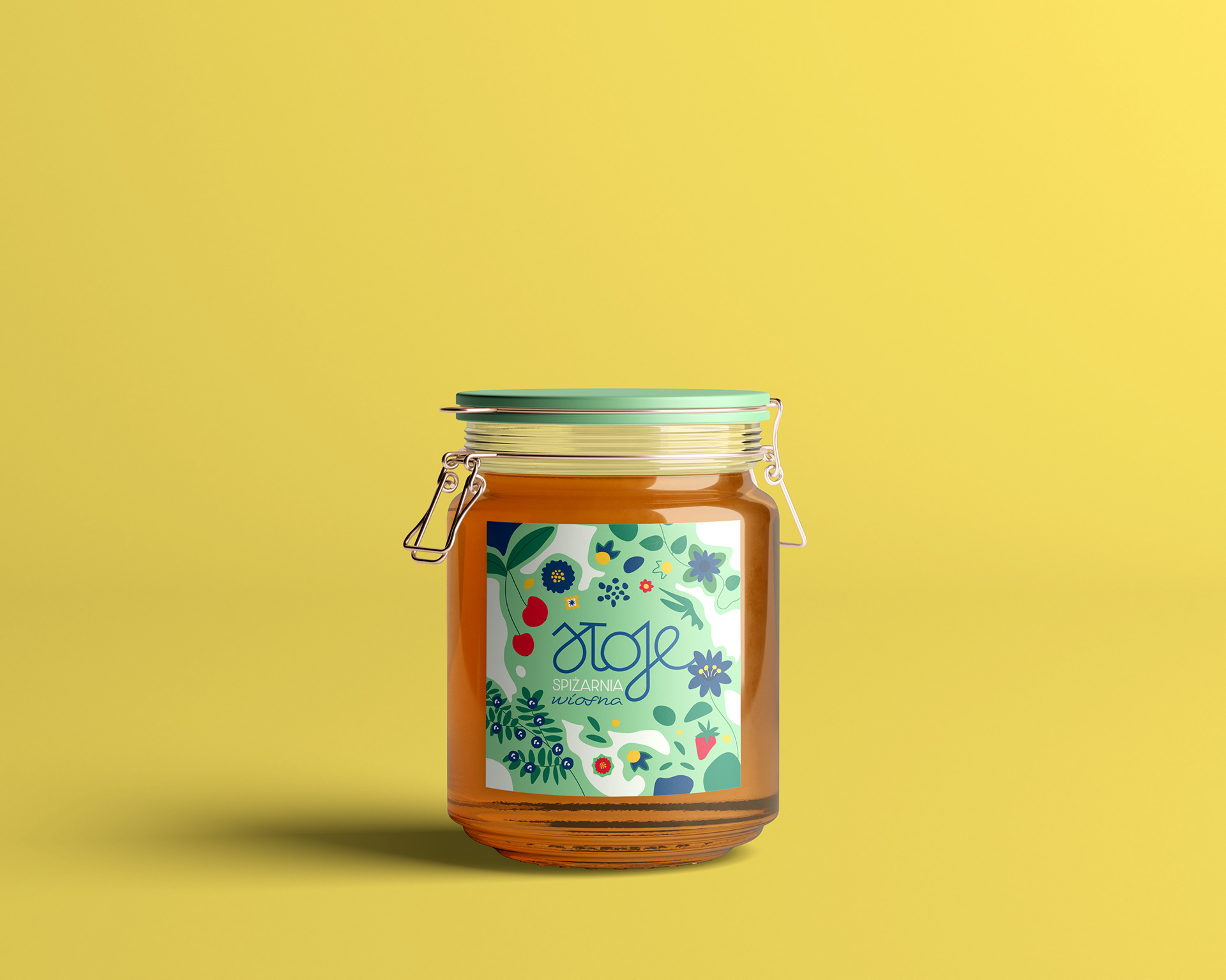
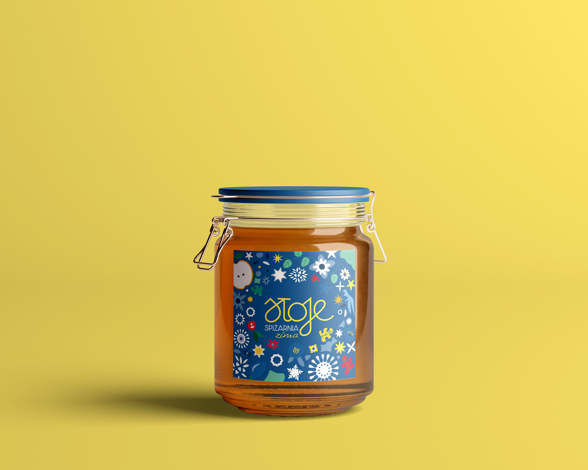
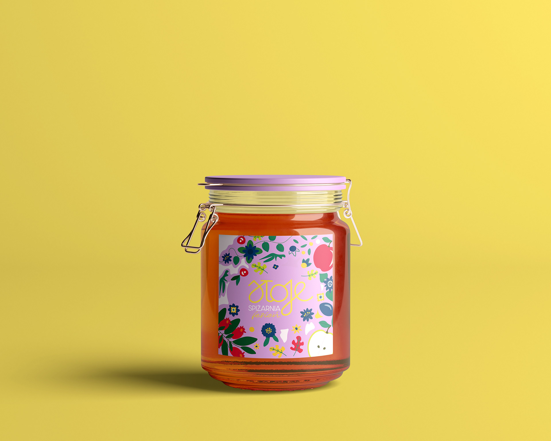
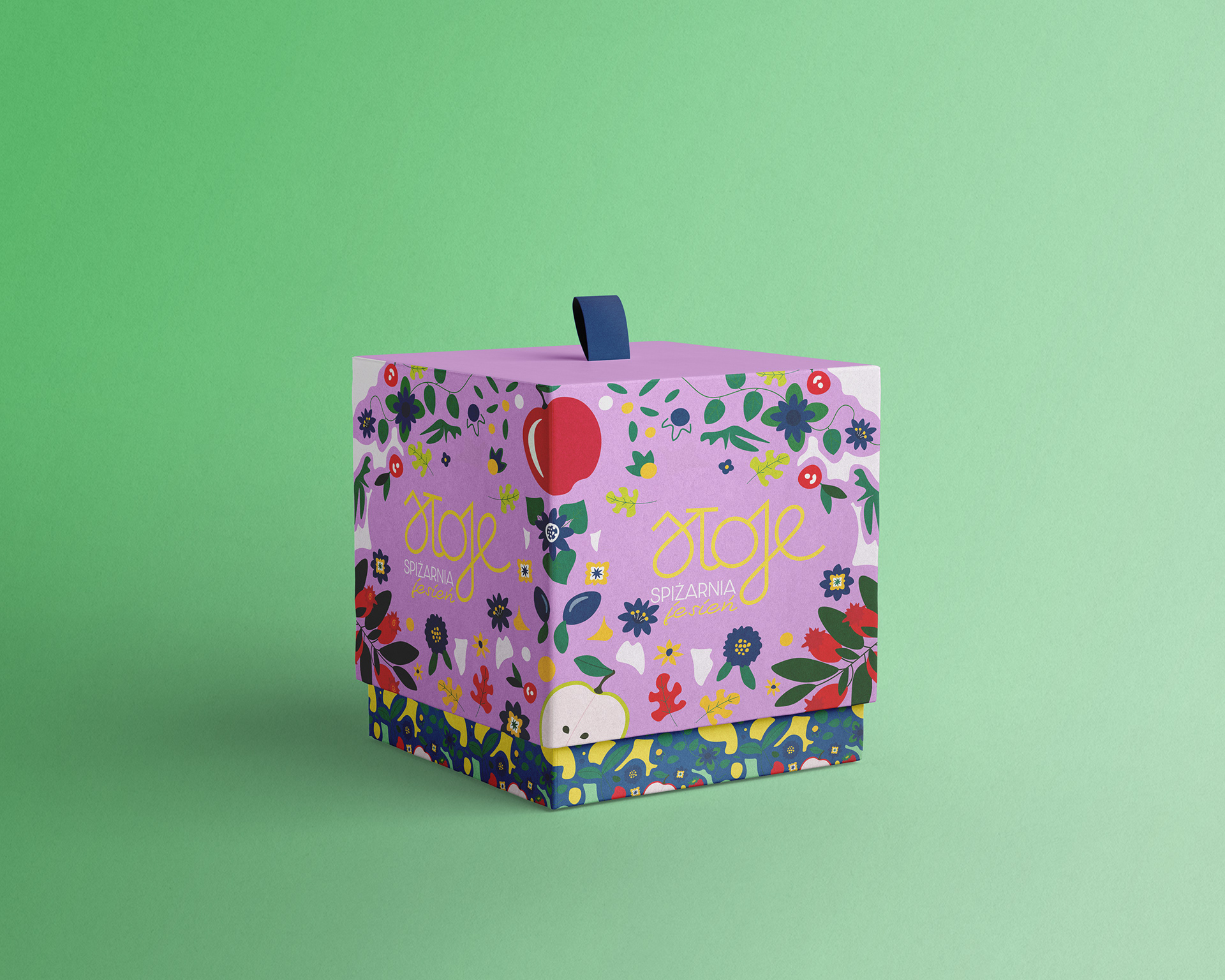
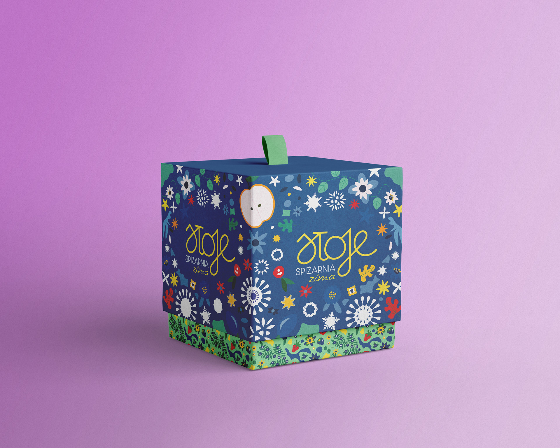
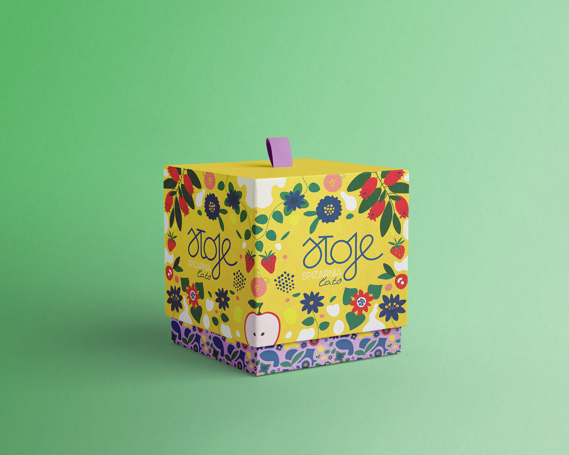
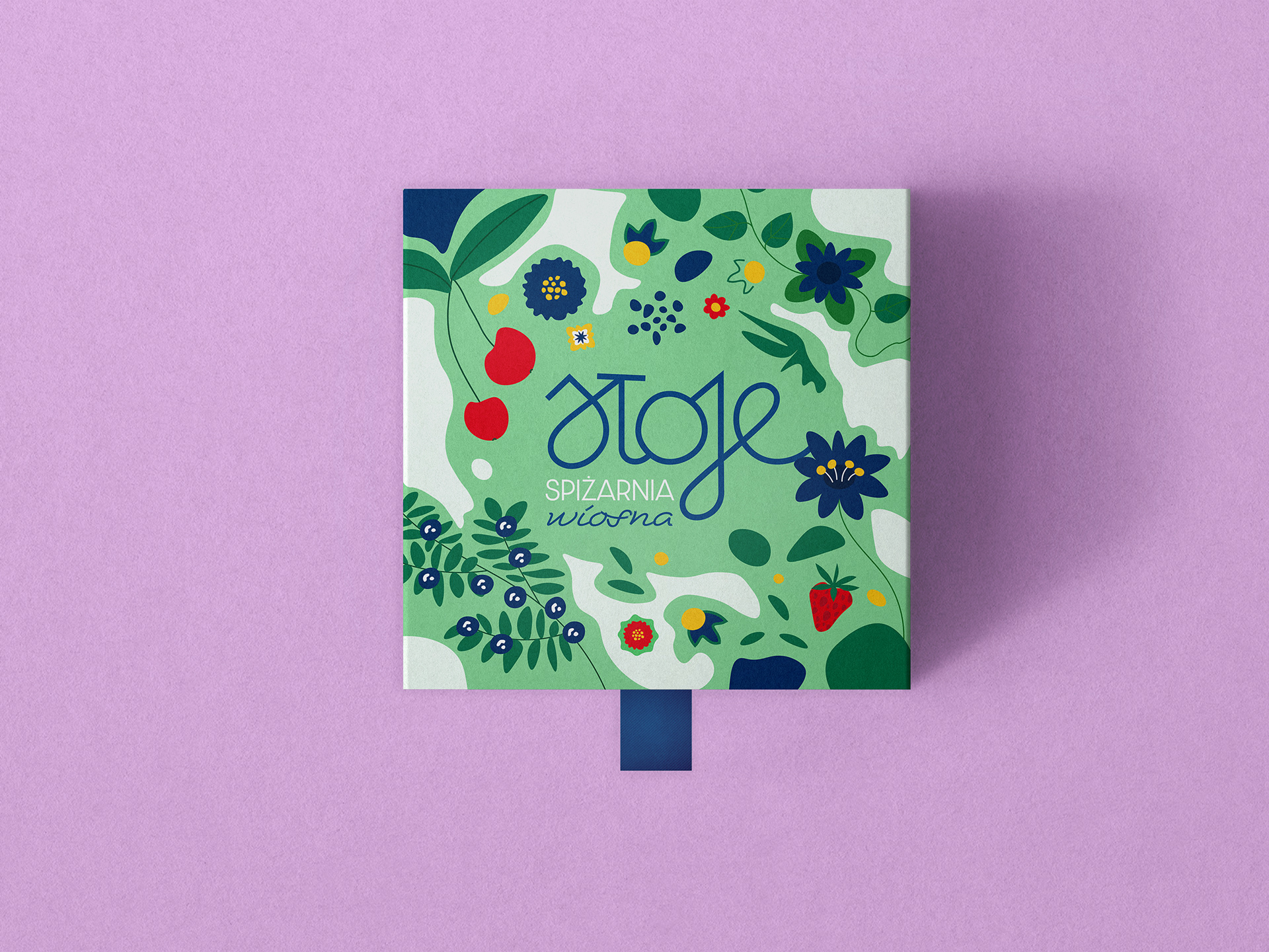
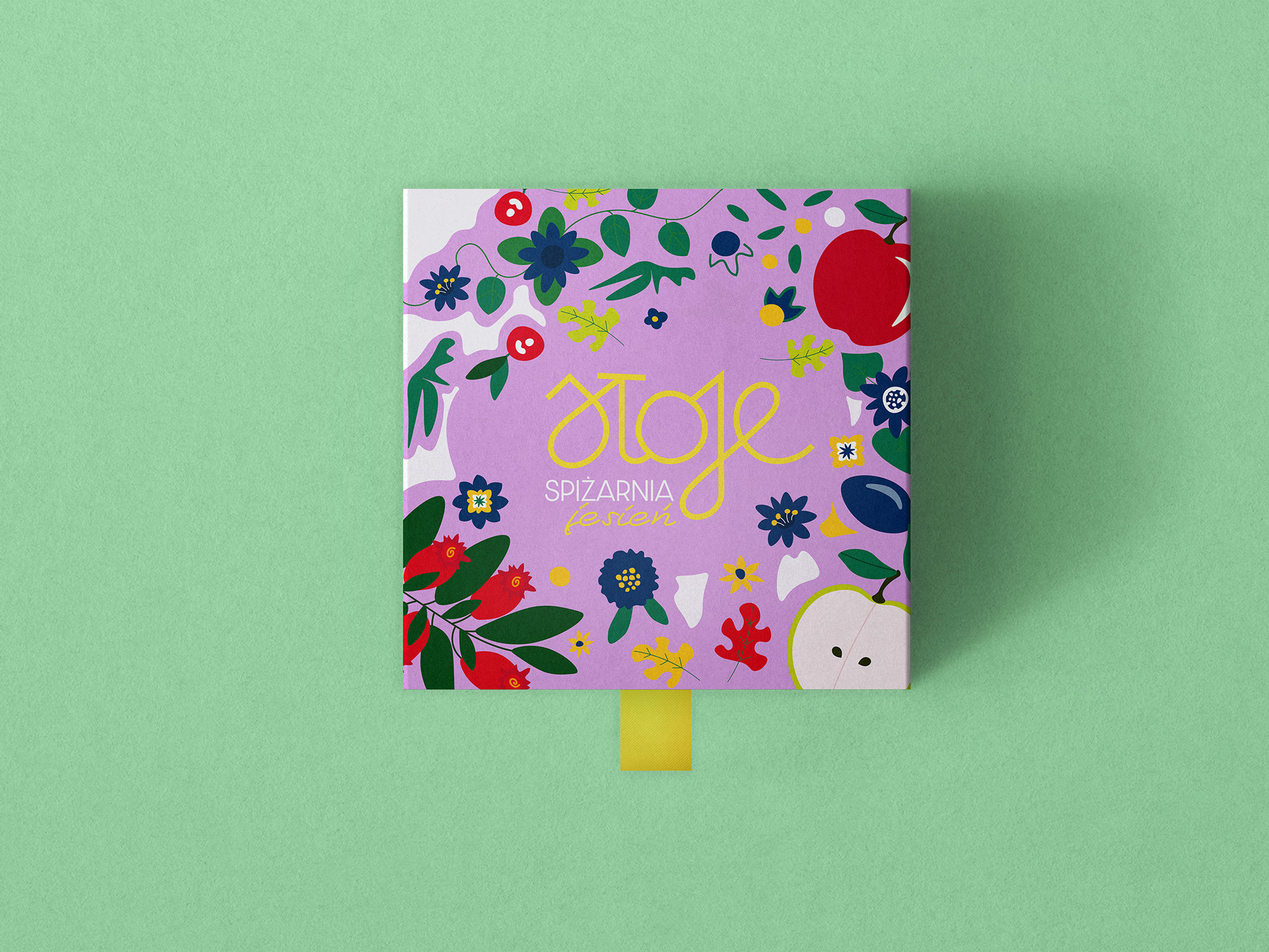
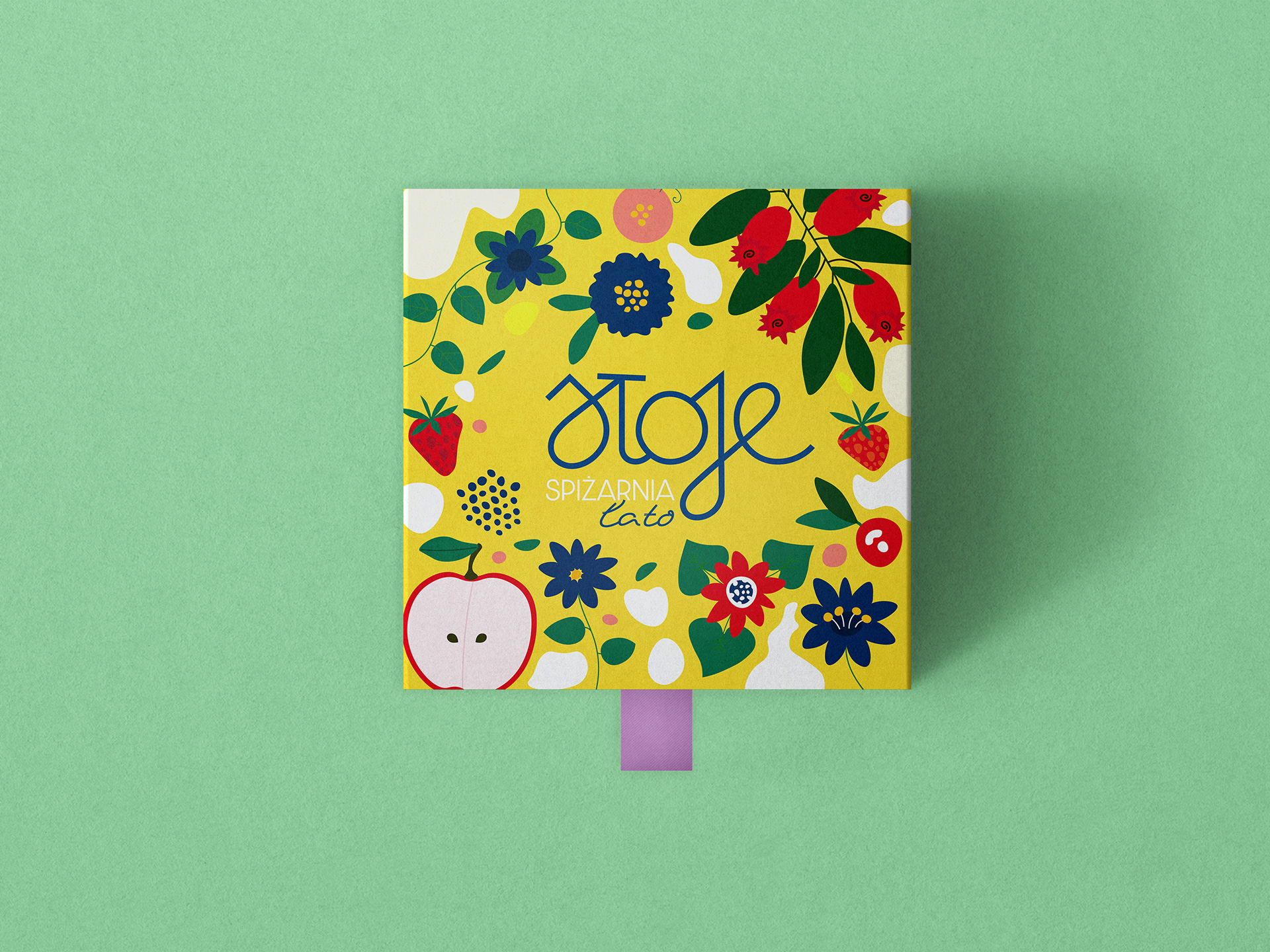
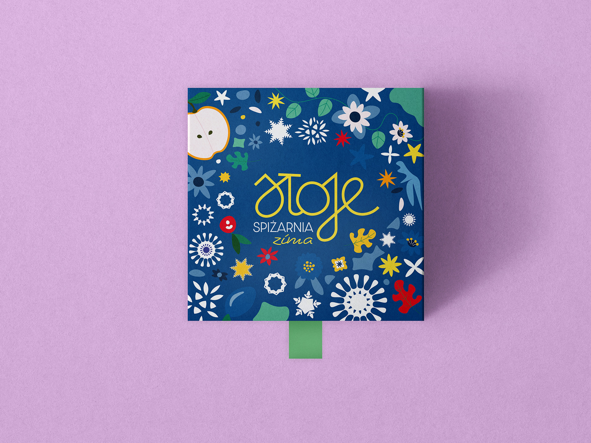
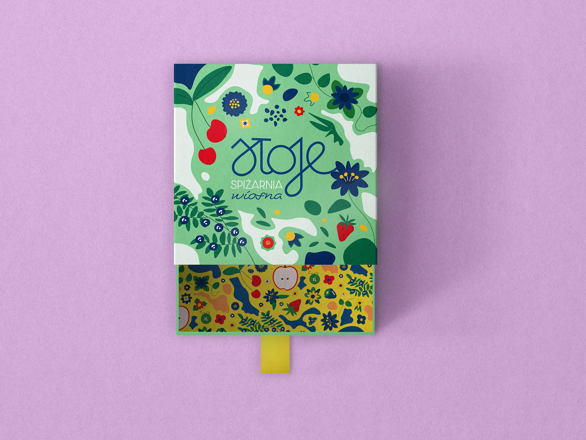
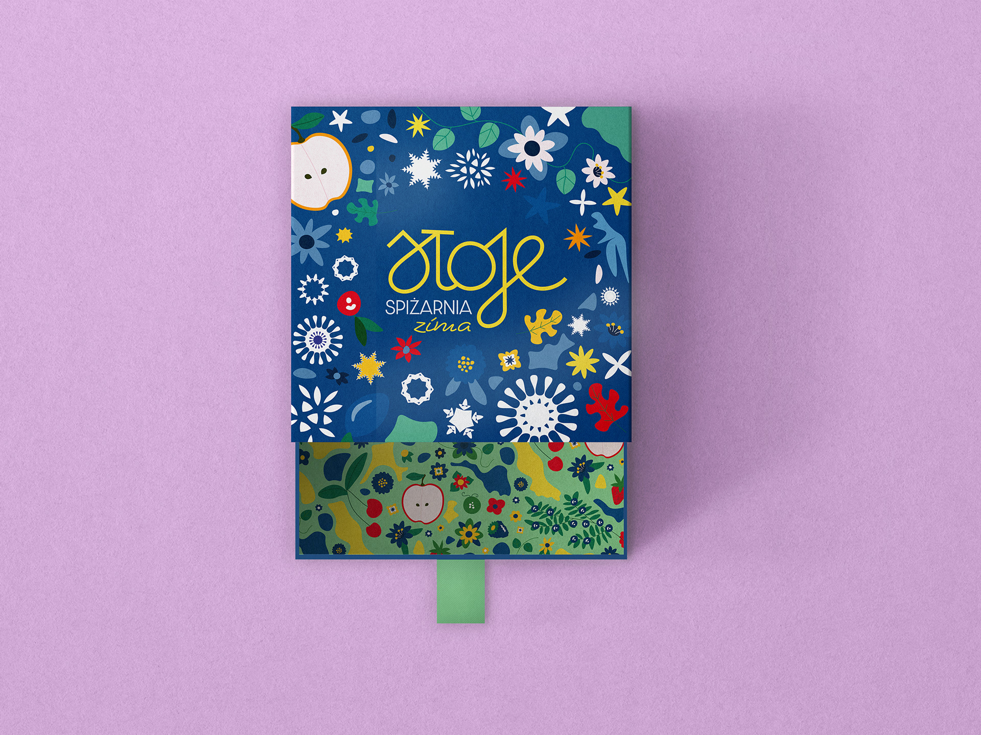
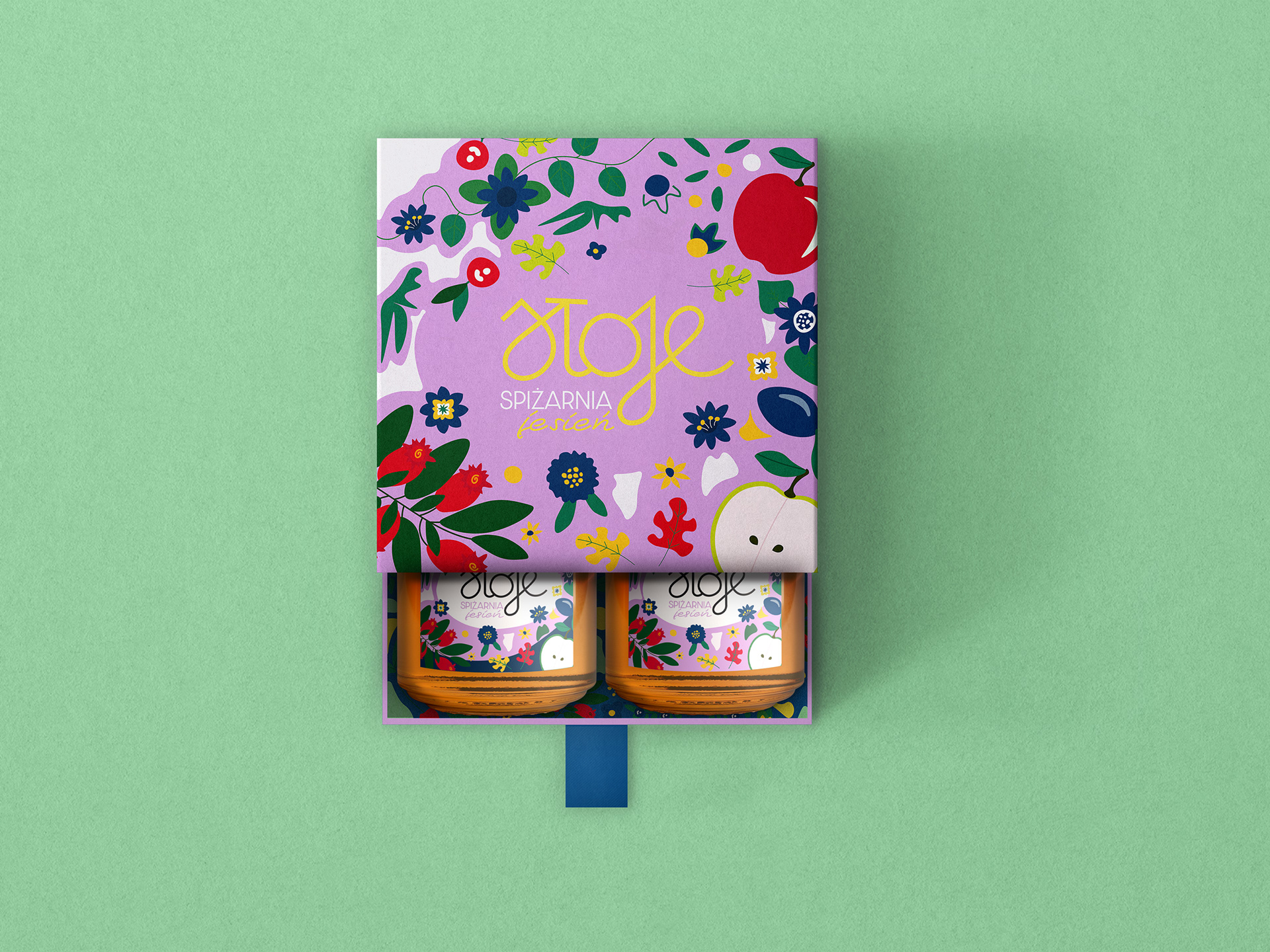
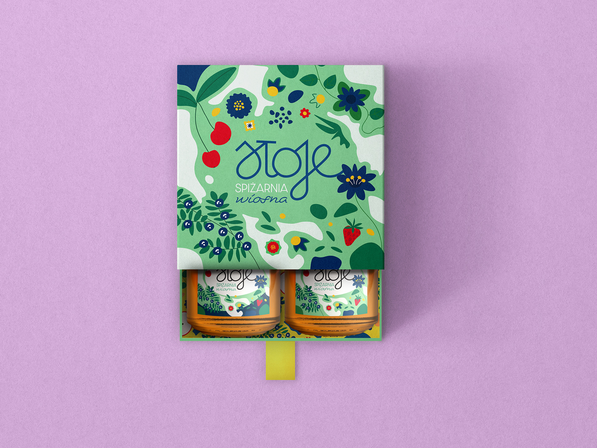
Packaging system
Custom-designed labels, sticker, boxes, and patterns highlight seasonal produce while reinforcing the brand’s handmade essence. The packaging carries visual storytelling across every format, creating emotional connections, from the way jars look on a shelf to how the brand feels in someone’s kitchen.


Rooted in the charm of handwritten labels, vintage jars, and everyday kitchen rituals, the packaging system blends warmth with practical function. Every element, from labels to product boxes and lid stickers, was designed to support daily logistics and tell a story customers can relate to.

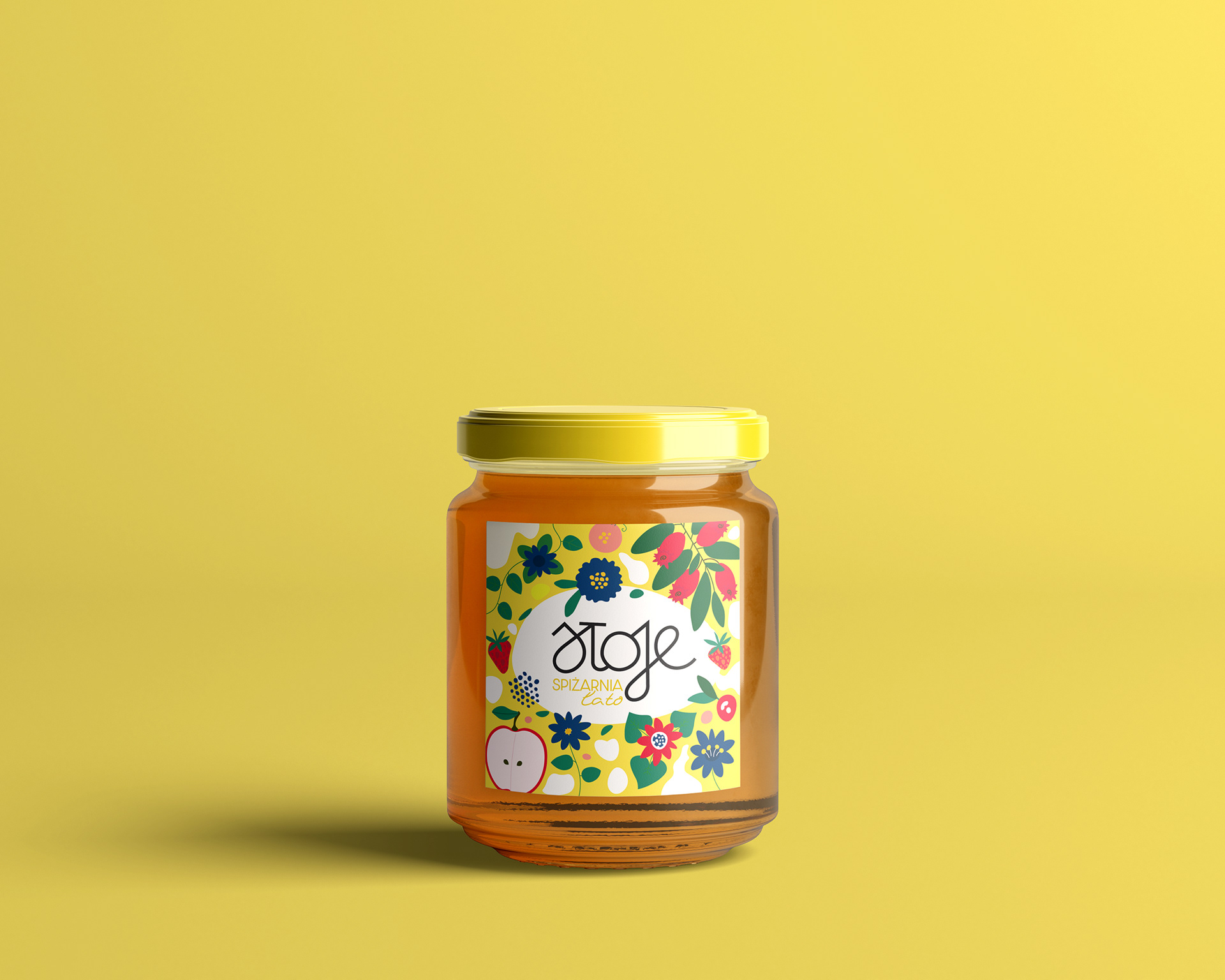


Each back label was designed to look beautiful and to serve a clear purpose. Its layout accommodates essential product data from ingredients and allergens to batch numbers and shelf-life details.

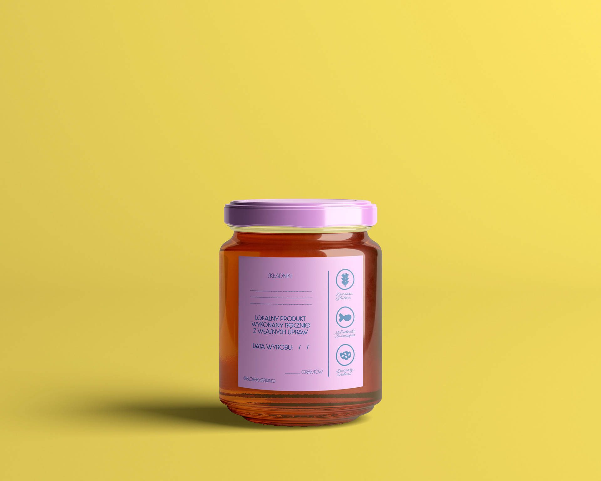

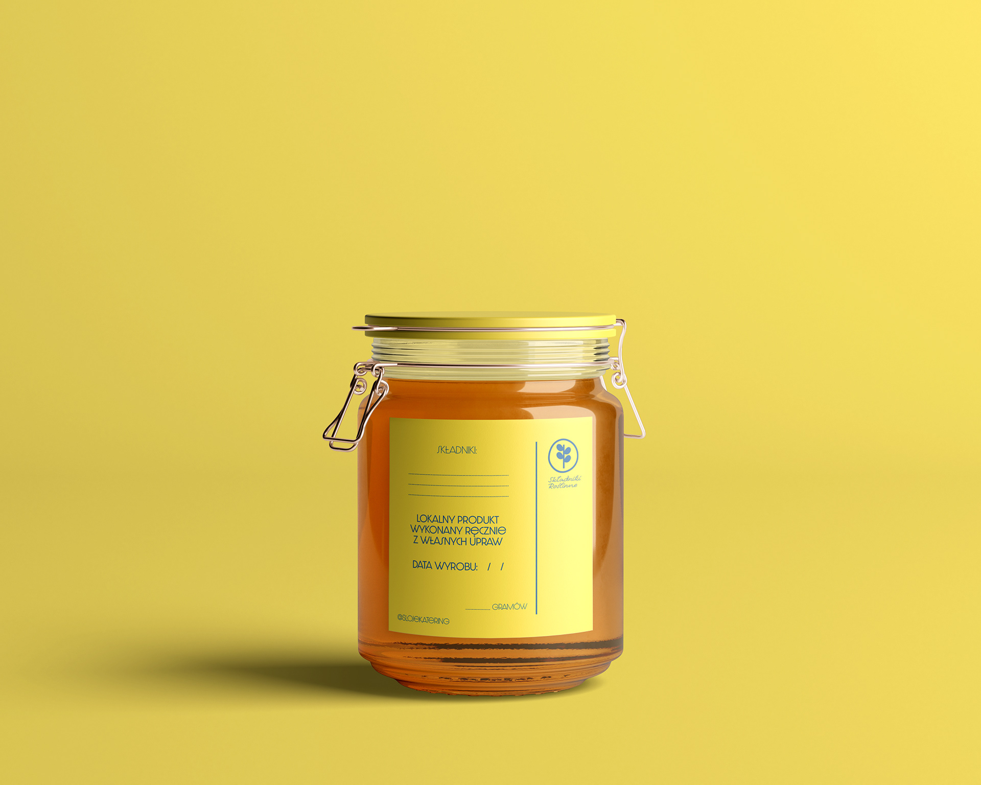
A flexible marking system with hand-stamped elements adds a personal flair while staying practical for everyday use.


We developed complementary label complementary label line for catering, easy to apply across trays, boxes, and takeaway packaging.


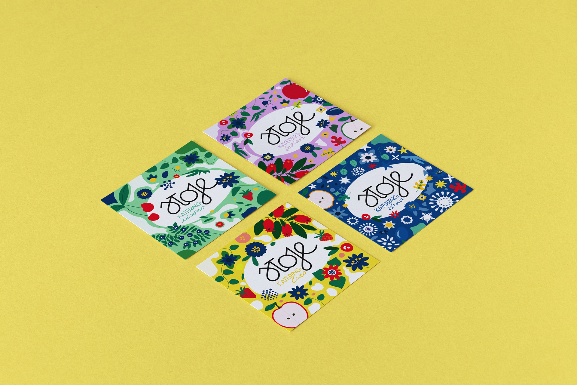
The packaging system is easily adaptable to seasonal offerings, limited batches, and changing menus, keeping the brand consistent, no matter the moment.


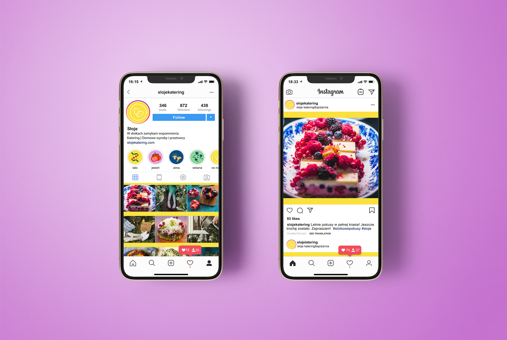
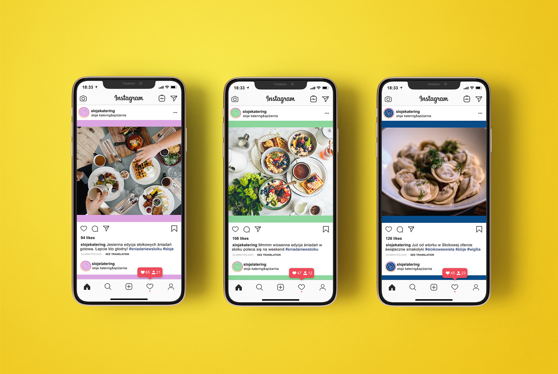
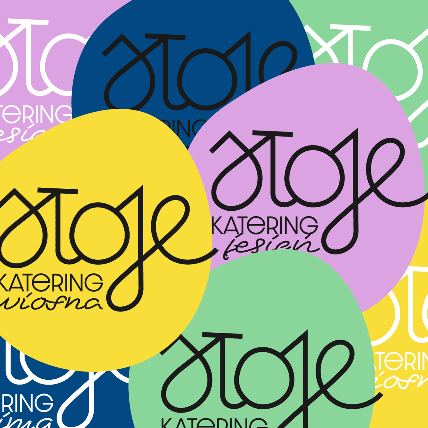
Social media that reflects the seasons
Sloje’s digital presence follows the same thoughtful rhythm as its packaging, using seasonal colour-coding to clarify the offer, highlights seasonal ingredients and highlight what’s fresh and in season.